
Delta Dental Enrollment Dashboard
Helping enrollment analysts catch costly coverage errors sooner
As a Product Designer, I led the design work for a centralized dashboard that helped Enrollment Analysts monitor file processing, investigate errors, and track system communications without switching between disconnected tools.
40%
estimated reduction in task time
5.5%
testing error rate
+$2.3M
in projected operational savings
Project overview
Role
Product Designer
Timeline
9 months, 2023
Responsibilities
Product strategy
Workshop facilitation
Interaction design
Prototyping
Usability testing
Design system application
Cross-functional collaboration
Core team
2 Product Managers
2 Engineers
1 Product Designer
1 UX Researcher
The problem
Analysts had to find critical errors across disconnected systems
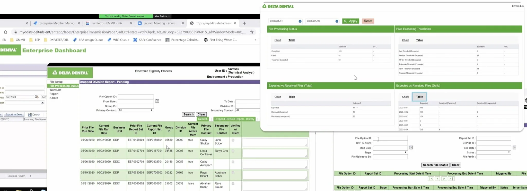
Enrollment Analysts inspected more than 150 files each day using five to eight legacy tools that did not communicate reliably with one another.
Errors had to be identified manually or through overnight reports that could arrive late or fail to arrive altogether. Analysts also had no centralized way to confirm whether files and emails had been successfully processed.
When an issue affecting the Coca-Cola account went undetected for nearly a year, Delta Dental incurred more than $2 million in losses.
How might we help Enrollment Analysts identify and resolve issues before they become costly mistakes?
Research
Fragmented tools made problems difficult to find and even harder to resolve
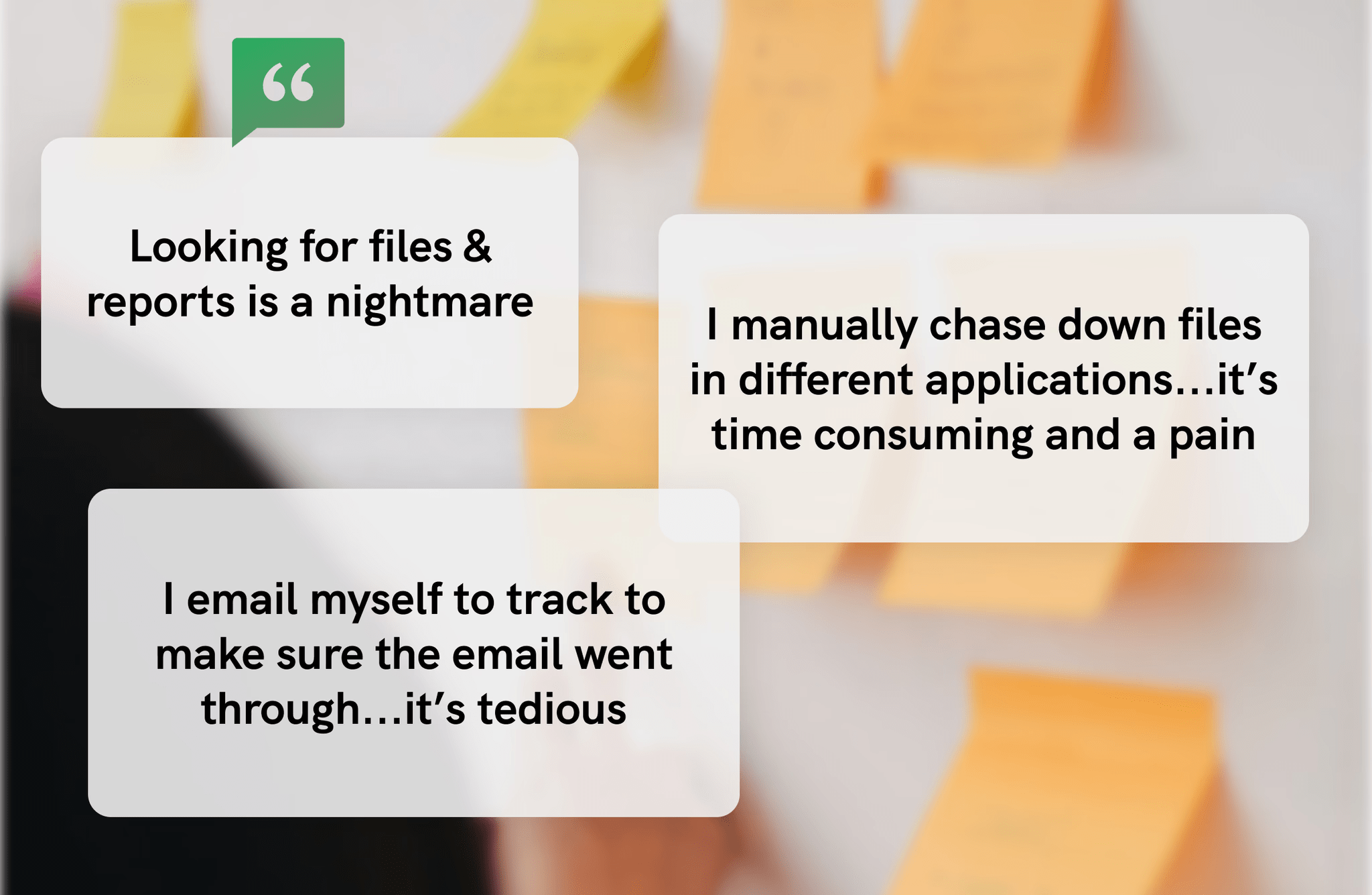
I partnered with UX Research to facilitate a three-day workshop with Enrollment Analysts and subject-matter experts. Through interviews and journey mapping, we examined analysts’ daily responsibilities, gaps in the existing workflow, and opportunities to reduce manual work.
Research revealed four recurring problems:
Analysts used as many as eight tools to investigate a single file.
Errors were often discovered through delayed overnight reports.
Failed emails could go unnoticed.
Analysts lacked a shared view of file and issue status.
Strategy and scope
We focused the first release on visibility, prioritization, and traceability
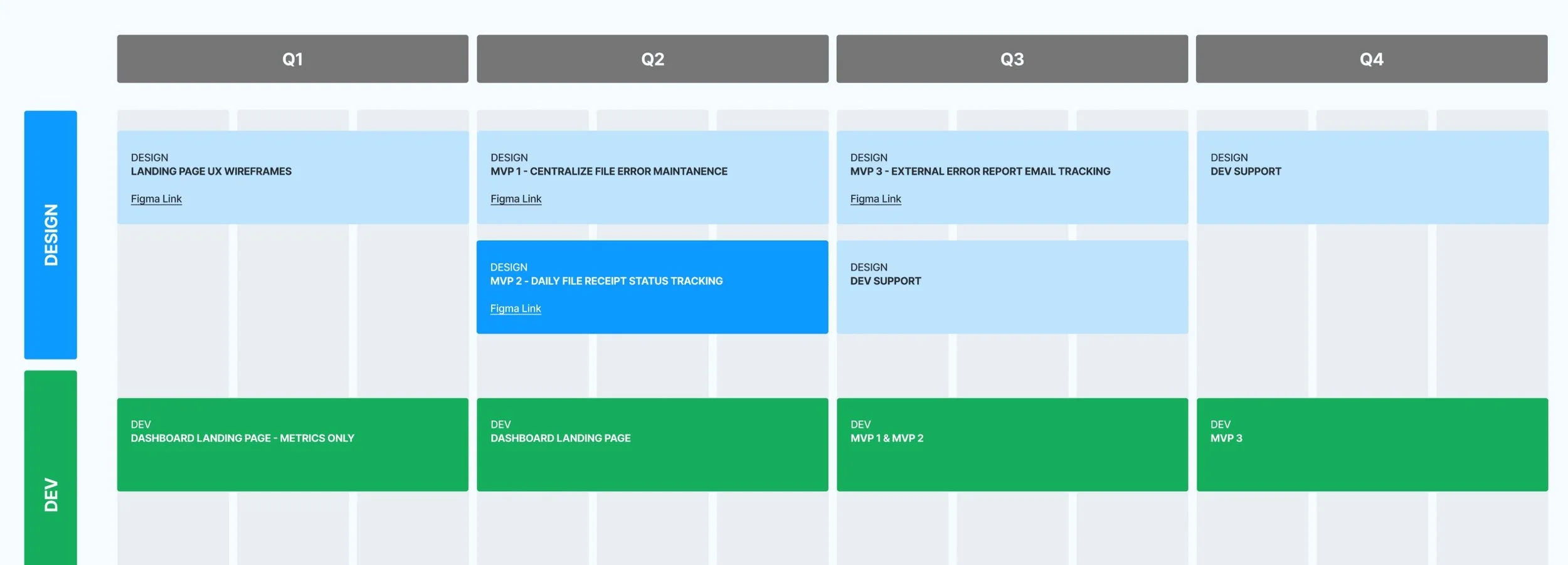
I facilitated an impact-versus-feasibility exercise to balance analyst needs, business risk, and technical effort. We prioritized four core capabilities to deliver incrementally over nine months:
Dashboard overview
Centralized error management
File-receipt tracking
Email-status tracking
We used four principles to guide the work:
User control: Let analysts focus on the accounts and information relevant to them.
Actionable information: Prioritize information that requires attention.
Current system status: Show the most recent data available.
Transparency: Help analysts understand what happened and what to do next.
Decision 1: Centralize the daily workload
Give analysts one place to understand what required attention
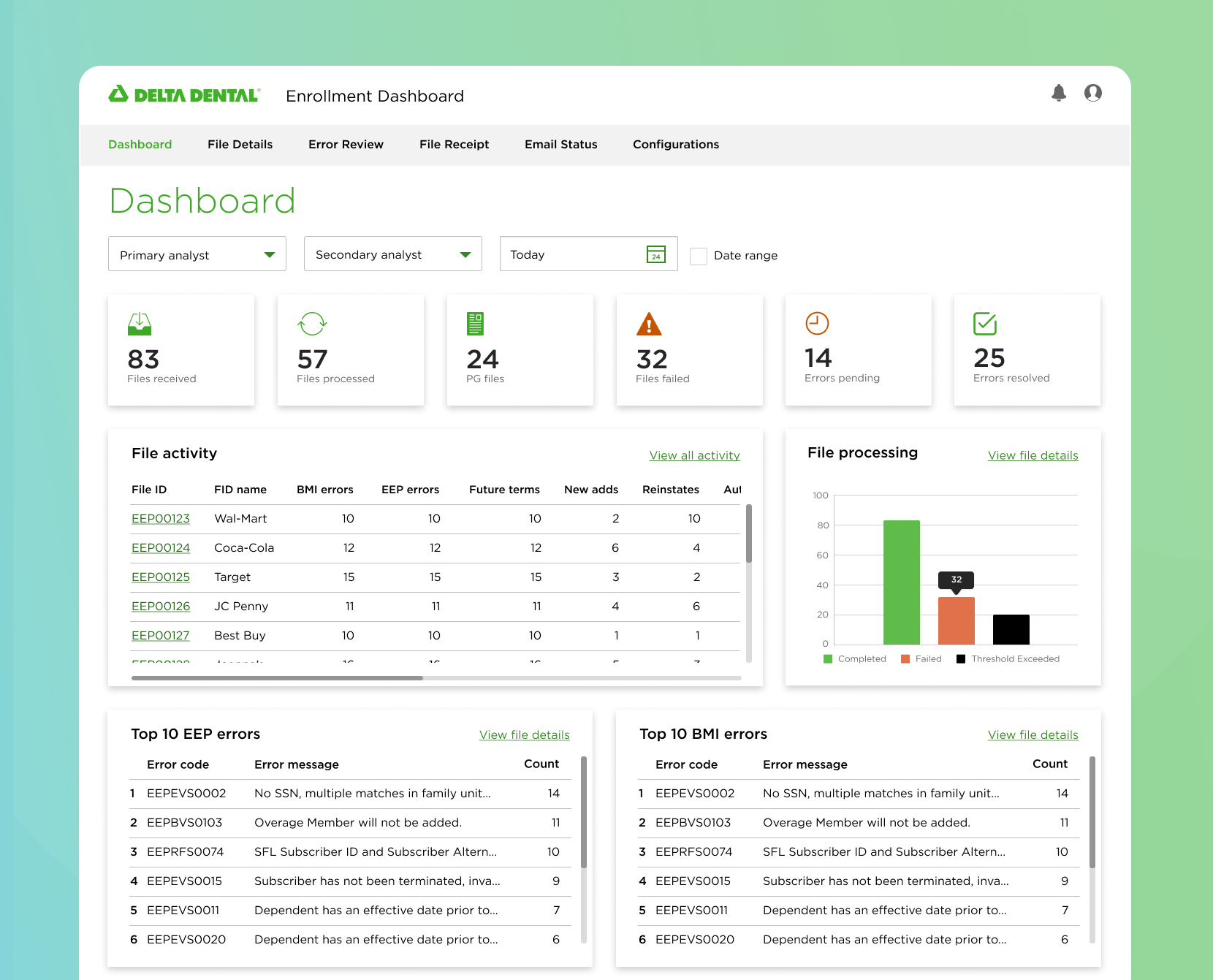
The first capability established a centralized overview of file activity, errors, and email status. Rather than checking several systems independently, analysts could begin from one dashboard and investigate issues from there.
The design prioritized:
Customizable views by analyst and date
High-visibility failed and pending states
Direct access to detailed records
Only the information needed to make a decision
Progressive disclosure for large datasets
Place these visuals together:
Annotated dashboard
Large-data explorations
Final dashboard walkthrough
Working with subject-matter experts, I identified which information analysts needed immediately and which details could remain hidden until requested. Tables supported comparison, while expandable sections reduced the initial information density.
Decision 2: Surface errors and missing files earlier
Help analysts identify problems before they escalate
Previously, analysts depended on manual checks and overnight reports to discover processing errors. We combined error management and file-receipt visibility so analysts could identify failed, missing, or delayed files sooner.
The experience allowed analysts to:
Review affected files and error details
Distinguish pending and resolved issues
Identify missing file receipts
Prioritize high-risk problems
Track the status of an investigation
Centralized Error Maintenance
A single place to review and manage all data errors.
Shows what went wrong and which files are affected
Removes the need to wait for overnight reports
Reduces the risk of missed or delayed error handling
Daily File Receipt Status
Clear visibility into which files were received and processed.
Identifies missing or delayed files immediately
Saves time by removing the need for manual checks
Prevents file issues from escalating unnoticed
Decision 3: Make system communications traceable
Show analysts whether important emails actually reached their destination
Analysts previously copied themselves on outgoing emails because the system did not clearly confirm whether messages had been delivered.
We created a centralized email-status view that showed:
What was sent
When it was sent
Whether delivery succeeded
Which messages failed
Which messages could be resent
Testing changed the product
We removed a feature that felt like surveillance
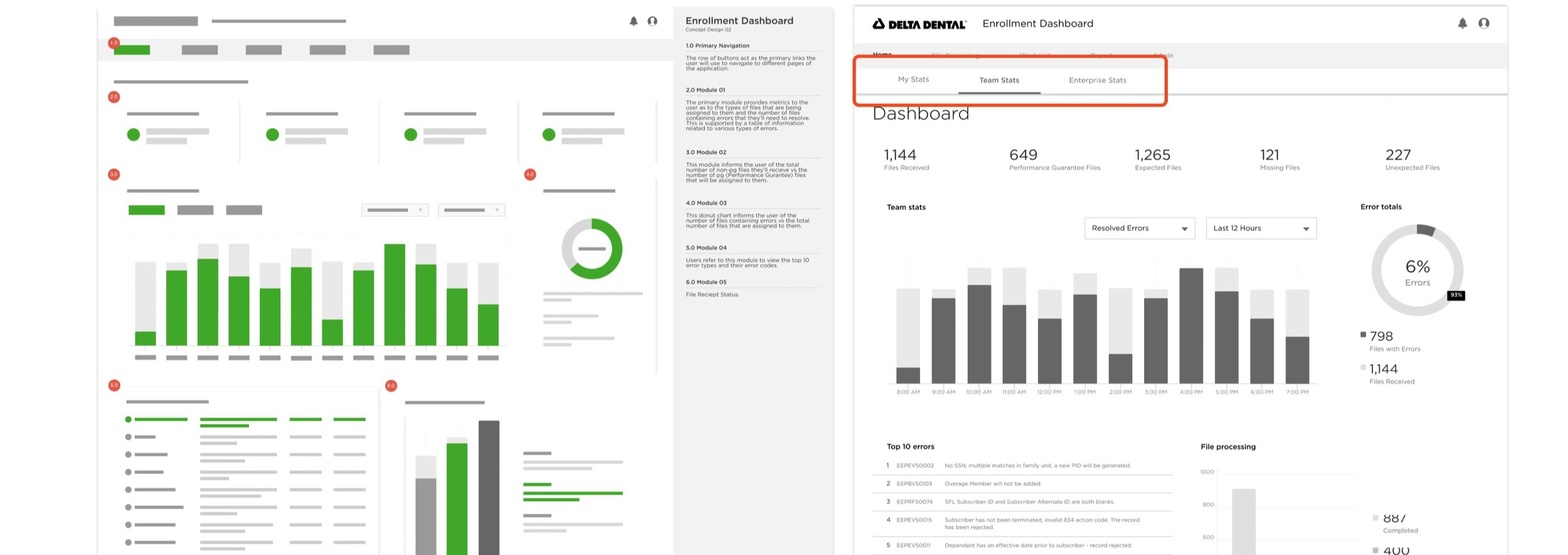
We explored comparing individual analyst performance with team performance. Although the concept introduced greater visibility, analysts felt that it emphasized employee monitoring rather than helping them complete their work.
Based on that feedback, we removed the comparison and kept the dashboard focused on workload and issue resolution.
We reorganized navigation around analysts’ workflows
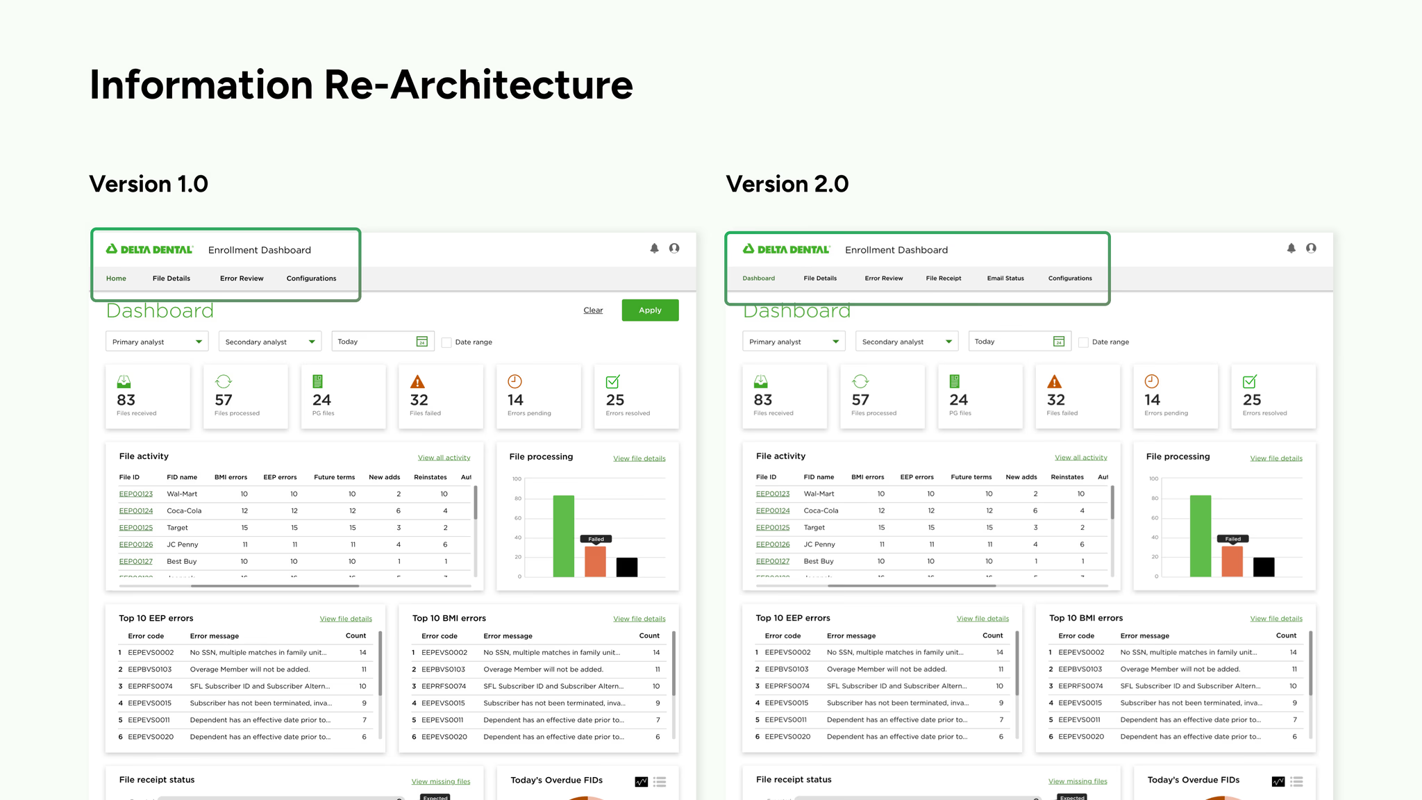
We tested the dashboard with 14 Enrollment Analysts and two managers. Participants understood the overall product direction, but the second round revealed that navigating between file receipts, email status, and related information was more difficult than expected.
We revised the information architecture by:
Giving file receipts and email status dedicated destinations
Grouping related operational information
Making high-priority tools easier to access
Creating a clearer path between overview and detail pages
We replaced a real-time promise with honest system status
Engineering constraints revealed that some error data could not update in real time because it first needed to pass through system processing.
Rather than implying that all information was live, we redesigned the experience to show pending and resolved counts. This gave analysts useful transparency while staying within the technical limitations.
Validation and impact
The dashboard made investigations faster and reduced operational risk
We tested the dashboard with 14 Enrollment Analysts and two managers to determine whether they could navigate the experience, find important information, and understand what required attention.
40%
estimated task-time reduction
Testing indicated that the dashboard could reduce the time required to complete the workflow by approximately 40%.
5.5%
testing error rate
Participants recorded a 5.56% error rate while completing tasks in the new dashboard.
+$2.3M
in projected operational savings
Projected operational savings
Estimated value of the time the organization could save through a faster, more centralized workflow.
Reflection
What I would improve next
Investigate data limitations earlier in the design process
Define what “real time” means for every system dependency
Plan for delays, missing data, and exceptions from the beginning
Continue improving navigation and issue prioritization
This project taught me that designing an operational dashboard is not simply about putting information in one place. The experience also has to help people understand what requires attention, what has already happened, and what action they should take next. Working closely with analysts and engineers helped us turn a fragmented workflow into a more transparent and manageable system.