
P R O D U C T D E S I G N
Delta Dental - Enrollment Dashboard
Enrollment Analysts are responsible for keeping client enrollment records up to date and reviewing errors related to Delta Dental coverage. This oversight, which went unnoticed for a year, resulted in Delta Dental paying out millions in claims.
P R O D U C T D E S I G N E R
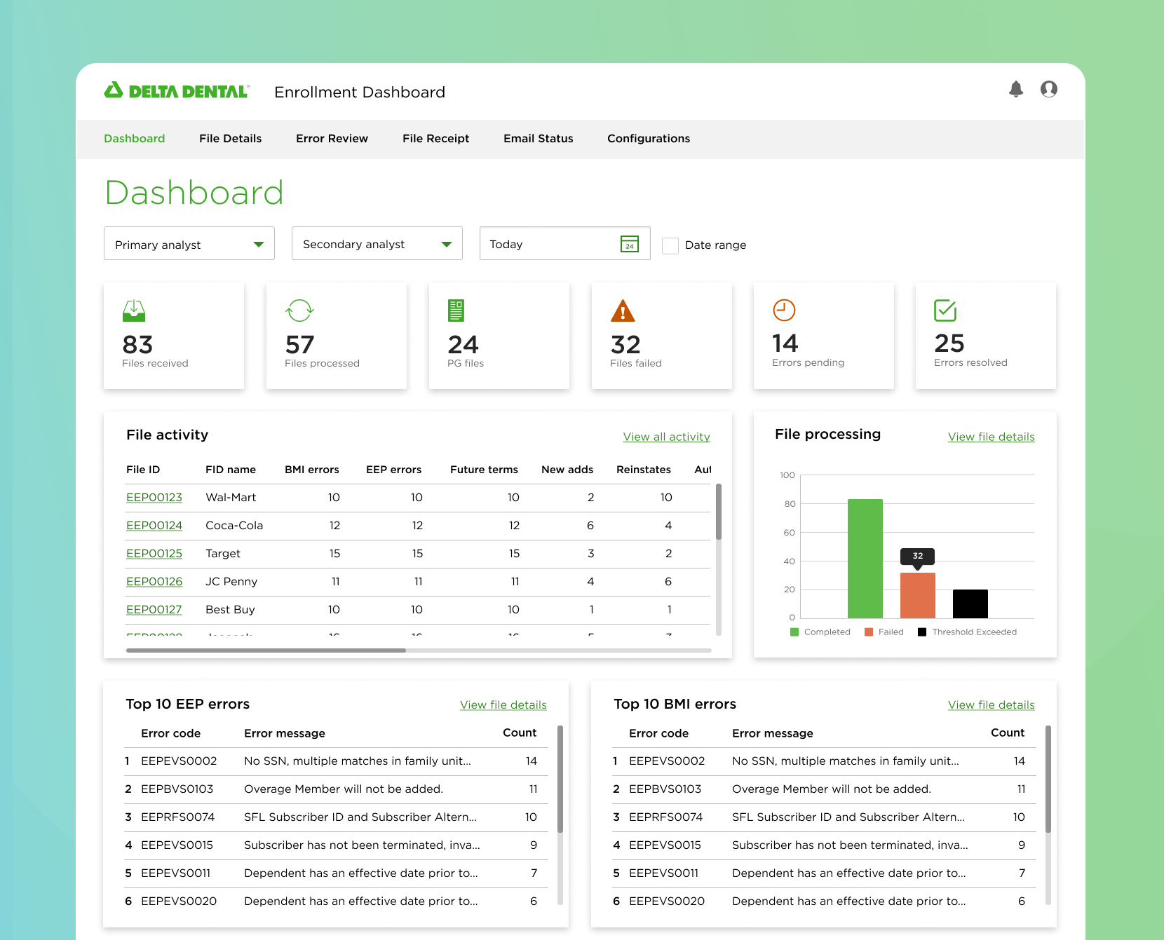
Delta Dental’s Enrollment Dashboard
Delta Dental is the nation’s leading provider of dental insurance, serving a wide variety of users. This initiative focused on Delta Dental Providers, who are responsible for managing the dental insurance of over 80 million customers.
Due to an oversight by enrollment analysts on the Coca-Cola account, Delta Dental incurred a loss of over $2 million.
Role
Product Design Lead
Timeline
9 Months (2023)
Team
2 Product Managers
2 Engineers
1 UX Researcher
1 Product Designer
Overall Impact
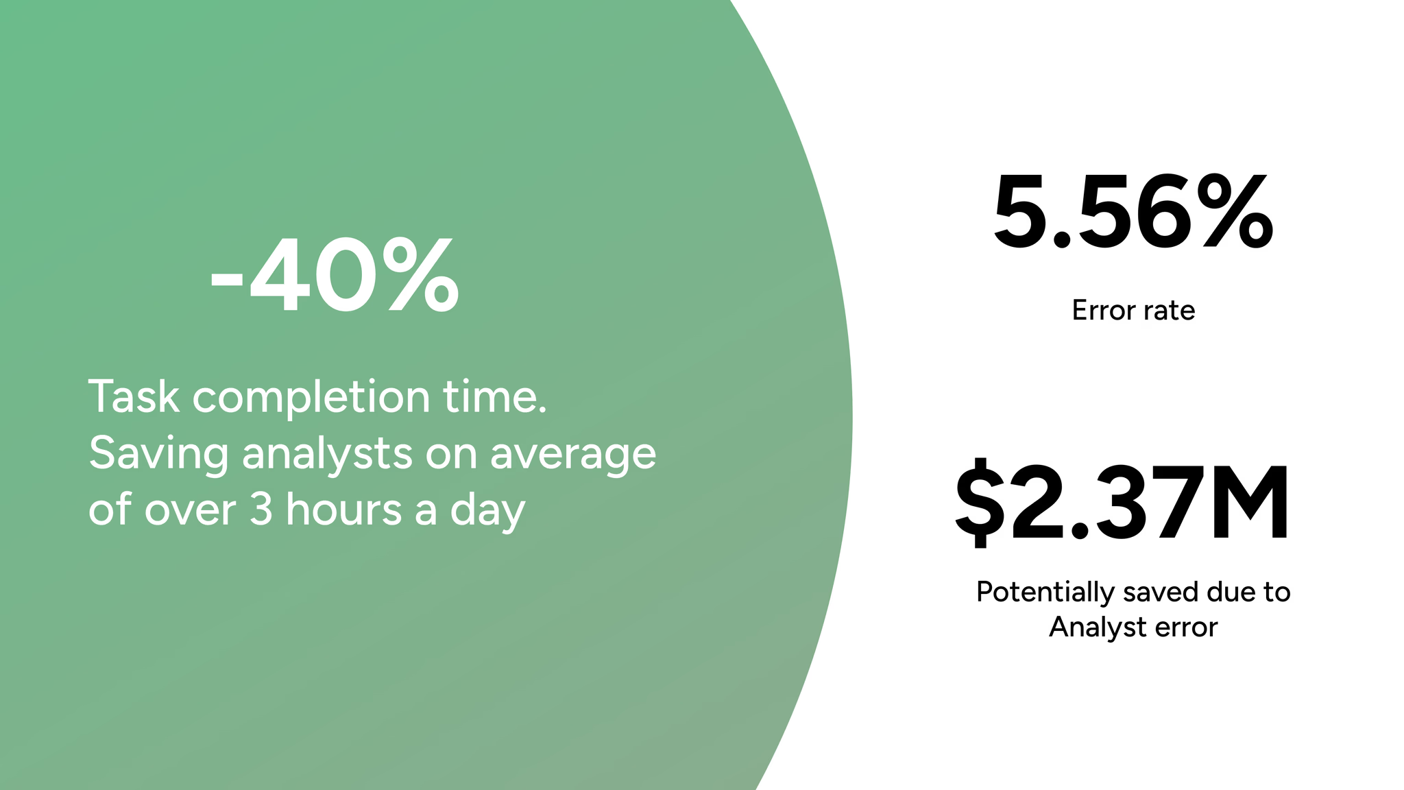
Decreased task completion time of analysts by 40%
Achieved 5.56% error rate
Avoided +$2.37M in future losses
My Impact
Led design process to deliever design artifacts for 4 MVPs, cross-functional partnership
Navigated technical complexity through cross-functional collaboration, establish product direction
Problem
Enrollment analysts are responsible for keeping client enrollment records up to date and reviewing errors related to Delta Dental coverage. This oversight, which went unnoticed for a year, resulted in Delta Dental paying out millions in claims.
Why it started
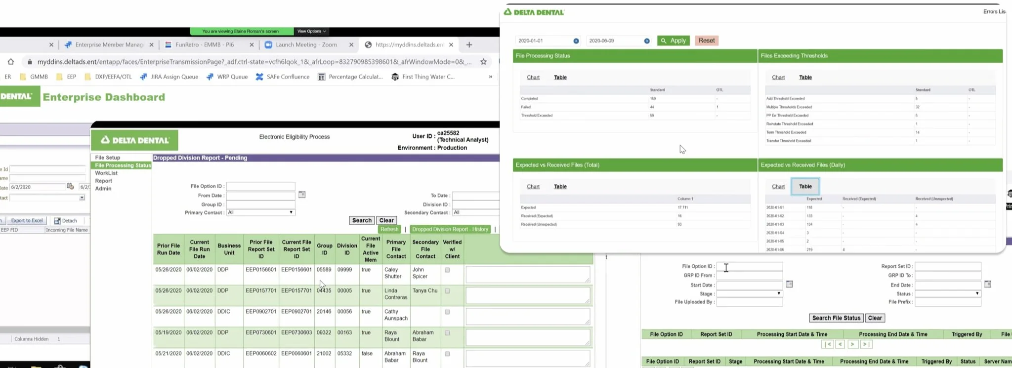
Each individual enrollment analyst is responsible for inspecting over 150 files daily. To perform these inspections, they must use legacy platforms.
How can we make the tasks of enrollment analysts easier, more efficient, and avoid this costly mistake from happening again?
Solution
As part of a massive 0 -> 1 initiative, my cross-functional team, stakeholders, and I broke down the needs of our users into four MVPs. Leading the design direction, we created a centralized experience for Enrollment Analysts to manage their day-to-day investigative workload. We provided them with live visibility control over their information, and transparency into what’s happening behind the scenes.
Empathize
Need a clear understanding of what users need to be successful
I collaborated with our UX Research team to host a three-day cross-functional workshop where we spoke with internal users and leveraged subject matter experts (SME’s) for both generative and evaluative research. Our goal was to gain a clear understanding of our users' day-to-day challenges, identify any pitfalls, and determine how we could alleviate them to help narrow our scope.
Through user interviews and journey mapping, we were able to synthesize our findings and align with stakeholders. We learned that:
Users have to navigate through eight different applications for each file.
Errors can only be viewed by either manually scanning each file or waiting for a consolidated error report overnight.
External error report emails are not always sent successfully, and there is no easy way to track them.
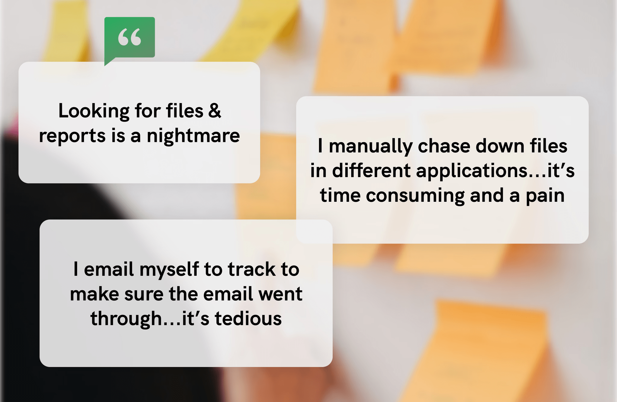
We also learned that Enrollment Analysts have to switch between 5-8 different applications to gain visibility into the problem, but not to solve it (e.g., updating plan type). Based on these insights, the team and I began shaping our scope.
Conceptualize
Overwhelmed with insights, we started to prioritize and form a design strategy:
MVPs
In order to prioritize our insights, I led an Impact Feasibility Matrix exercise. Listing features that could solve user problems, and we discussed how to balance business needs as well as user-centered design solutions. In doing so, we were able to establish our scope of work to 4 MVPs to be completed over a 9-month period.
1. Dashboard landing page
Provides enrollment analysts with an efficient, user-friendly dashboard to monitor file statuses, eliminating the manual process of managing eight different touchpoints.
2. Centralized error maintenance
Provides enrollment analysts with an efficient, user-friendly way to monitor errors, which are currently time-consuming due to the wait time for overnight reports.
3. Daily file receipt status
Provides enrollment analysts with an efficient way to monitor missing files, which are currently time-consuming due to long wait times.
*Analysts were unable to comment on or flag missing files.
4. Email tracking
It provides enrollment analysts with an efficient, user-friendly way to track outbound emails to clients, reducing confusion and improving alignment between the team and the client.
Design Principles
To stay aligned throughout the process, my team and I established a set of design principles to guide our decisions. Since this domain is highly technical and filled with complexity, these principles served as our north stars.
1. User control
The design presents information relevant to each individual enrollment analyst, giving them control over the information they receive.
2. Efficient information
Information should be quick, concise, and designed to help enrollment analysts complete their tasks as quickly as possible.
3. Live feed visibility
With real-time updates, the design should clearly display the most current information.
4. Transparency & Communication
Enrollment analysts shouldn't have to “cc” themselves on emails and should be able to communicate internally about the status of a particular file.
Timeline
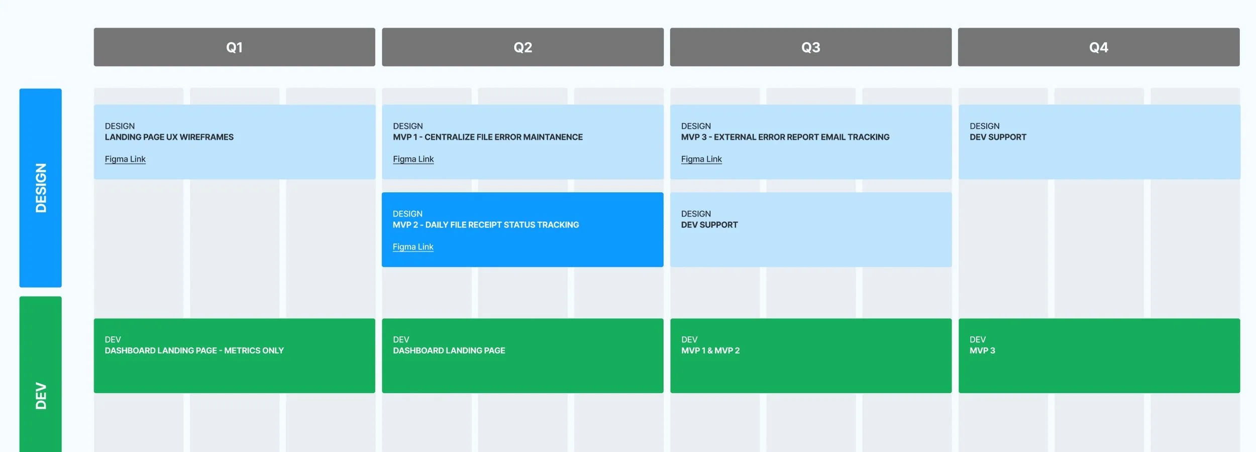
A major focus during planning was not only what to design, but also the cadence that would make sense. We established a 9 - 12 month timeline in which design and dev would work in conjunction. Check-ins as needed, and to move forward in alignment.
Constraints: Time, highly specialized domain, technical
KPIs: Task efficiency + Error rate
Design
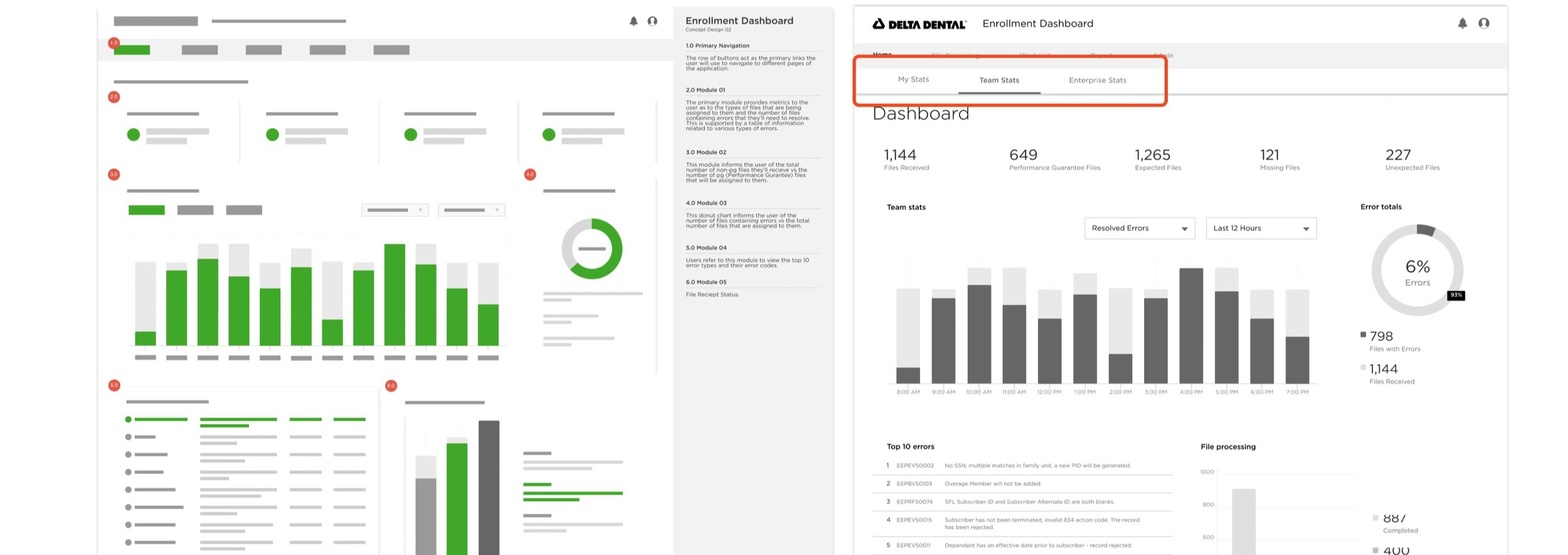
Exploration - My Stats & Team Stats
My approach was to create a centralized experience for enrollment analysts to manage their day-to-day workload without needing to leave the app to investigate. At this phase, we didn't have a clear vision of what the dashboard would look like, only that it would contain a lot of information.
We explored list views and graph-centered views, focusing on presenting large amounts of relevant data.
We ran concept tests and gathered feedback from the team and stakeholders regarding navigation, the types of information presented, and the formats used.
We also explored the idea of 'My Stats vs. Team Stats' to offer full transparency. This feature would provide analysts with a quick overview of relevant information. While users liked the direction of the page, they were not fond of the 'my stats vs. team stats' concept, as they felt it made them feel scrutinized and put under a microscope.
Exploration - Displaying large data
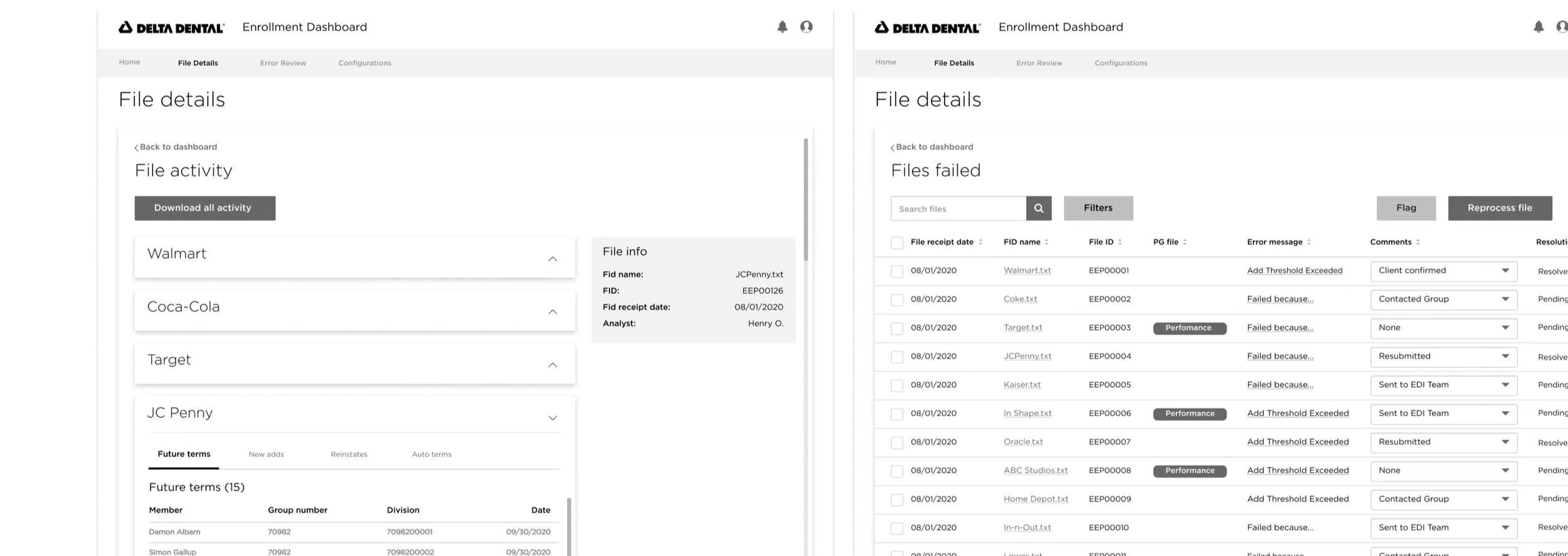
Finding the right balance between too little and too much information was key. We had to land somewhere in the middle. Users were overwhelmed by having too much to scan, so we focused on showing only what they actually needed. It was harder than it sounds, especially with something as complex as dental insurance. We worked closely with our subject matter experts to break things down and make the important stuff easier to understand.
From the outset, we knew the information would be data-table heavy, a fact validated through concept tests. The focus then shifted to determining when to use which components. Working within the Delta Dental design system, I utilized accordions and data tables to efficiently organize and present the information.
Validating our direction
Since the Enrollment Dashboard was a 0 -> 1 product, we placed a strong emphasis on usability testing to validate our progress. Collaborating with our UX Research team, we tested whether our designs met the criteria for the MVPs. We established clear goals, and I anonymously participated in the tests.
WHO: 14 Enrollment Analysts, 2 EA Managers
WHAT: Moderated user testing of our prototype
GOALS: To learn whether Enrollment Analysts could navigate the new product, if it made sense, what changes they would suggest, and if the most important pieces of information were easily accessible to them.
We received valuable feedback during the usability tests, with only minor tweaks needed across the platform. As a result, we projected that the new system would save analysts approximately 40% of their day, significantly increasing the efficiency of their workflow.
Technical Constraint: If the first option isn't the best, go with the second-best solution.
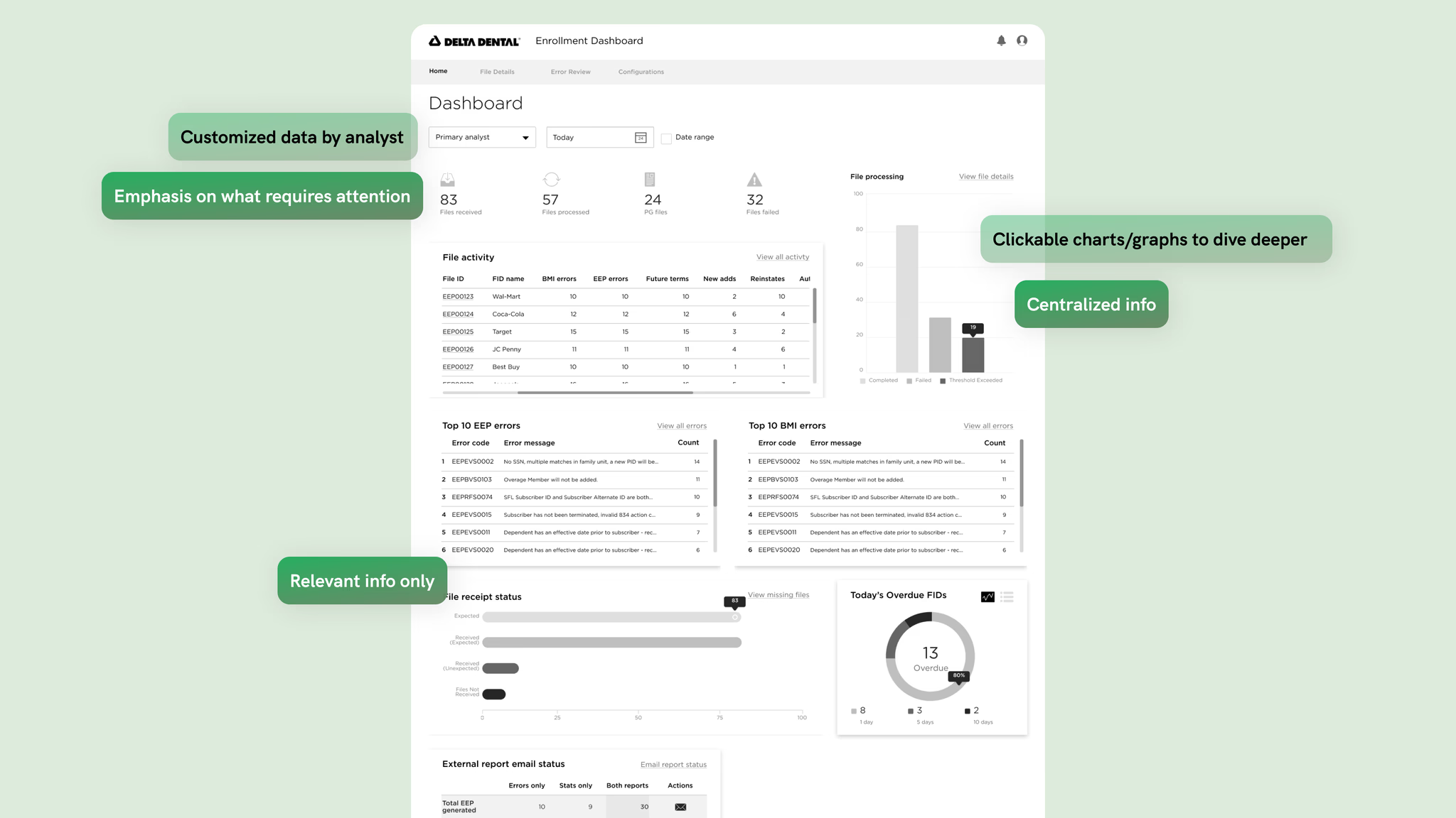
From the start, the team thought real-time updates would be available. They were, except for one: errors. There was some miscommunication within our agile team. Errors couldn’t be updated in real time because they needed to be processed in our system, and the processing time varied.
What I did: Recognizing this as a significant hurdle, I knew I couldn’t solve it alone. I collaborated with the business and engineering teams to determine the earliest possible time errors could be updated. Ultimately, through discussions, we decided that if we couldn’t provide real-time data for everything, full transparency would be the next best solution.
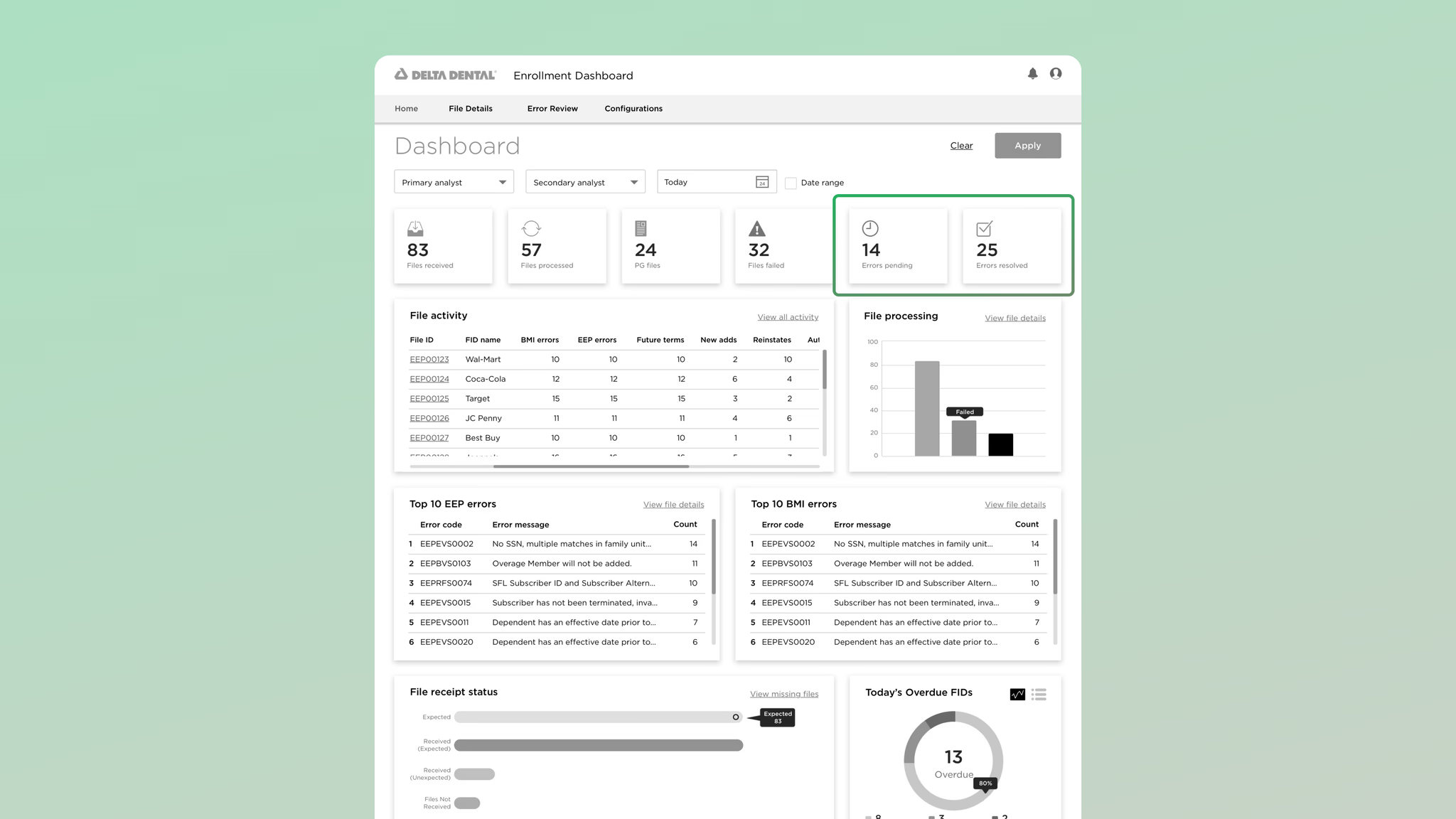
I updated the dashboard designs to communicate that errors were pending, as well as show the number of resolved errors, allowing users to cross-reference and track progress. We planned to test the effectiveness of this solution in the next round of usability testing.
Learnings
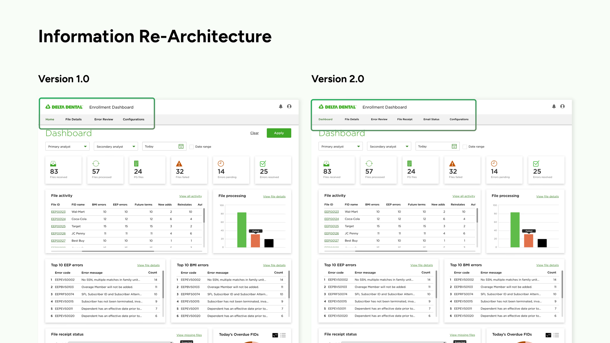
Information Re-Architecture
During our second round of usability tests, we received both good news and 'bad' news (an opportunity for iteration).
The good news was that the changes we made regarding error updates were validated, and feedback was consistent with the previous usability test, confirming that our design solutions were helpful to users.
The 'bad' news was that our navigation was confusing for users. Given that Enrollment Analysts are constantly on the go, we needed to be more intentional and clear by improving the navigation.
What I did: I collaborated with the team to iterate on the design, using the insights gathered from users to expand and refine the navigation. We also created a roadmap for tests after the MVP phase.
Solutions
MVP 1 - Dashboard Landing Page
A centralized solution that enables users to quickly identify issues and take action
MVP 2 - Centralized Error Maintenance
An efficient and user-friendly way to monitor errors, informing enrollment analysts of what actions need to be taken
MVP 3 - Daily File Receipt Status
Easily investigate and identify file issues, saving time and reducing user errors
MVP 4 - Email Tracking
No more CC’ing themselves to track email delivery; a holistic view that allows them to easily resend emails when necessary
Impact
Learnings
What would I have done differently?
Although we were informed late in the process that errors wouldn’t be based on live data, I could have investigated this limitation further to fully understand its impact. Additionally, when initially told that all data could be provided in real-time, I should have asked more clarifying questions to uncover potential exceptions or constraints.
Next steps:
Dive deeper into user flows: I would focus on making the error rate as low as possible by thoroughly exploring user flows and identifying potential pain points.
MVP scope: Since this was an MVP, I would like to explore whether there’s a more effective way to display data to improve user experience.
Explore alerts: I’d also like to explore how to incorporate alerts into the dashboard to further enhance usability and ensure users are promptly informed of important updates.