
Delta Dental Member Portal
Making dental benefits easier to find and understand
I led the design work for a self-service member experience that made coverage information easier to access, understand, and use on mobile.
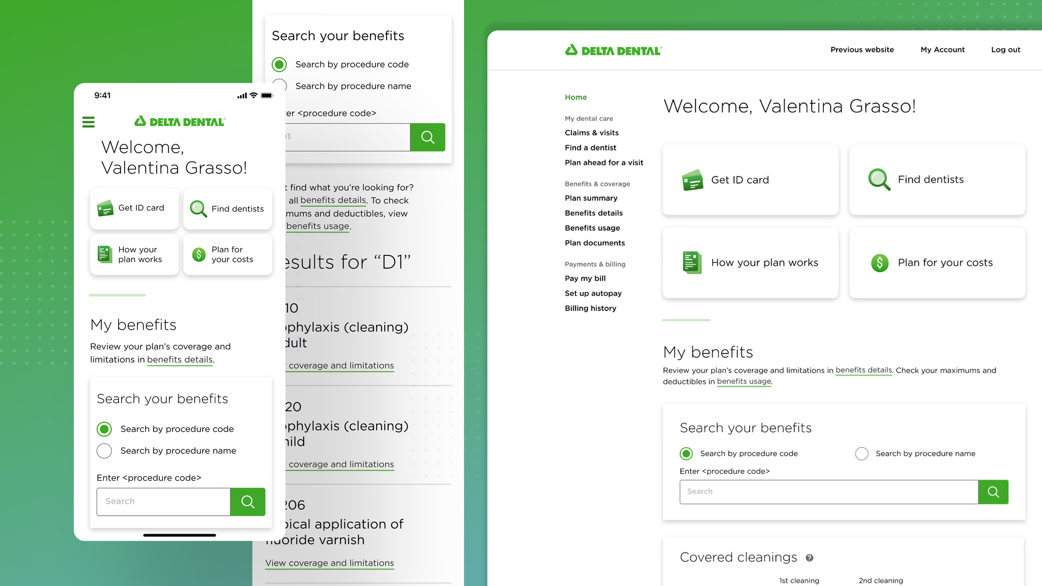
100% task completion
86% CSAT
Estimated $7M savings opportunity
Usability results reflect testing with 15 participants. The $7M estimate applies to the broader call-center initiative supported by this redesign.
Project overview
My role
Product Designer
Timeline
3 months, 2023
Responsibilities
Discovery
Workshop facilitation
Product strategy
Interaction design
Prototyping
Usability testing
Design delivery
Core team
Product Manager
2 Engineers
Product Designer
Jr Product Designer
UX Researcher
Content Writer
My contribution
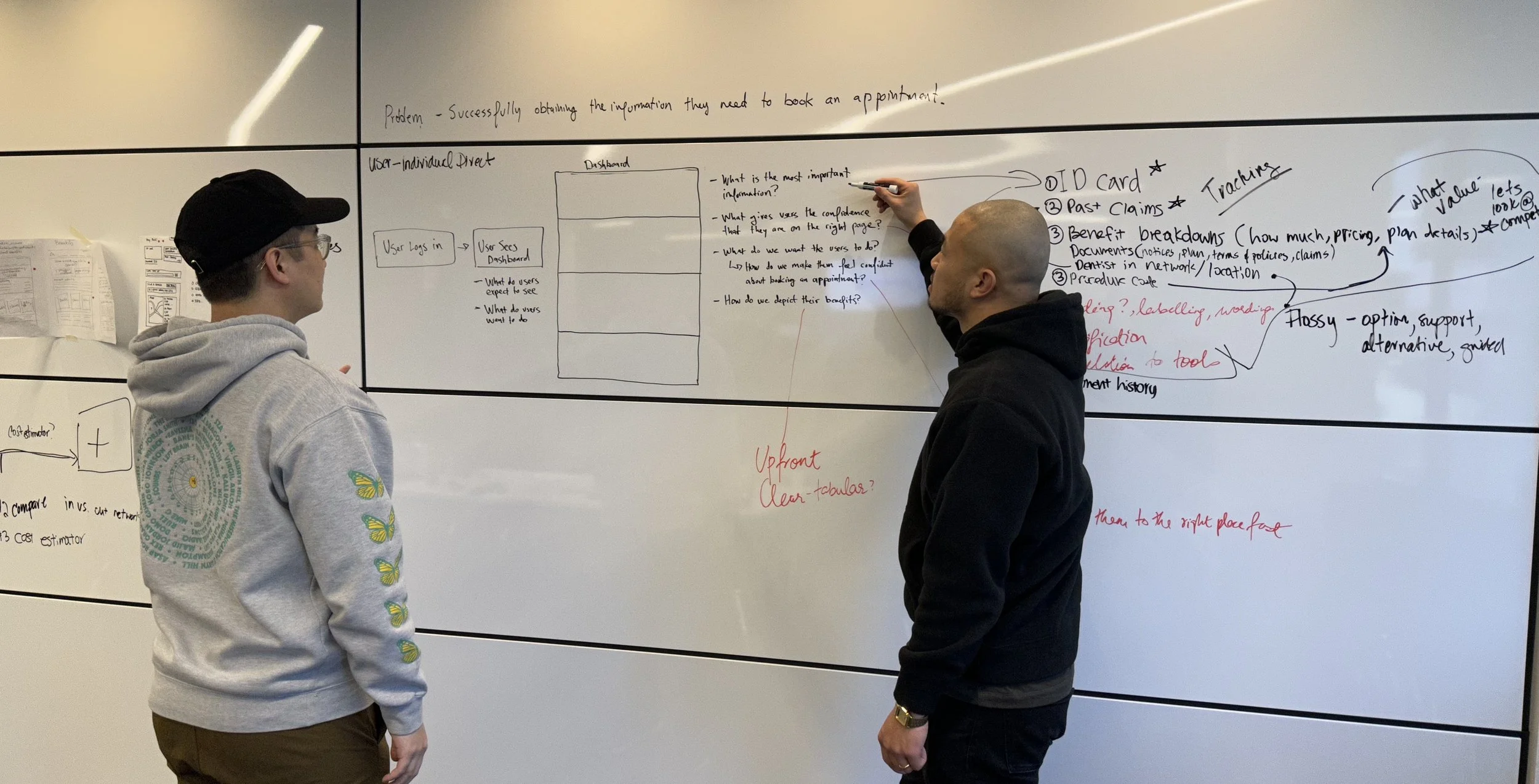
As a Product Designer, I led the design work from early discovery through MVP delivery. I facilitated cross-functional workshops, translated research into product direction, explored and tested potential solutions, and partnered with product, research, content, engineering, and other designers throughout delivery.
The Problem
Members could not answer basic coverage questions without contacting support
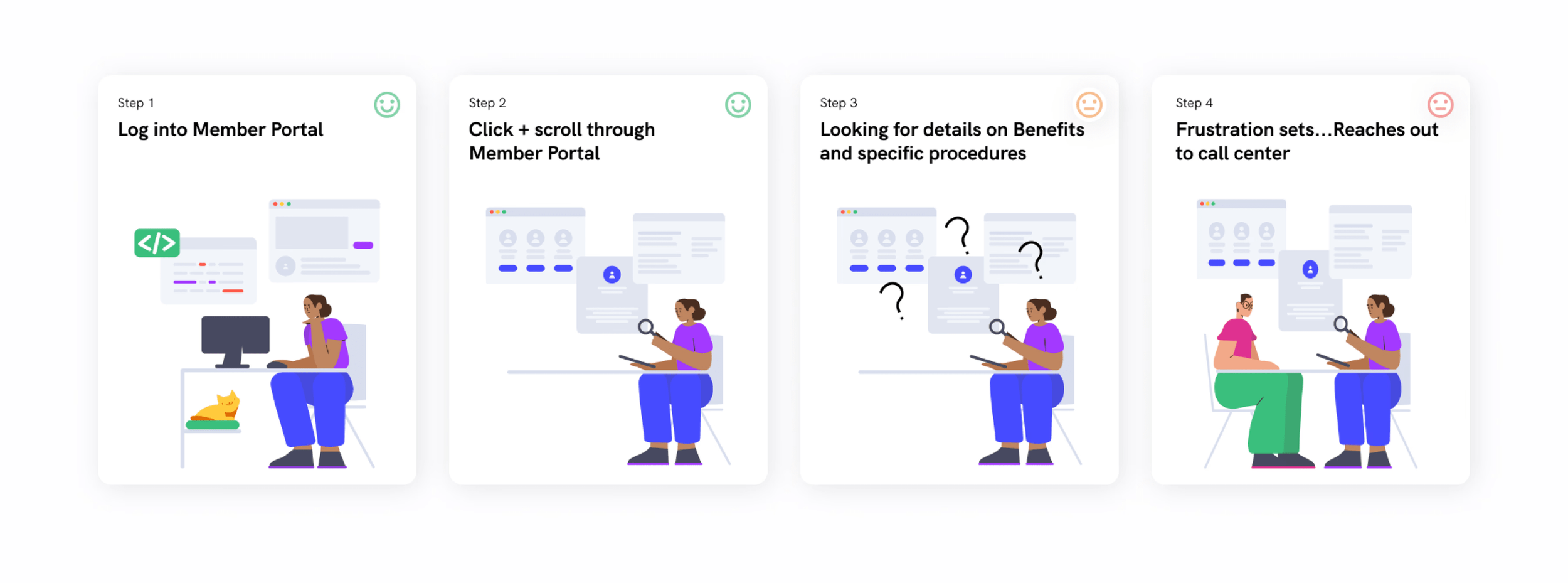
Members visited the portal to understand what their dental plans covered. However, important benefit details were difficult to locate, required multiple steps to access, and were not well optimized for mobile.
Research showed:
67% could not find the information they needed online
45% were specifically searching for benefit information
22% wanted more information about coverage details
When members could not find clear answers, they often contacted the call center for information the portal should have provided.
Question: How might we help members understand their benefits without needing to contact customer support?
Research and direction
Benefits were technically available, but not truly accessible
We began with a five-day design sprint involving up to 18 cross-functional collaborators, followed by a two-week research sprint. We combined member interviews, conversations with call-center managers, heuristic analysis, competitive research, affinity mapping, and stakeholder workshops.
The research produced three important findings.
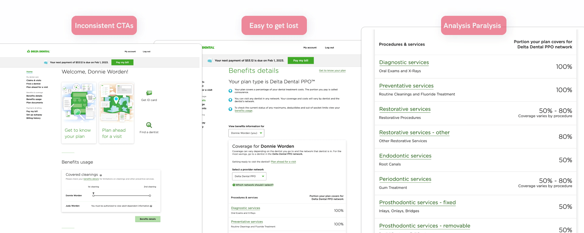
Important actions were easy to miss
Members overlooked tools such as “Get ID Card,” even when the team expected those actions to be easy to find.
Coverage information required too much effort
Members needed at least four clicks to reach important benefit details, creating additional friction on mobile.
Members wanted direct answers
Members were not trying to learn the structure of dental insurance. They wanted to know whether a procedure was covered and what they might have to pay.
We mapped the ideal user flow from the homepage to procedure details.
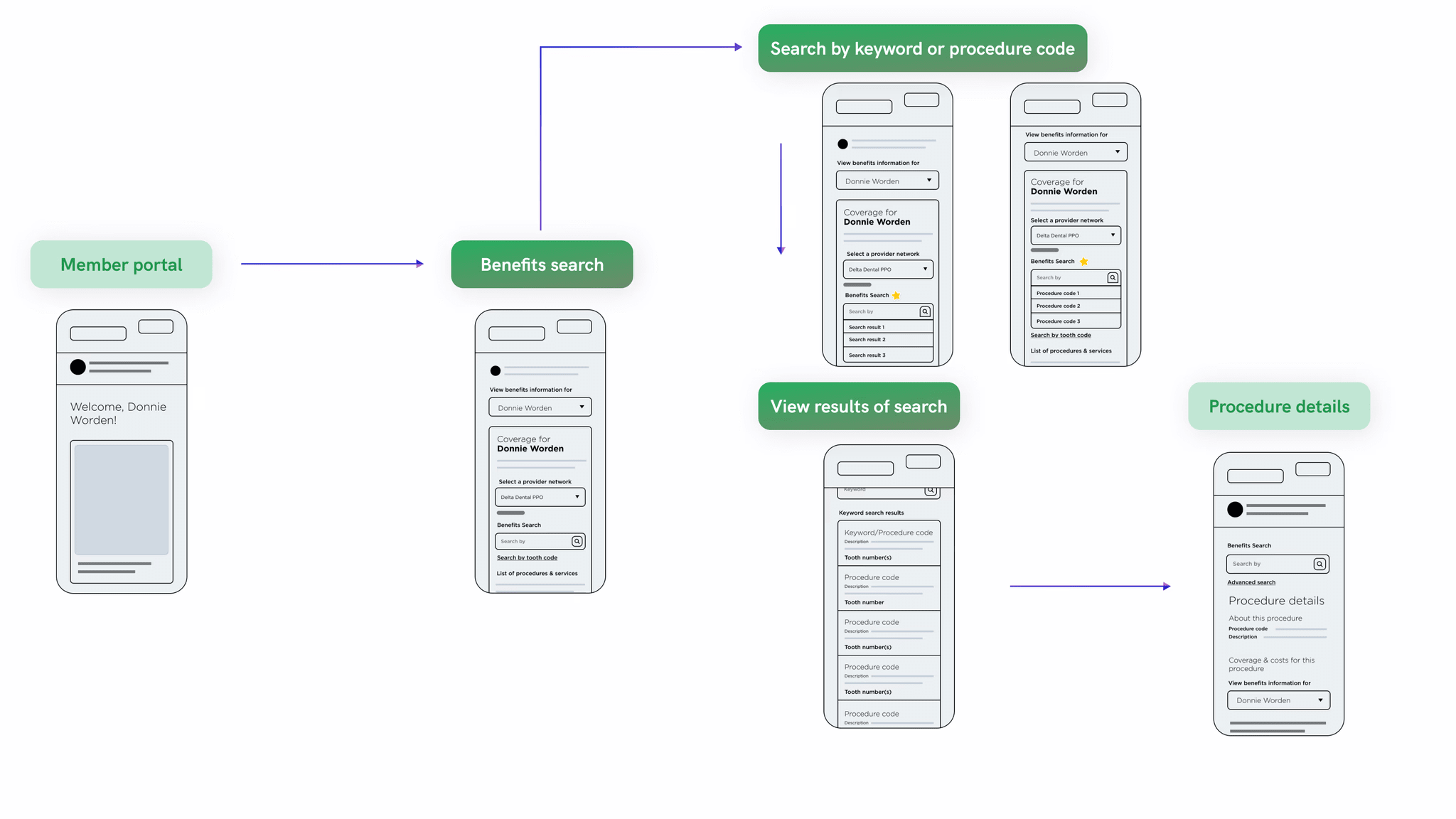
Goal: Make benefits findable, understandable, and accessible from the homepage, especially on mobile.
Decision 1: Make benefits searchable
Let members search for the procedure they already had in mind
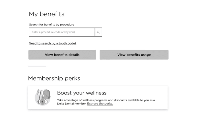
Members previously had to navigate insurance categories and terminology before finding coverage information. We explored adding Benefits Search directly to the homepage so members could look up a procedure using familiar language.
What we explored
We tested several approaches to search placement and results presentation. Testing revealed that:
Some placements were overlooked
Inline results disrupted the reading flow
Search needed clearer separation from static homepage content
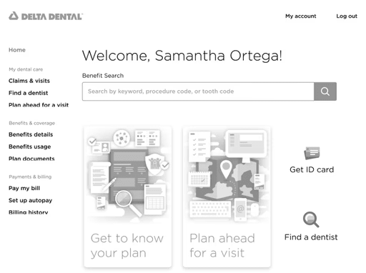
Search embedded at the top of the home page — overlooked by participants.
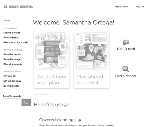
Search embedded in main navigation — missed by participants.
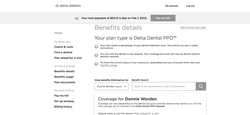
Search embedded in Benefit details — participants expected the search form to be on the homepage.
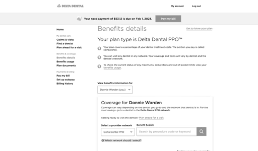
Search embedded in Benefit details — missed by participants.
What we decided
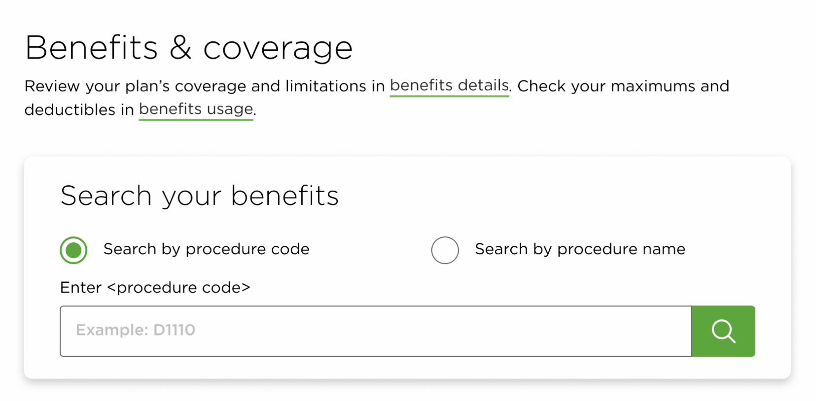
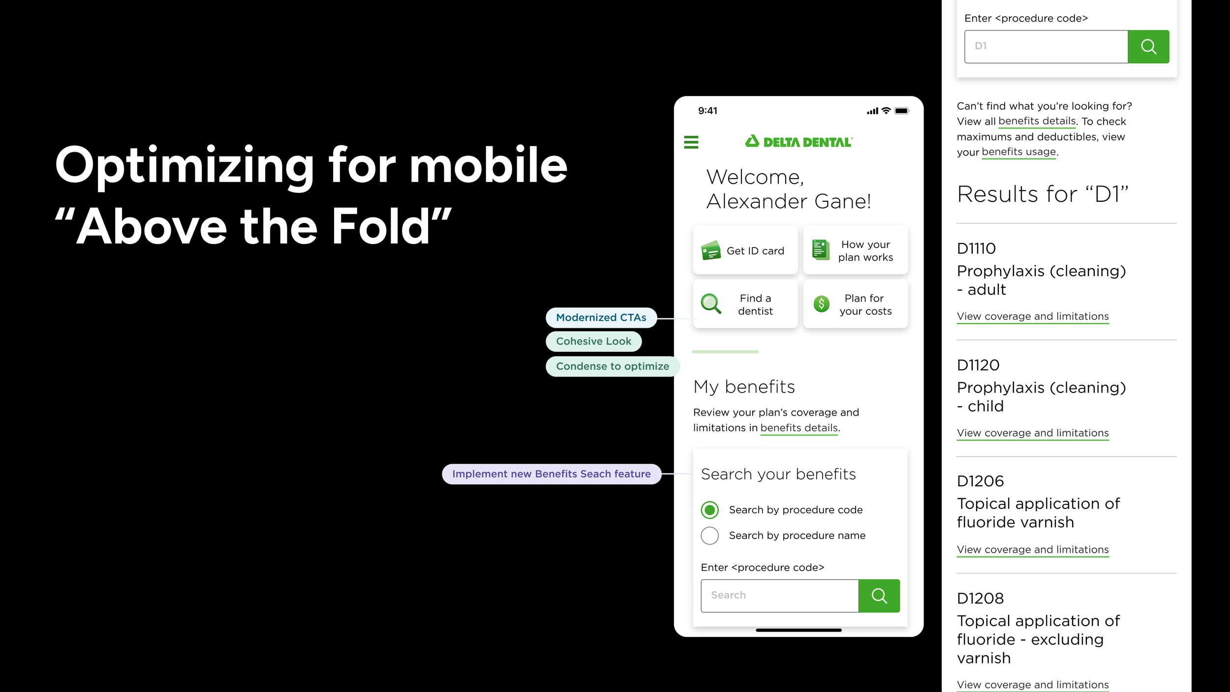
We created a dedicated search experience that prioritized:
Whether a procedure was covered
Estimated out-of-pocket costs
Related results
Searching by either procedure code or procedure name
A layout that worked across desktop and mobile
Evidence
The final search experience achieved 100% task completion in usability testing.
Decision 2: Reorganize the homepage around member priorities
Give the most important tasks the strongest hierarchy
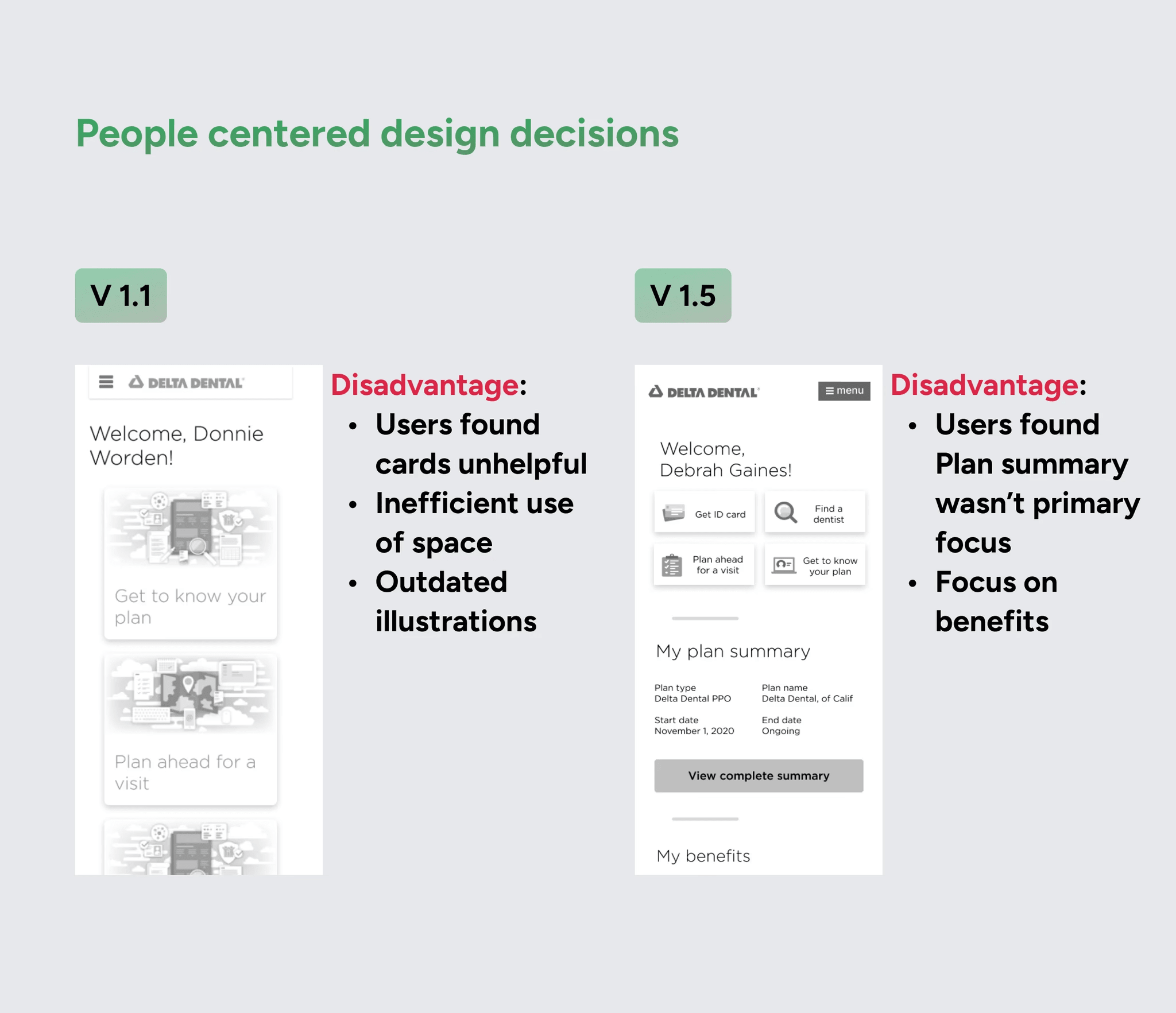
The existing homepage gave similar visual weight to actions with very different levels of importance. Members struggled to locate basic tools and understand where to begin.
We tested different content hierarchies and homepage structures. The final direction elevated the tasks members came to accomplish most often:
Access an ID card
Find a dentist
Review plan information
Search for coverage
Estimate procedure costs
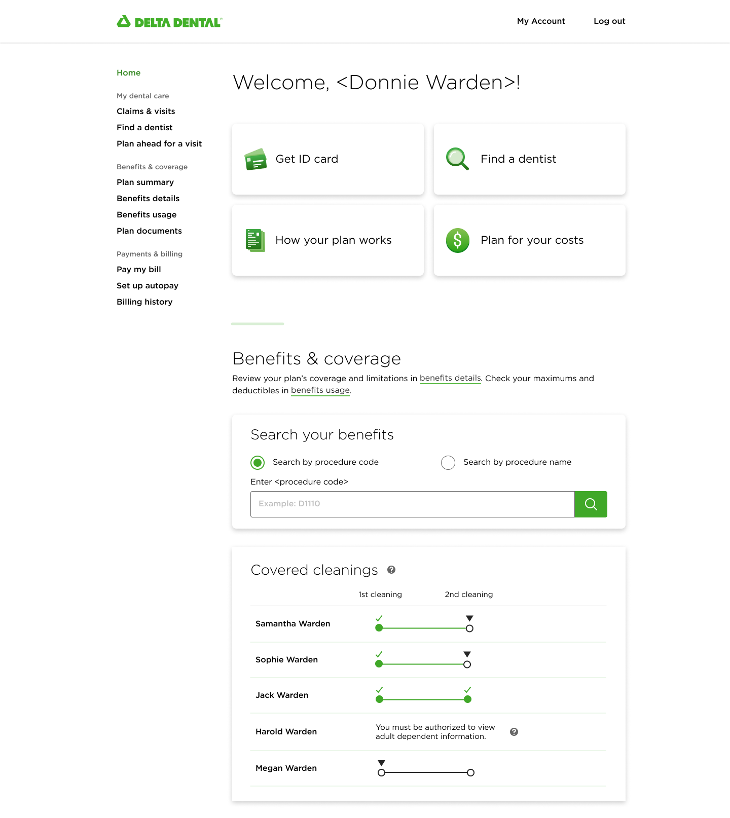
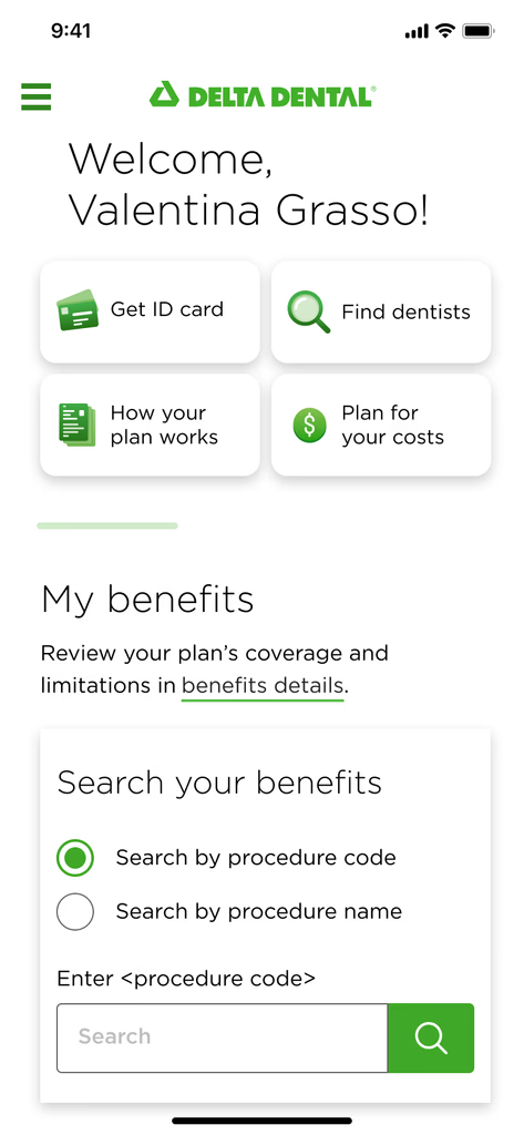
The redesigned homepage elevated high-priority actions and introduced Benefits Search directly within the benefits experience.
Decision 3: Treat mobile as a primary use case
Make benefit information accessible when members are away from a desktop
Members may need insurance information while visiting a provider or discussing care. That made mobile access an important use case, not simply a responsive adaptation.
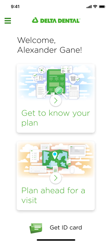
We designed the experience around:
Earlier access to ID cards and search
Less information density
Reduced scrolling
Thumb-friendly actions
Clearer presentation of coverage details
Before
After
MVP tradeoffs
Removing Plan Summary
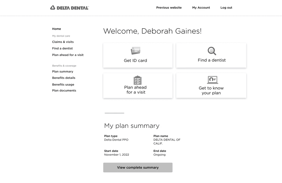
We explored placing a Plan Summary at the top of the homepage. Testing showed that it repeated information members could already access and introduced additional calls to action, making the page feel more overwhelming. We removed it from the final direction.
Deprioritizing tooth-specific search
We also explored allowing members to enter a tooth number as part of Benefits Search. Technical constraints made it unsuitable for the initial release, so we documented the concept for future testing rather than delaying the broader experience.
Final MVP and impact
The redesigned experience helped members find answers independently
Validation and projected impact
We tested the final experience with 15 participants. Each used a sample procedure code to find the corresponding procedure details.
100%
Task completion
All 15 participants completed the task.
86%
Customer satisfaction
CSAT measured during usability testing.
$7M
Projected savings opportunity
Across the broader call-center initiative supported by this redesign.
Reflection
What I would improve next
Test clearer coverage labels such as “Covered” and “Out of Network”
Invest earlier in the Benefit Details experience
Revisit tooth-specific search if user demand and technical feasibility support it
Connect portal analytics to specific call-center contact categories
This project strengthened my ability to turn a broad business goal into a focused product direction. Improving self-service was not simply about putting more information online. It required organizing complex insurance information around the questions members were already trying to answer.