
P R O D U C T D E S I G N
Delta Dental - Member Portal
A modernized member experience built to simplify access to dental benefits and reduce confusion. This self-service redesign focused on clarity, mobile usability, and reducing the need for support.
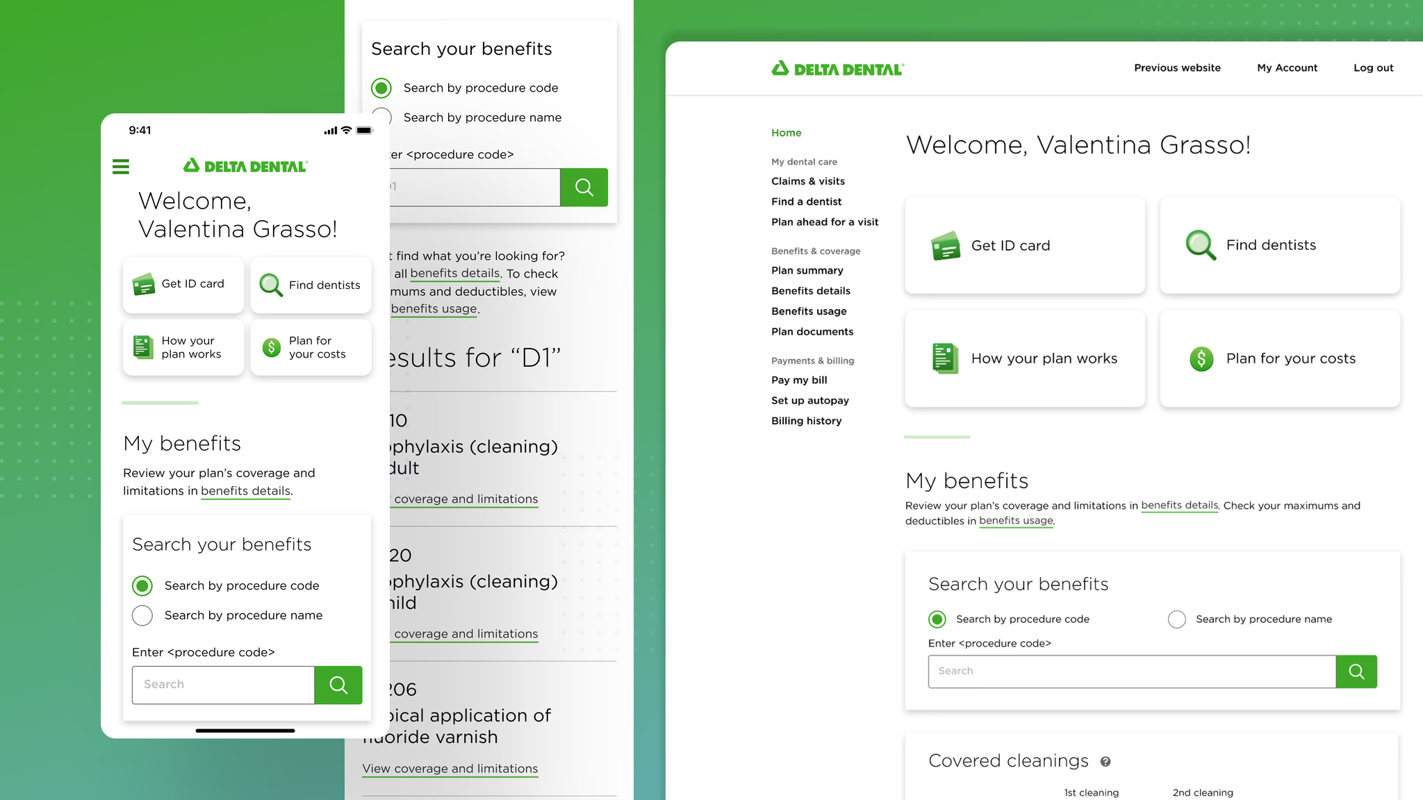
Delta Dental’s Member Portal
Delta Dental is the nation’s leading provider of dental insurance. The Member Portal serves a wide variety of users across different regions and needs. This redesign was part of a larger initiative to modernize how members access and understand their dental benefits.
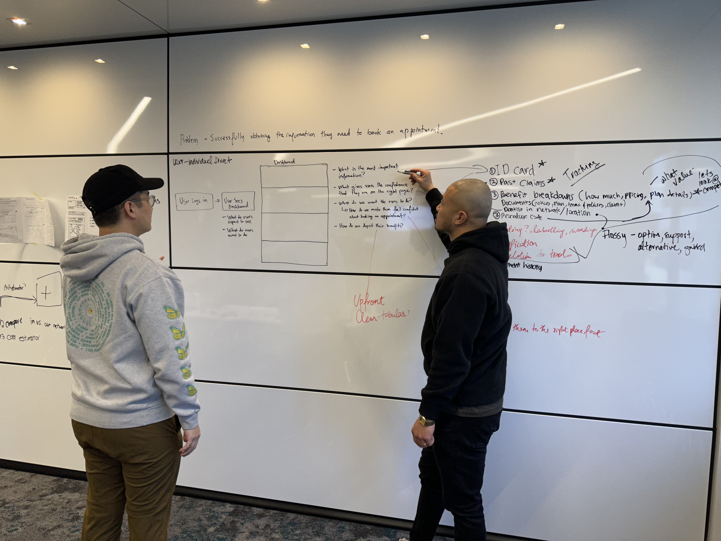
We kicked off with a 5-day design sprint focused on Member Benefits, partnering with up to 18 cross-functional collaborators across product, engineering, research, and content.
Our shared goal was simple:
Create a valuable self-service experience that provides a clear benefits summary so members can better understand their coverage.
Generative and evaluative research revealed that many members had only a partial understanding of what their plans covered. This insight laid the foundation for the redesign and guided every step of the process.
Role
Product Design Lead
Timeline
3 Months (2023)
Team
1 Product Manager
2 Engineers
1 Lead Product Designer
1 Jr Product Designer
1 UX Researcher
1 Content Writer
Overall Impact
Increased CSAT rate (86%)
Task success rate (100%)
Saved an estimated $7M in costs by optimizing call center operations
My Impact
Led the process as Product Design Lead, delivering design artifacts and fostering cross-functional partnerships.
Conducted workshops and collaborated with stakeholders to establish design strategy and define product direction.
Problem
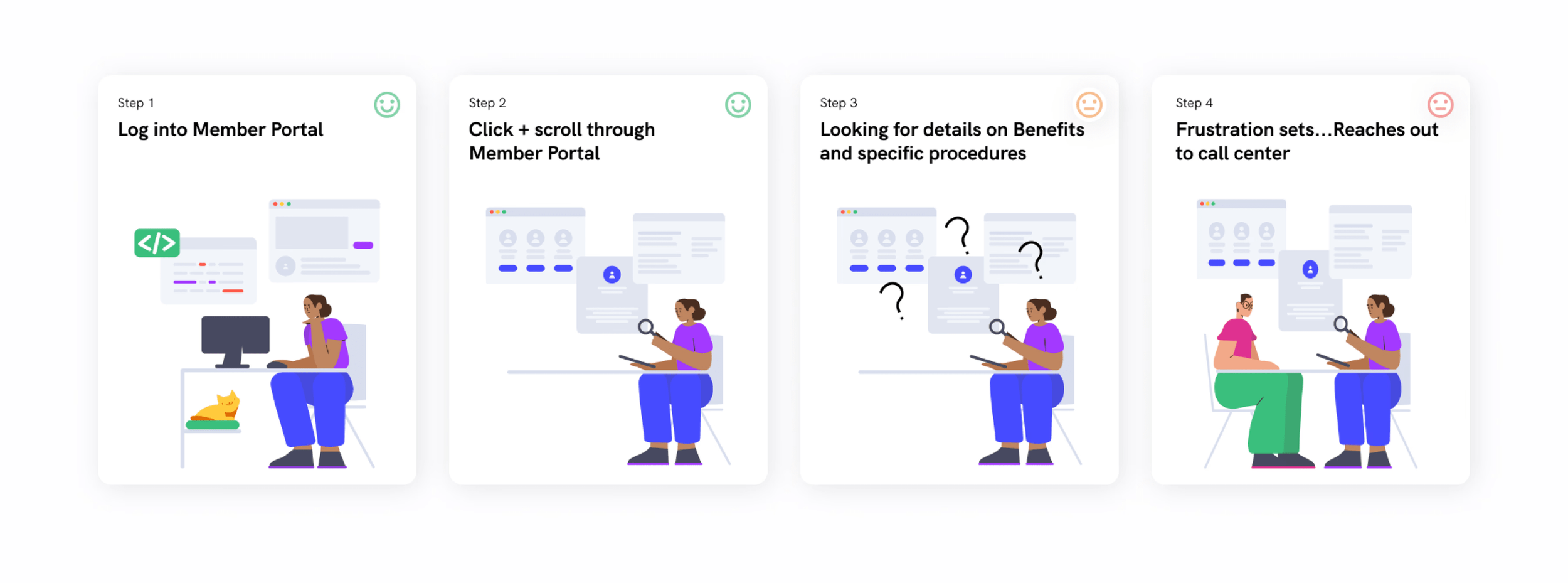
Members struggled to find benefit details and often contacted support for help. Research showed:
67% of users couldn’t find the information they needed online
45% were searching specifically for benefits
22% wanted information about coverage details
This lack of clarity contributed to high call center volume and member frustration.
The Challenge:
How can we reduce the need for members to contact the call center regarding their benefits?
Research & Strategy
1. Empathize
While leading research sessions with the cross-functional team, my goal was to build alignment and avoid jumping into solutions too quickly.
We started with a one-week sprint and followed with a two-week research sprint to better understand user pain points. We used heuristic analysis, competitive audits, and interviews with call center managers and members.
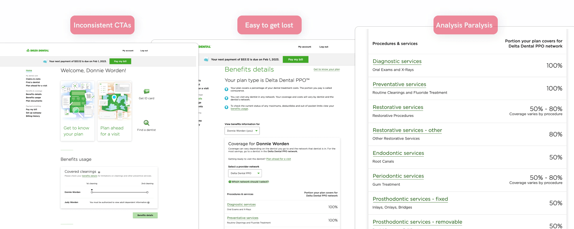
Key Findings:
Members often couldn’t find information we assumed would be easy to locate, such as the “Get ID Card” CTA
Many members relied on the call center for simple information that should be easily accessible on the site
Accessing coverage details required at least four clicks and wasn’t well optimized for mobile
2. Conceptualize
From affinity mapping and stakeholder workshops, we aligned on our MVP strategy. We prioritized design opportunities that addressed real user needs while also meeting business goals.
Workshops included:
Lean UX Canvas
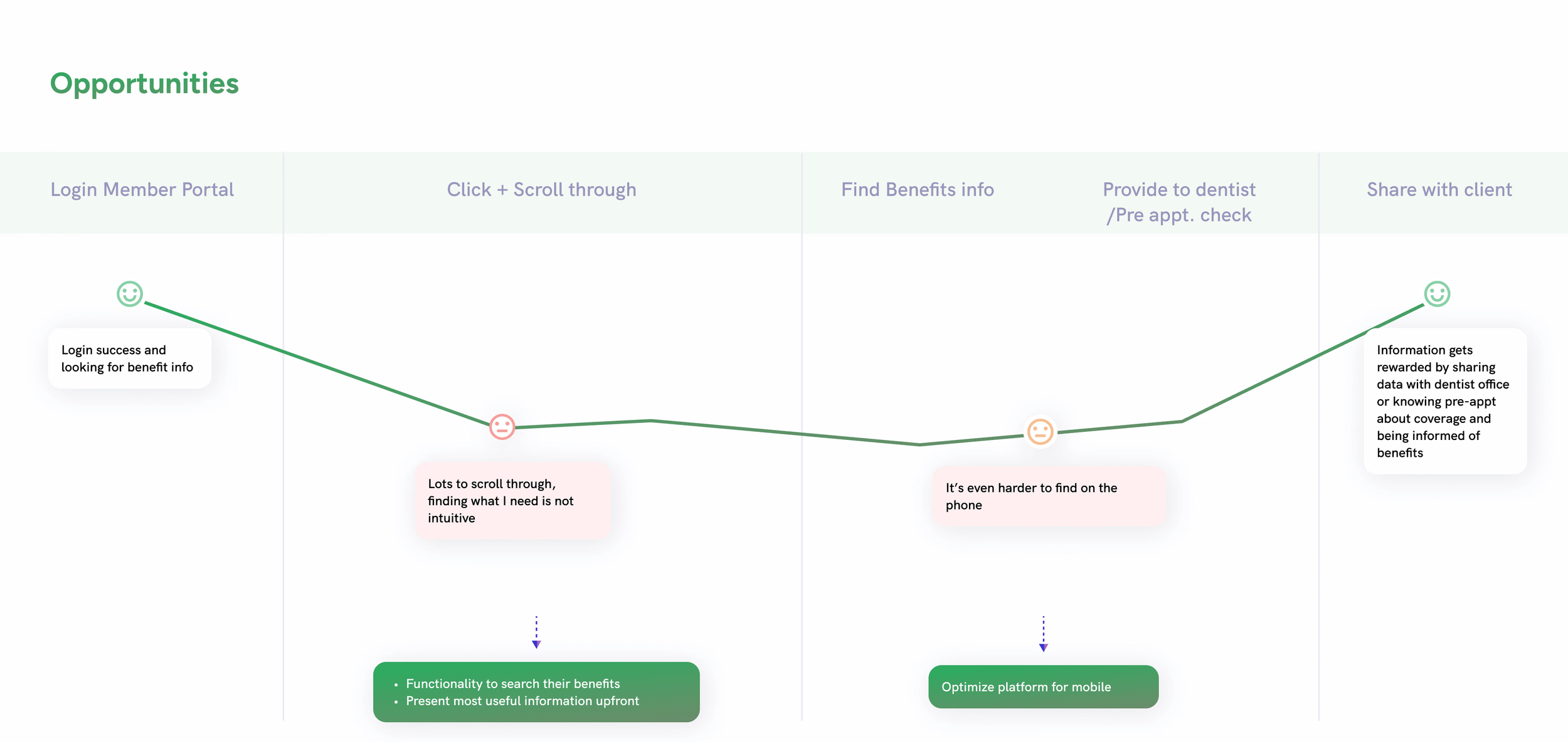
We identified key opportunity stages:
Logging into the Member Portal
Scrolling and clicking through the interface
Finding coverage information
Providing information to a provider (dentist)
Design Process
Workflow Mapping
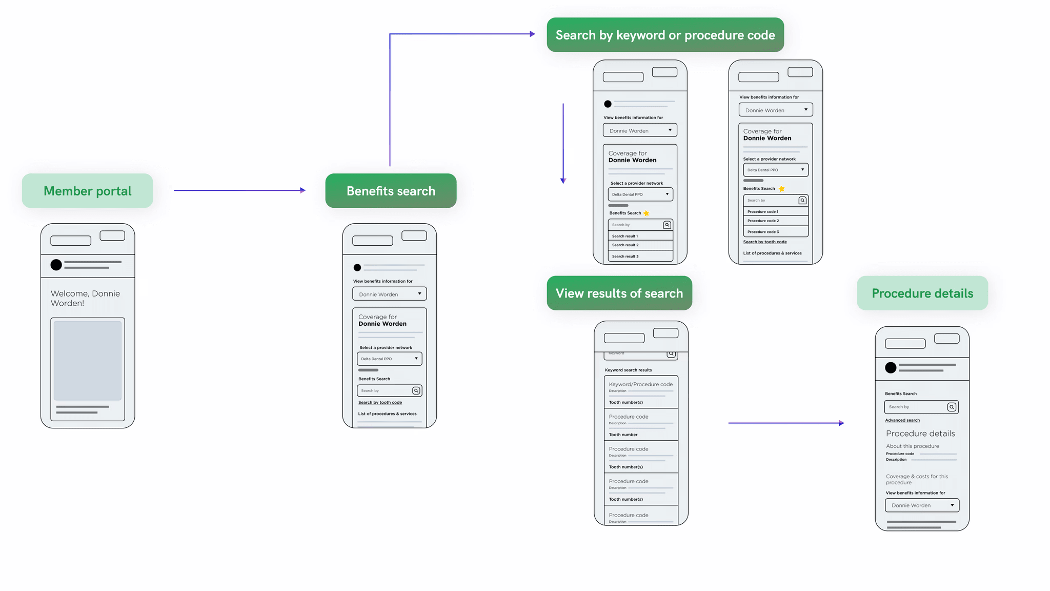
To kick off the design phase, I created a detailed user flow that mapped each step members take when navigating the portal. This included entry points, page transitions, and decision paths. Wireframes were paired with the flow to illustrate layout intentions and content structure.
This workflow helped:
Align the team on key touchpoints
Identify areas of confusion or unnecessary steps
Inform the hierarchy and navigation structure of the final design
Solutions
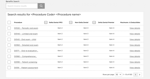
1. Benefits Search
A major update was the introduction of a search feature that let members look up procedures by name or code.
How we improved the experience:
Simplified layout: Focused on showing coverage and out-of-pocket costs up front
Reduced complexity: Removed overly-technical language, grouped related results, optimized for mobile
Proven impact: Achieved 100% task completion in usability testing
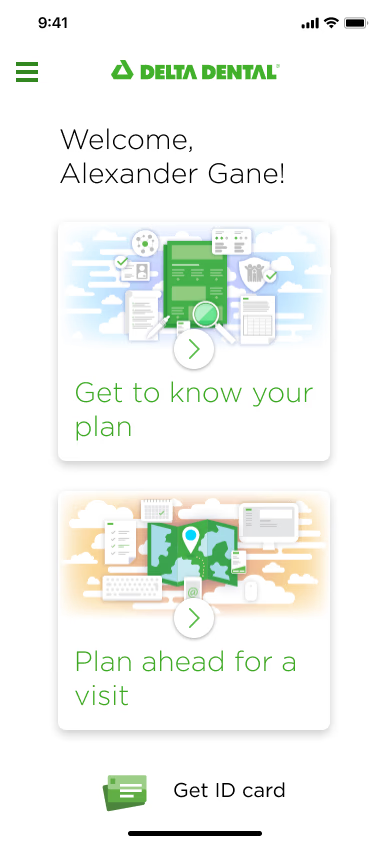
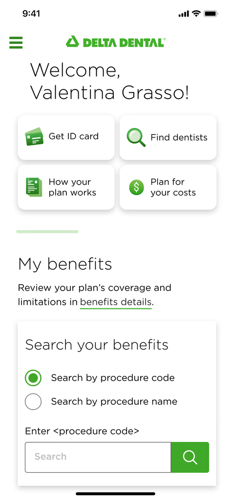
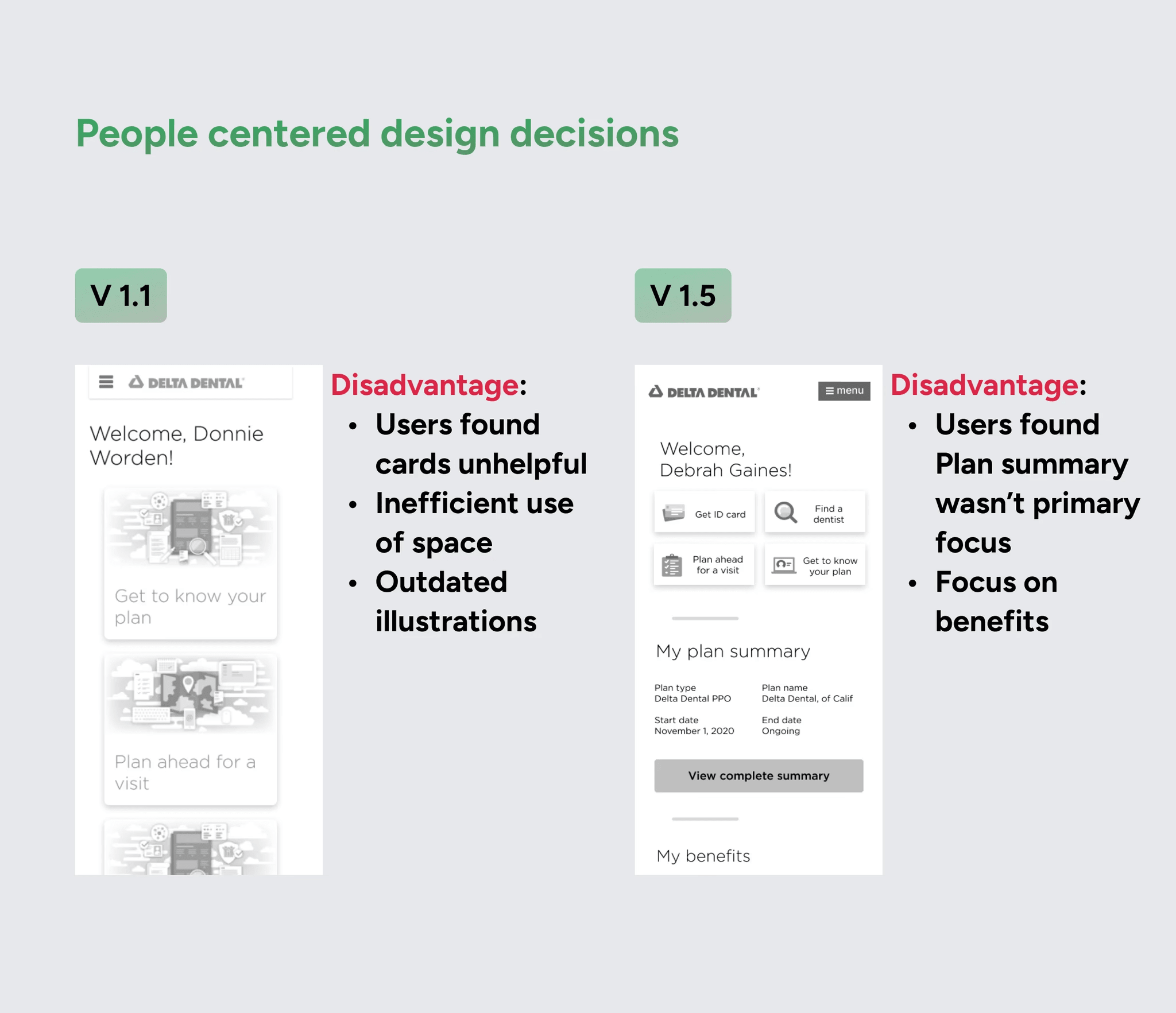
2. Homepage Redesign
We redesigned the homepage with a mobile-first mindset to better support members checking benefits on the go.
What we improved:
Reordered content to prioritize tasks like accessing the ID card, locating a dentist, and reviewing plan info
Elevated tools that were previously buried, including “Get ID Card” and “Find a Dentist”
Added pathways to learn about coverage and estimated procedure costs
Before
After
Mobile Optimization
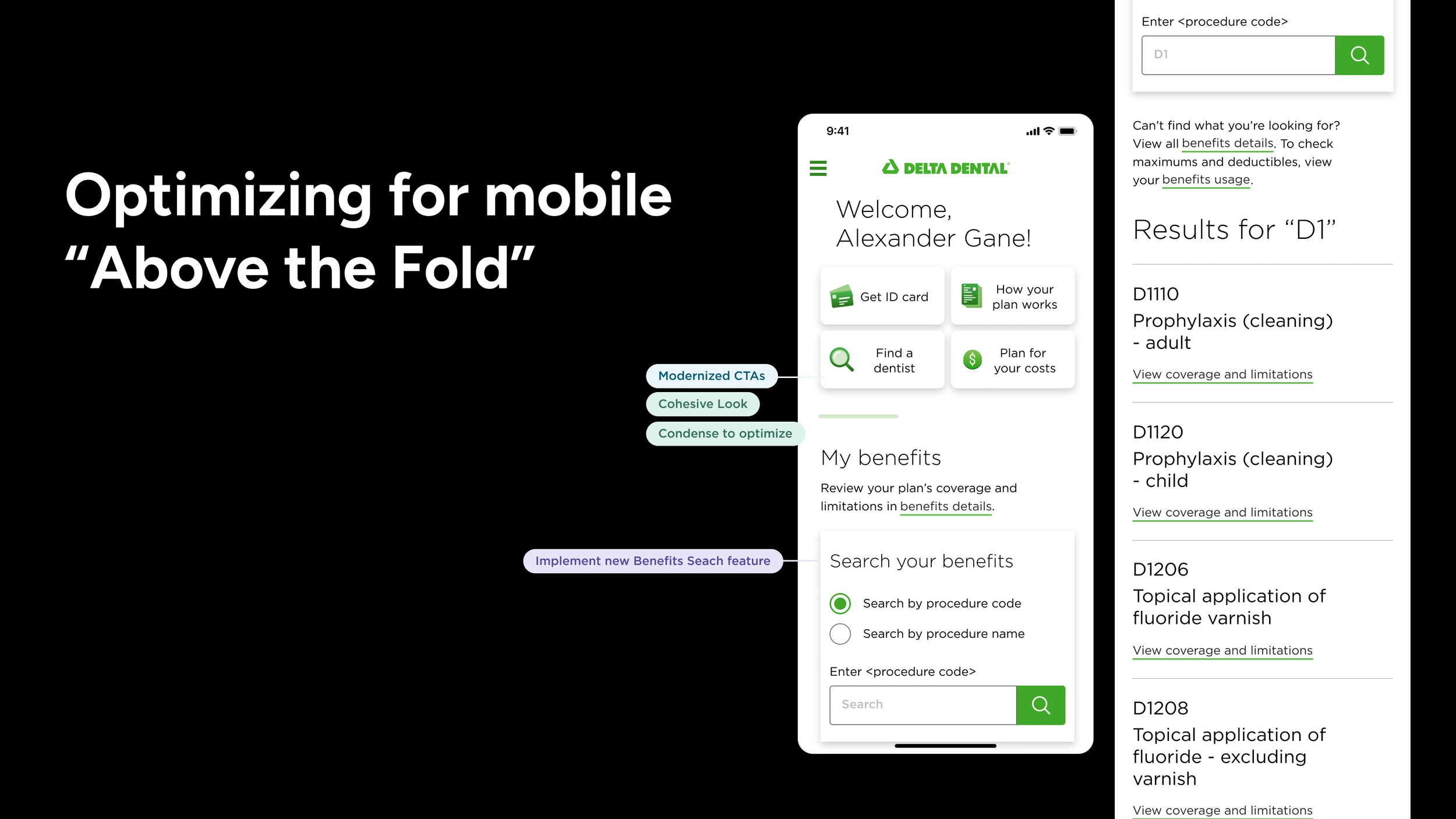
Knowing that a large portion of members access their benefits from a phone, we prioritized mobile usability throughout the redesign. Our focus was to streamline the interface for smaller screens and make high-priority content accessible without excessive scrolling.
Key considerations:
Designed all layouts with a mobile-first approach
Surfaced tools like ID card access and search within thumb-friendly zones
Simplified information density to reduce cognitive load on mobile
This approach helped ensure the Member Portal was not only mobile-responsive, but optimized for mobile use.
Design Iterations
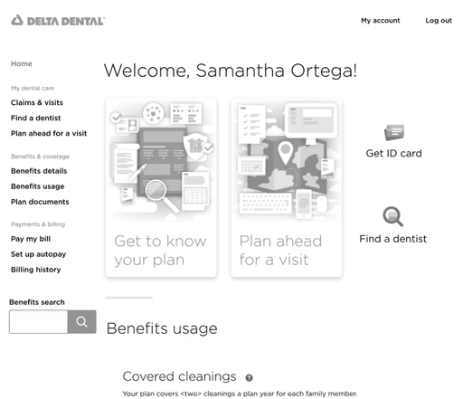
1. Homepage Reorganization
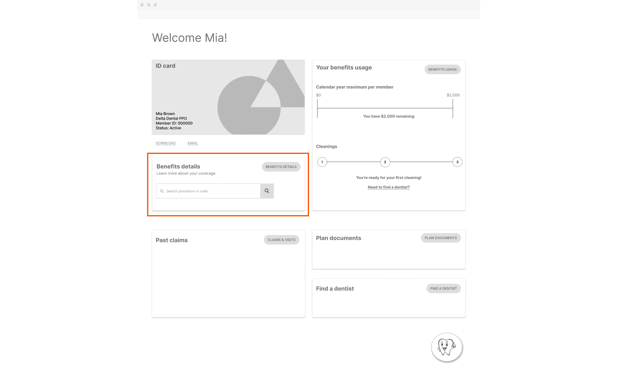
Goal: Understand what users valued on the homepage and identify areas for improvement.
Created wireframes exploring layout changes
Ran concept testing on structure and content
What we learned:
Users liked having benefits information in one place
The existing structure caused friction due to poor hierarchy
Benefits Search emerged as a desired feature
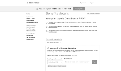
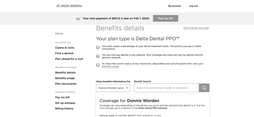
2. Benefits Search Entry and Results
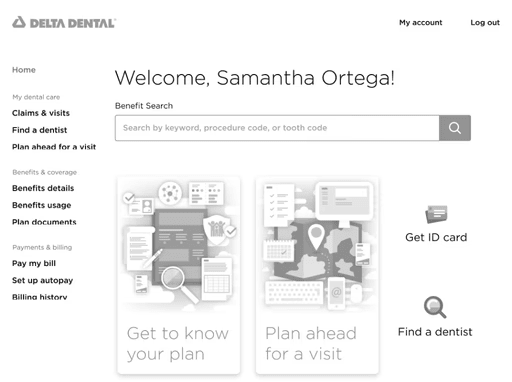
Goal: Test placement and presentation of the new Benefits Search feature.
Created five layout variations for homepage and results
A/B tested different approaches to search placement and display
What we learned:
Some placements were missed entirely by users
Inline results disrupted reading flow
Search needed to be more clearly separated from static content
Exploration 1
Exploration 2
Exploration 3
Exploration 4
Exploration 5
3. Plan Summary and Tooth Code Exploration
Goal: Introduce a quick Plan Summary and explore search input for Tooth Code.
Move Plan Summary to the top of the homepage
Explored the addition of Tooth Code as a search input option
Refined CTA layout for clarity
What we learned:
Plan Summary repeated information and wasn’t helpful
Multiple CTAs on the page overwhelmed users
Tooth Code input was deprioritized due to technical constraints but documented for future exploration
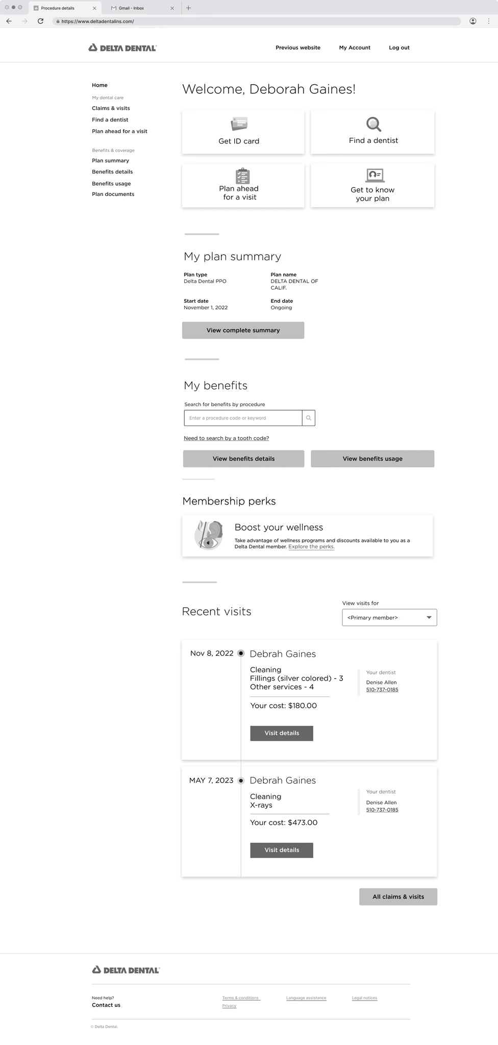
4. Final Homepage and MVP
Goal: Deliver a responsive, scalable homepage with integrated Benefits Search.
Finalized design direction based on user feedback
Ensured accessibility and mobile usability
Delivered polished prototypes, dev-ready files, and a walkthrough video
Results:
100% task success
86% CSAT
Marked reduction in benefit-related support calls
What I Would Do Differently
Explore more upfront
I really enjoy the early exploration phase. With a bit more time, I would have pushed further before narrowing in on the MVP.Test badges in search results
Adding simple visual cues like "Covered" or "Out of Network" might have made it easier for users to scan and understand their options at a glance.Improve the Benefit Details page earlier
This screen stayed underdeveloped longer than it should have. Iterating on it sooner could have created a more seamless overall experience.Run A/B testing on the Tooth Code feature
We had to remove it from MVP due to technical constraints, but testing it could have helped us decide whether it deserved a spot in future releases.
Final Thoughts
This project was an opportunity for our team to rethink how members access and understand their dental benefits.
By listening to real user feedback and collaborating closely with our cross-functional team, we created an experience that felt modern, intuitive, and helpful. The final product improved clarity, reduced support calls, and gave members more control over their care.
This project taught me how to move quickly without losing focus on quality, and how to solve meaningful problems by putting users at the center of every decision.