
P R O D U C T D E S I G N
Delta Dental - Member Portal
Delta Dental is the top provider of dental insurance in the country. There’s a wide range of users, but if you’re reading this and use Delta Dental for your dental insurance, then this project is probably for you!
P R O D U C T D E S I G N E R
Delta Dental’s Member Portal
During a design sprint for Member Benefits with 18 cross-functional partners, we worked toward the goal of creating a valuable experience through a self-service portal that offers a clear summary of benefits, helping members better understand their coverage. Generative and evaluative research conducted during the sprint revealed that many of our customers have an incomplete understanding of their benefits.
Role
Product Design Lead
Timeline
3 Months (2023)
Team
1 Product Manager
2 Engineers
1 Lead Product Designer
1 Jr Product Designer
1 UX Researcher
1 Content Writer
Overall Impact
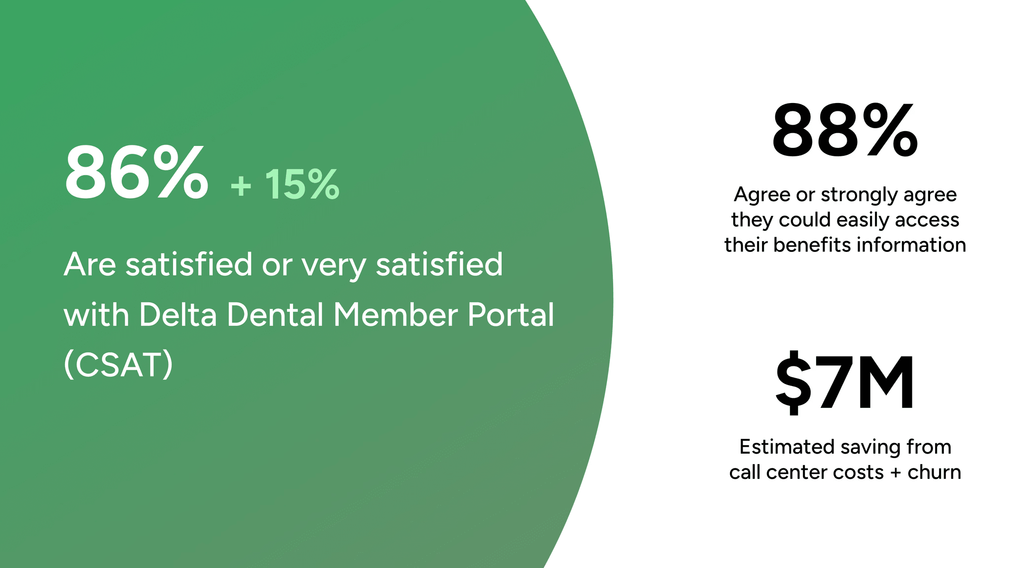
Increased CSAT rate (86%)
Task success rate (100%)
Saved an estimated $7M in costs by optimizing call center operations
My Impact
Led the process as Product Design Lead, delivering design artifacts and fostering cross-functional partnerships.
Conducted workshops and collaborated with stakeholders to establish design strategy and define product direction.
Problem
Members don't know where to go to find details surrounding their benefits and covered procedures.
67% of users are not able to find the info they need online
----
45% of those users were searching for their benefits
22% were searching for info surrounding their benefits
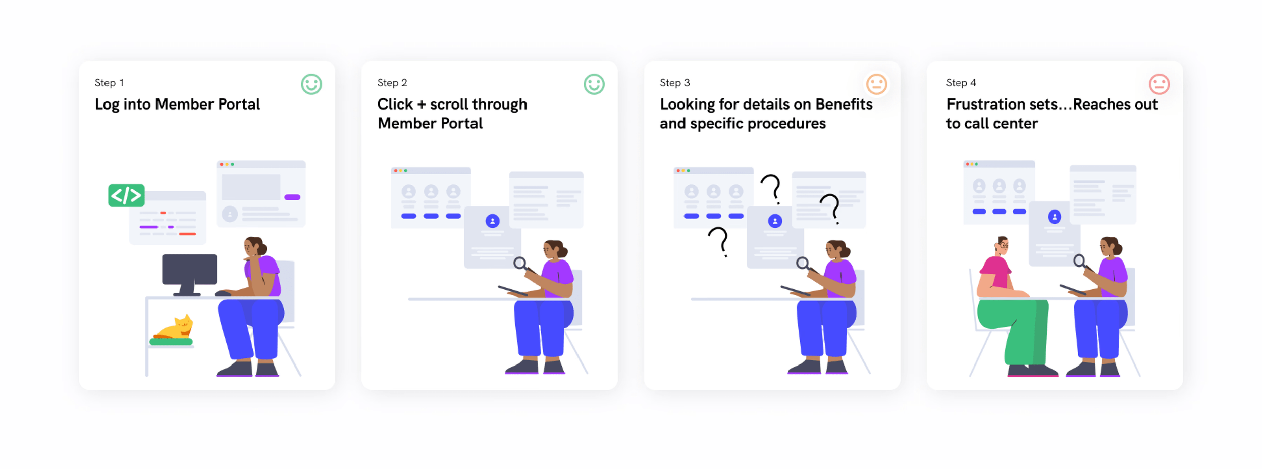
How can we reduce the need for members to contact the call center regarding their benefits?
Solution
Implement Benefits Search feature:
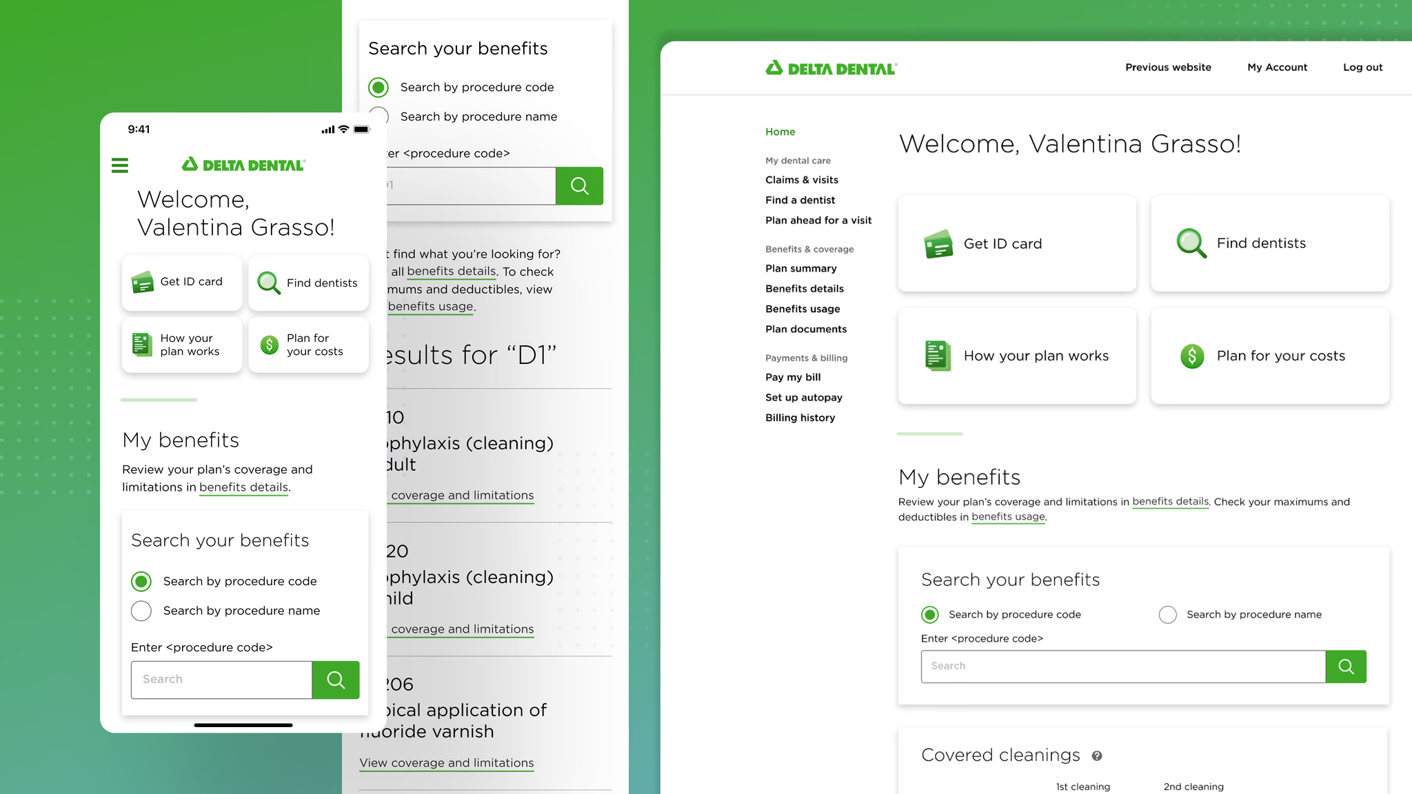
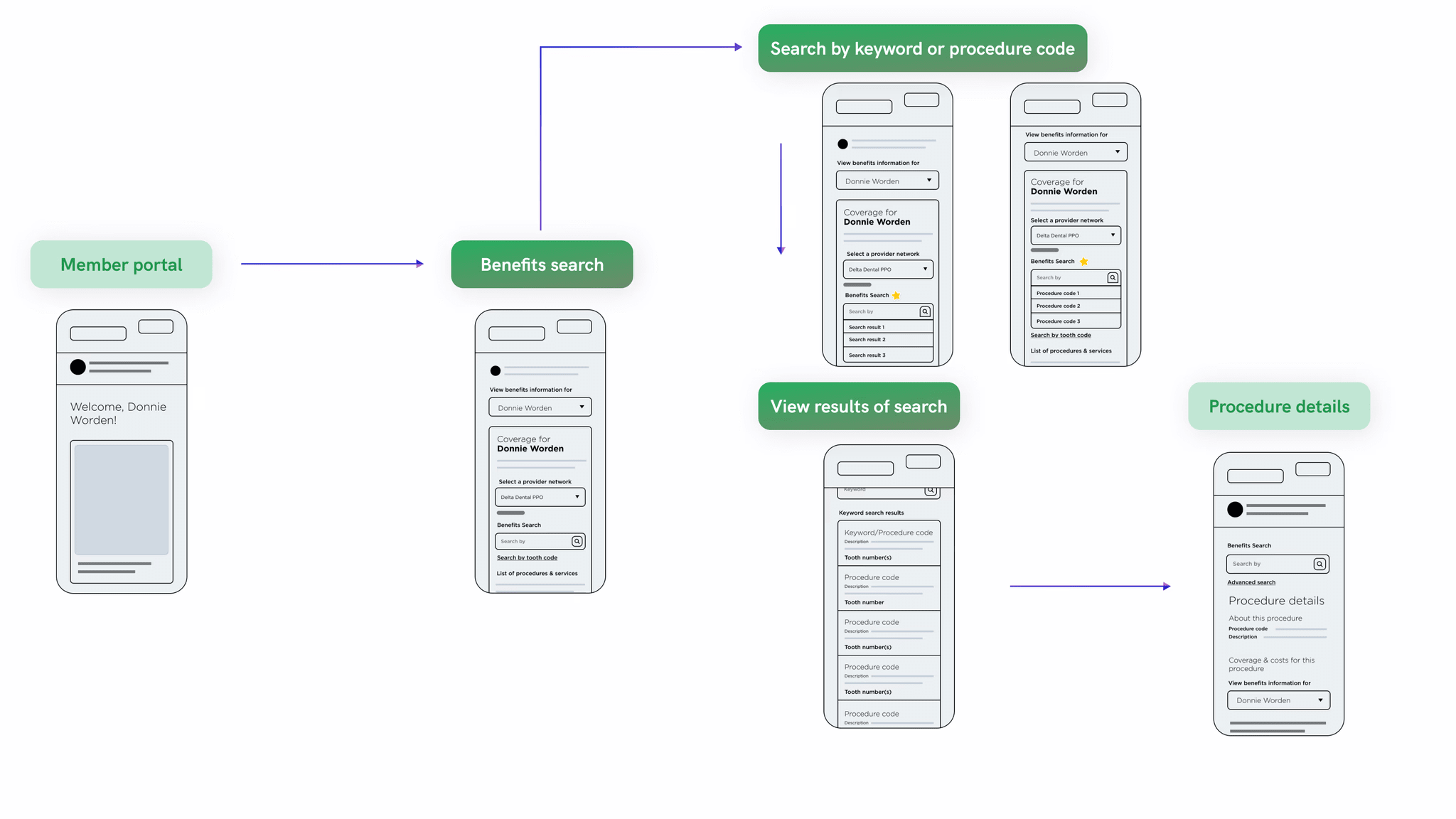
Spearheaded the redesign of the Member Portal homepage and implemented a new feature enabling customers to search for their benefits by procedure code or name. This feature provided quick access to benefit information, reducing the need for call center inquiries.
Benefits search flow: 100% completion rate
Home page redesign
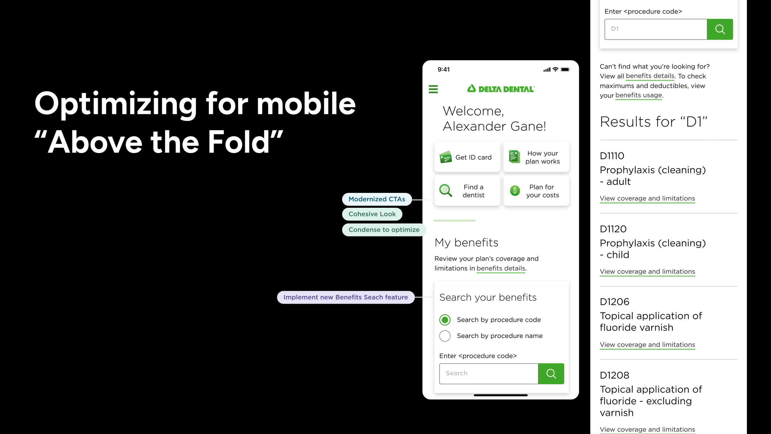
Recognizing that many customers access their benefits on the go, we prioritized the mobile experience with a specific focus on the "above the fold" section. This redesign not only enhanced the post-login experience but also modernized a key part of Delta Dental's legacy platform.
By reorganizing the information architecture, we made it easier for users to quickly find relevant information, reducing confusion and significantly improving overall usability.
Overall we achieved a 86% CSAT (Customer Satisfaction Score) score.
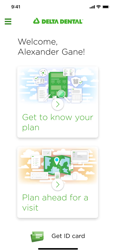
Before
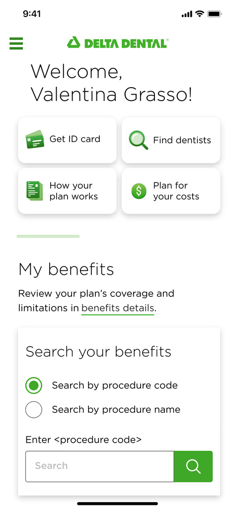
After
EMPATHIZE
Understanding customers’ wants, needs, and expectations
While leading these sessions for the cross-functional team, my strategy was to foster alignment while preventing premature solutioning.
Building on our initial one-week sprint, we embarked on an intensive two-week research sprint to thoroughly understand pain points and identify ways to address them. Our methods included heuristic analysis, competitive analysis, and interviews with call center managers and users.
Through our research, we identified key insights that validated our initial hypothesis:
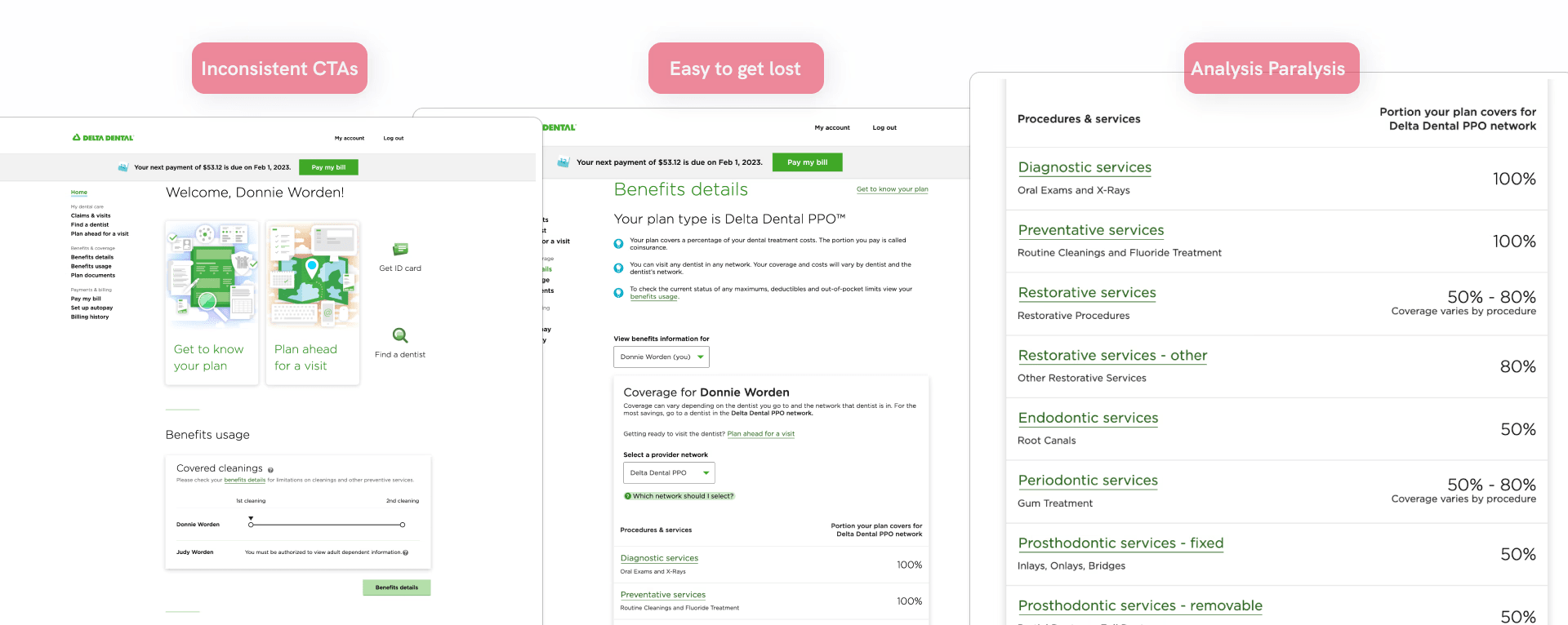
Many users overlook the "Get ID card" and "Find a dentist" options
Users call the support center to obtain information about specific procedures
Users must click 4 times to access relevant information, often getting lost in the process
CONCEPTUALIZE
Overwhelmed with insights, we began prioritizing and shaping our design strategy
After affinity mapping and prioritizing insights, our team conducted a research debrief with stakeholders. We aligned on business goals for the Member Portal and ensured that the design opportunities provided value by balancing user needs with business objectives, ultimately shaping our MVP.
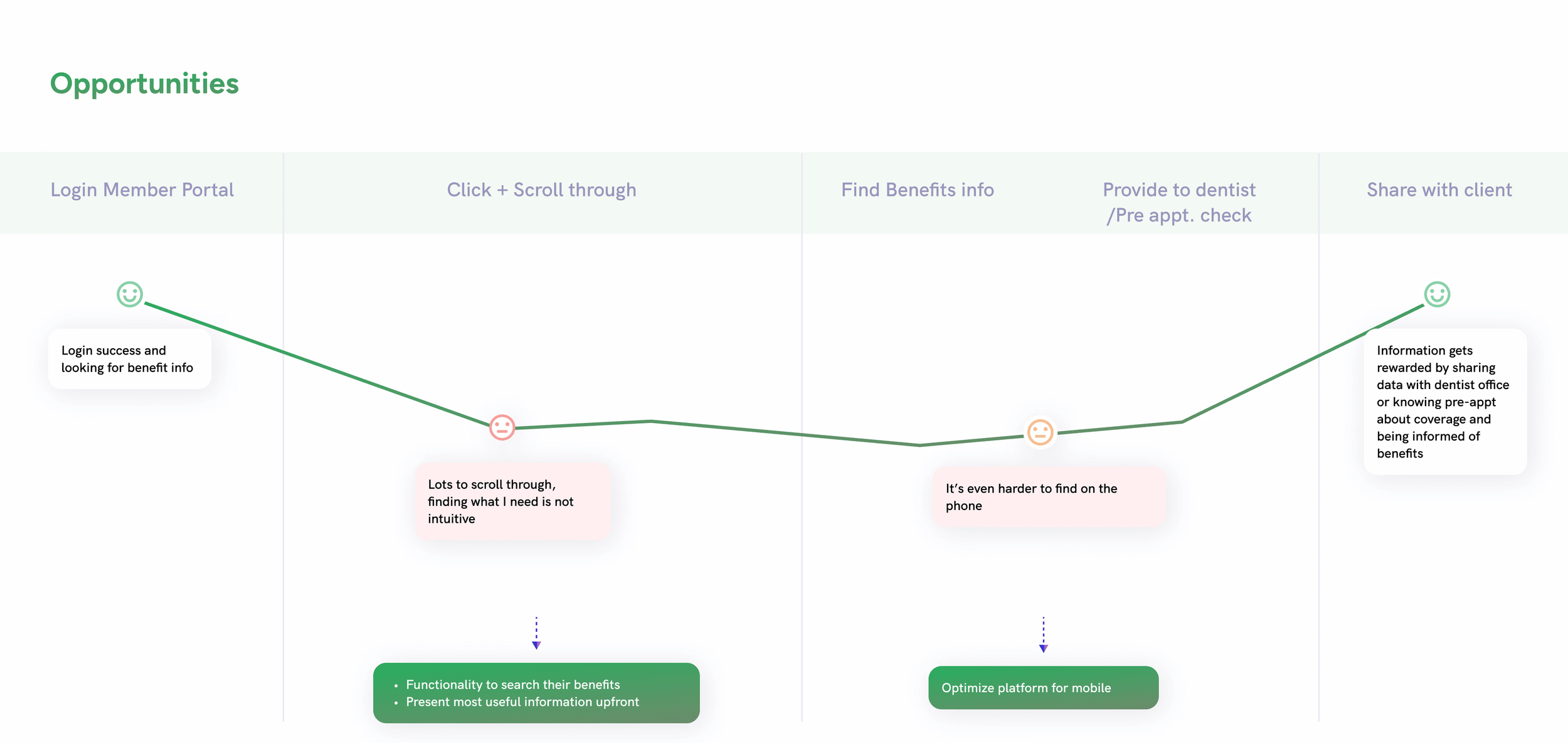
Given the quick turnaround and technical constraints, including an evolving platform for member benefits and a still maturing design system, we needed to clearly define our scope. I led a workshop that included several collaborative exercises to help the team align on requirements, key performance indicators, and constraints.
This workshop included exercises like Who? What? When? Where? Why? and the Lean UX Canvas, which guided us towards the following statement:
Delta Dental members need easy access to their benefits, a clear understanding of the Member Portal, and the ability to look up their benefits by name and procedure code. This ensures they feel confident about their coverage for upcoming appointments or procedures.
Constraints:
Time + Technical
PM Blocker
KPIs:
Behavioral - Task success rate
Attitudinal - CSAT Score
DESIGN
Workflow mapping
My approach to exploration was to gain a full understanding of how we could improve the interactions on our Member Portal. I first focused on enhancing the user flow to establish clear entry and interaction points. To support this, I created a workflow map to define the design direction and ensure alignment with my cross-functional team and stakeholders.
V1.1 Exploration: Homepage re-organization
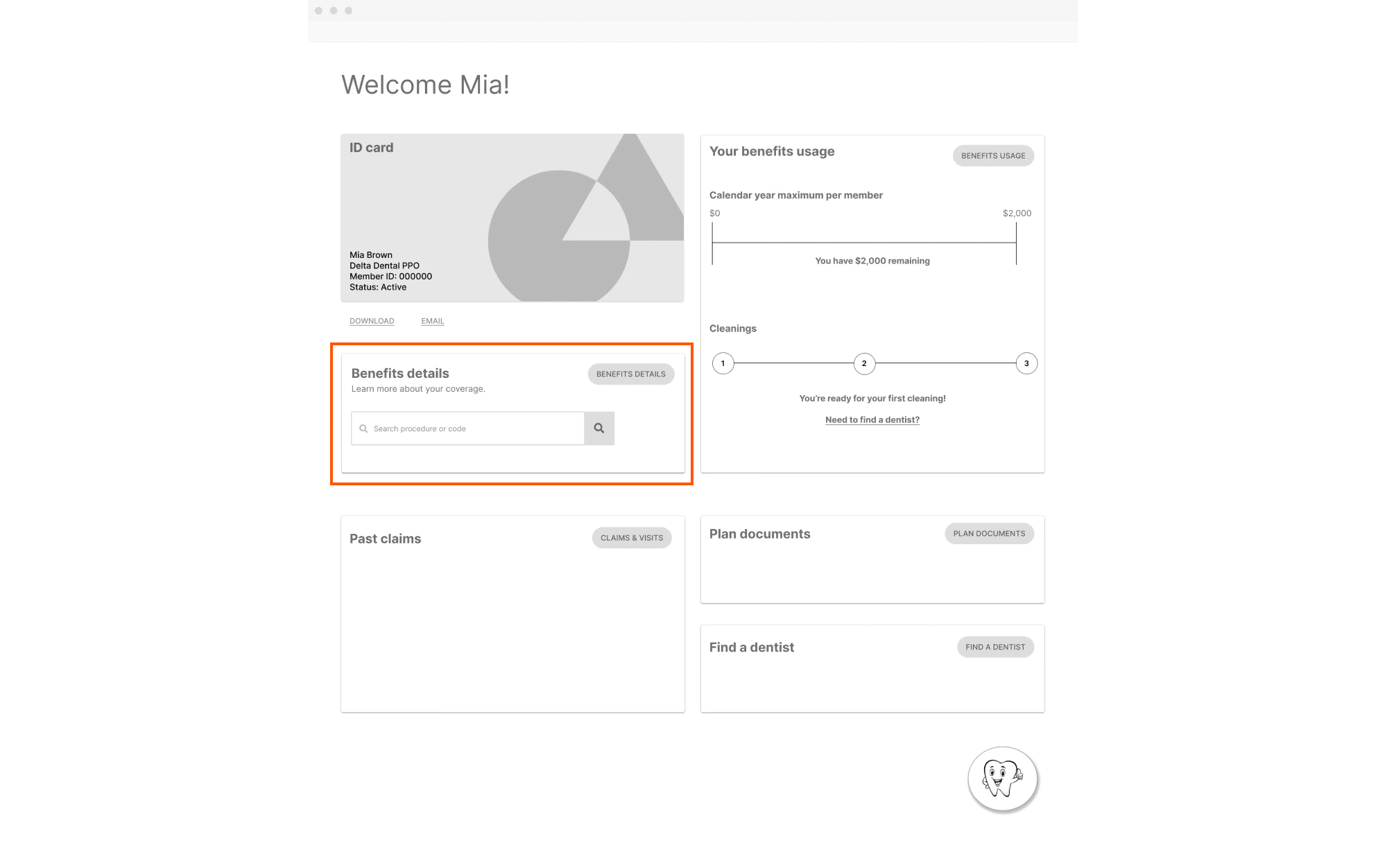
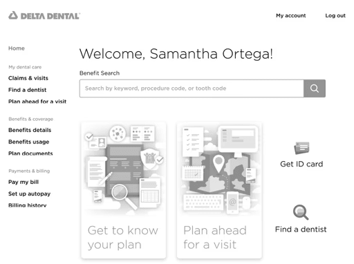
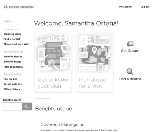
Taking a broad approach, I aimed to understand how users perceived the homepage layout as a whole. Through concept testing, we discovered that many aspects of the current homepage were valuable to users. Moving forward, we focused on retaining what worked, improving what didn’t, and implementing a well-received search feature.
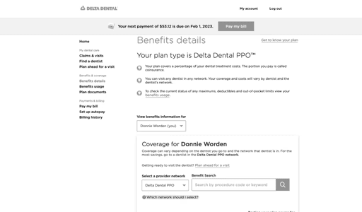
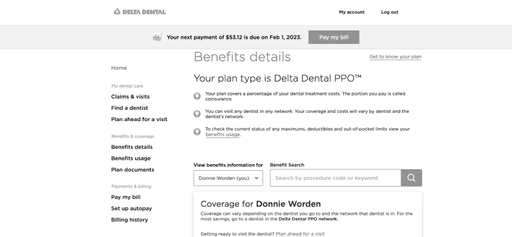
V1.2 Exploration: Benefit Search flow - entry points and results
While working within Delta Dental’s design system and overall interface and mindful of tight deadlines, I explored different placement options, entry points, and display formats for a search feature on both the homepage and the Benefits Details page. A/B testing and surveys revealed that users found the placement unintuitive and that presenting search results disrupted the page, making them difficult to process.
Exploration 1
Exploration 2
Exploration 3
Exploration 4
Exploration 5
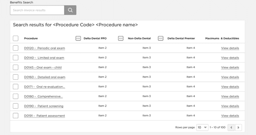
V1.5 Exploration: Benefit Search Flow - Plan Summary Section and Tooth Code
As I refined the design direction, I explored adding a Plan Summary section to provide users with a quick overview of relevant plan information. However, A/B testing and survey results showed that users found the section unhelpful due to repetitive information. On the other hand, they felt the Benefit Search placement was more intuitive but were overwhelmed by the number of CTAs.
During this phase, I encountered a blocker from one PM regarding the implementation of a 'tooth code' option. To address this, I presented our test findings and ultimately reached a compromise that aligned with our scope and deadline. Further iterations were added to the roadmap for future improvements.
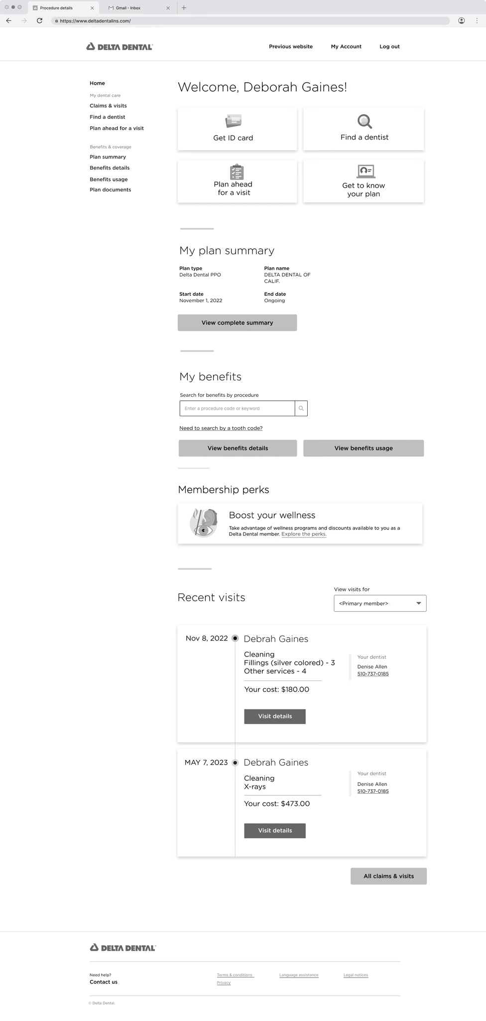
V2.0 Member Portal homepage
100% task completion rate
86% CSAT
Easy to search and retrieve benefit information
Member Portal Video
V1.1 0 - V1.5 Optimizing for mobile
While implementing and testing Benefit Search, we simultaneously explored ways to optimize for mobile. Early generative research revealed that an increasing number of users check their benefits on the go.
Balancing both initiatives, I collaborated closely with the Junior Product Designer to ensure alignment and a unified approach. Our primary focus was optimizing above the fold, allowing users to see the most relevant information upfront.
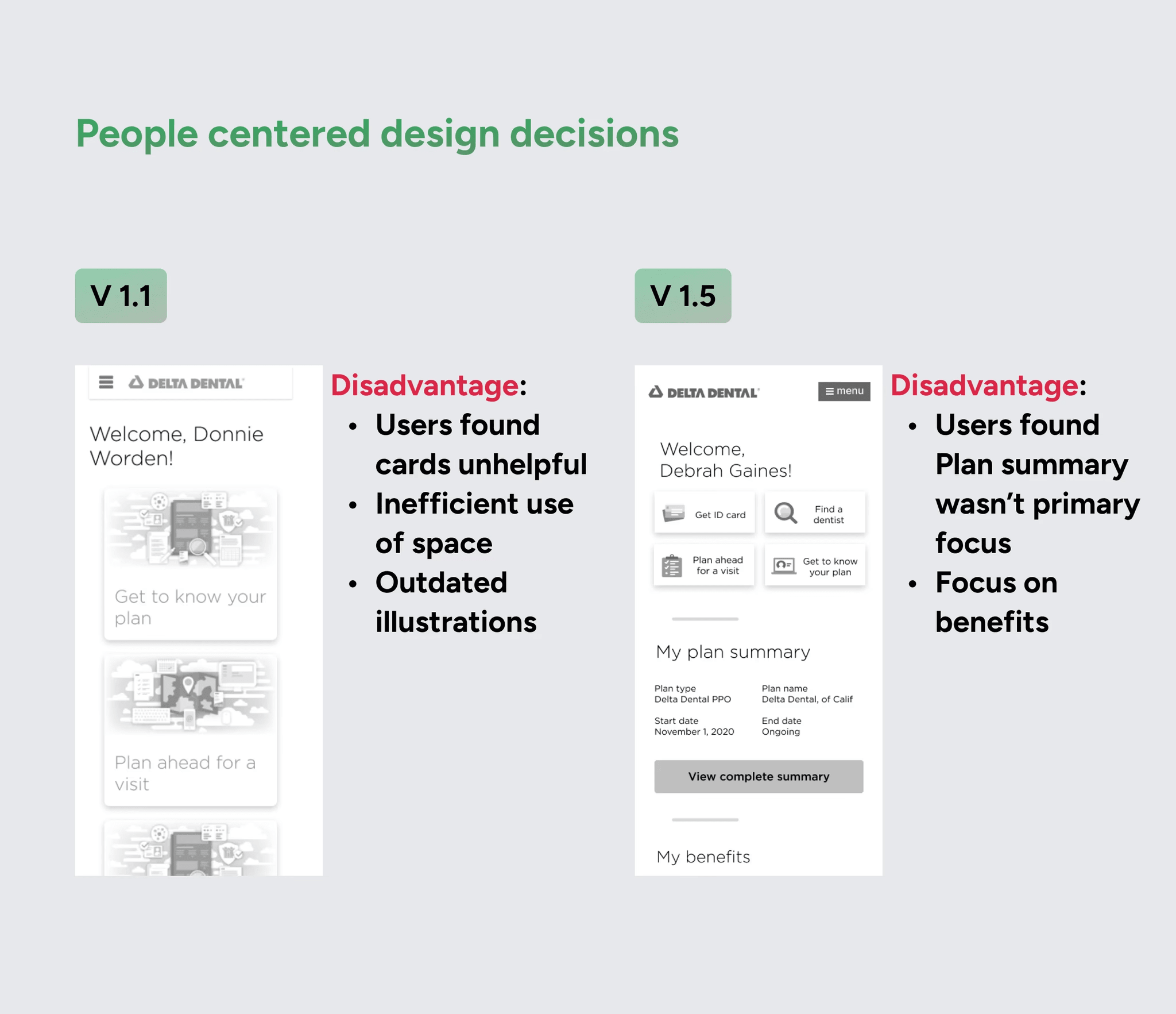
V2.0 Optimizing for mobile
IMPACT
Learnings
What would I have done differently?
Given the tight deadlines and the complexity of managing feedback from stakeholders and cross-functional teams, I found myself wishing I had more time to spend in the exploratory phase, which happens to be one of my favorite parts of the design process.
In hindsight, I would have explored adding badges to Benefit Search results to see if they could have fit within the previous MVP.
Explore adding badges to Benefit Search results to display coverage details upfront, reducing clicks and improving efficiency.
Optimize the Benefit Details page for a better user experience.
Conduct A/B testing for the Oral Code search option.