
A N A L Y S I S
Drop (Massdrop)
I put together an analysis for the new website that addresses inefficiencies in the UX, including the Login Wall, which affects user acquisition
Problem
With the rebrand of Massdrop to Drop, there is community speculation on the company’s business model moving forward. Users are conflicted by the shift towards a more conventional e-commerce platform, assuming Drop will be carrying products "comparable" to those found on web stores such as Amazon and Thinkgeek (now GameStop).
Strategy
To continue building trust with the Drop community, it’s necessary to understand what users enjoyed about the previous web experience, and how Drop can appeal to both new and old users alike, while growing as a business.
Identify our user and design principles
User Research
Conducting user research was a bit tough given the short time frame between interviews, so I formed most of my conclusions based off conversations with my friend, Brett (who frequently shopped on Massdrop @bsakaguchi), Reddit posts, and my perception. Based off my research, I concluded that the primary Drop user has these attributes:
LIKES:
Buying the best products within relevant lifestyle genre
Owning exclusive products and collaborations
Learning and researching must-have essentials
Talking about and putting products on display to others
PURCHASING HABITS:
Browses websites and forums daily to look out for eye-catching products and deals
Thoroughly researches a product by reading reviews to ensure the best value
Will buy more than one item from the same category to have a rotation
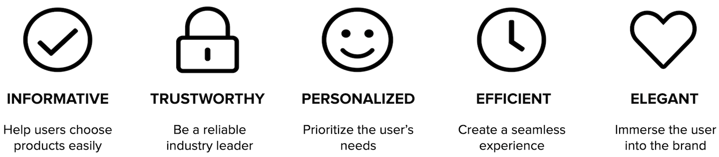
Core User-Centered Design Principles
Acquisition Issue: Login Wall
Nielsen Norman Group states: "demanding that users register or log in before they can use an app or see website information has high interaction cost and defies the reciprocity principle.”
To address the login wall, I created two solutions: one that alters the story of the home page and one that better utilizes the login wall.
Solution 1:

UPDATING THE HOME PAGE
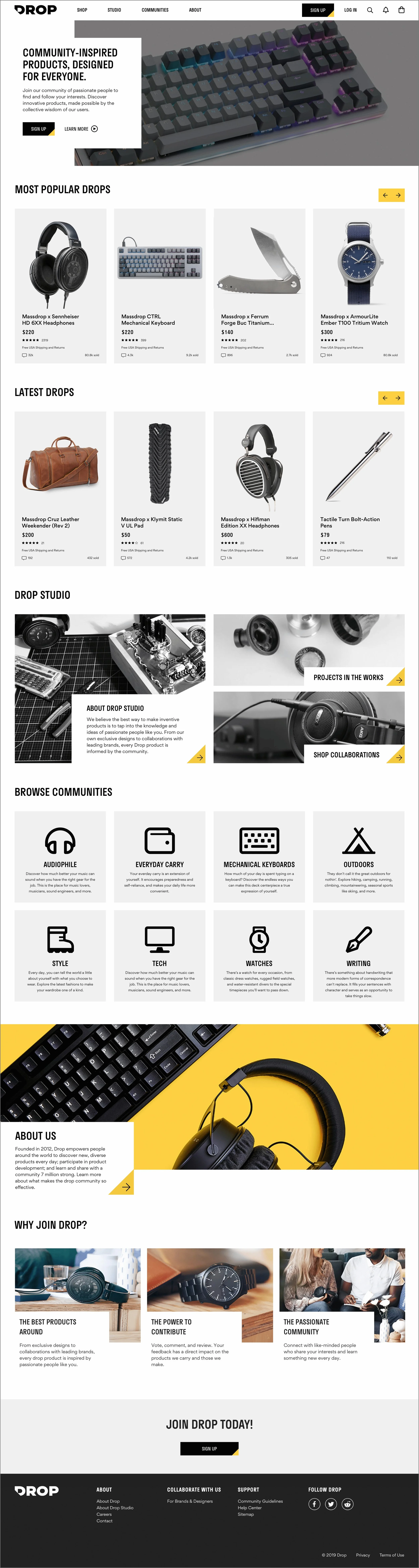
In this design (Design Solution 1), I removed the login wall, which in turn, changes the purpose of the home page. With this design, I shifted the focus of the home page to tell the story of the brand. If and once the user creates an account, we will modify the logged-in experience of the home page so that it’s more curated to the user’s interest.
The problem with the current (live) home page is that it doesn’t really speak to what the company does. Right now, its purpose is showing miscellaneous products and community sections without providing much context for what they are or how they should be used.
Solution 2:

UPDATING THE LOGIN WALL
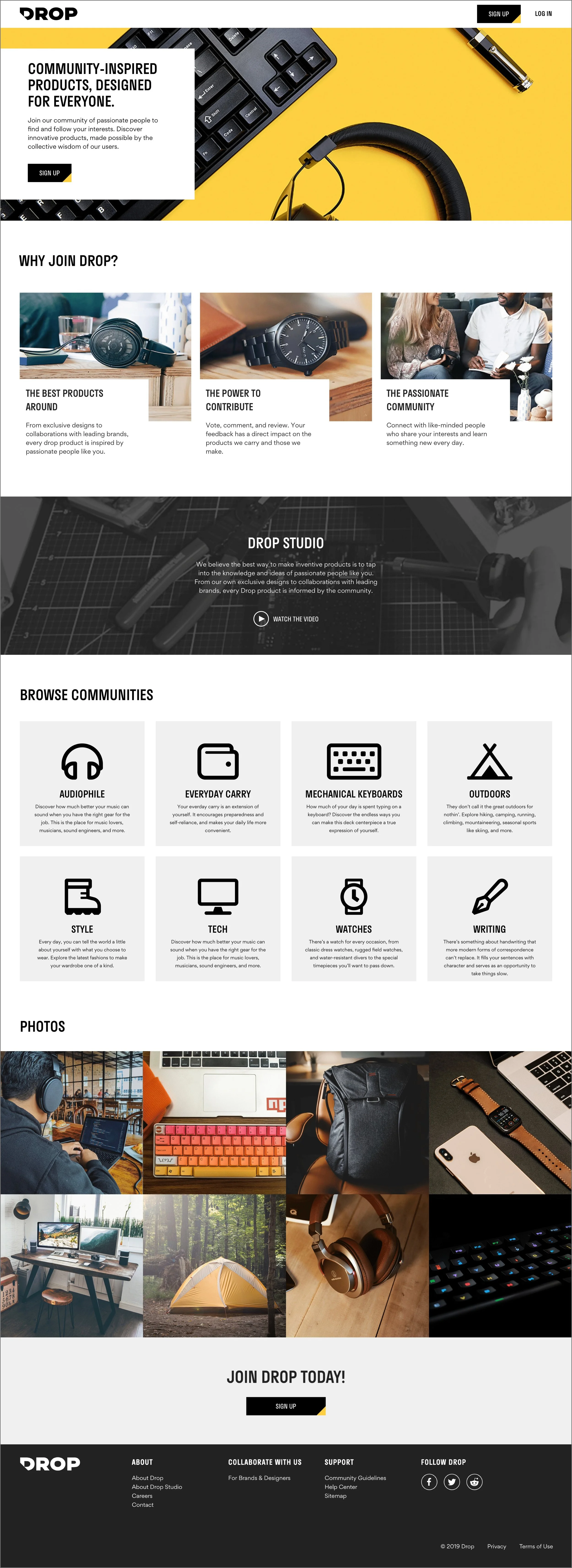
In this design (Design Solution 2), I keep the login wall but change the design of this login page. With this new login wall, I tell the story by starting with the “Why”, then proceeding with the “How” and “What”.
The problem with the current (live) login wall is that it feels very generic and doesn’t create much value to users; the page looks a bit underwhelming compared to the products. When users first come onto the site, they are not likely to understand Drop’s value.
Design and research to address customer's needs
Home Page Assessment
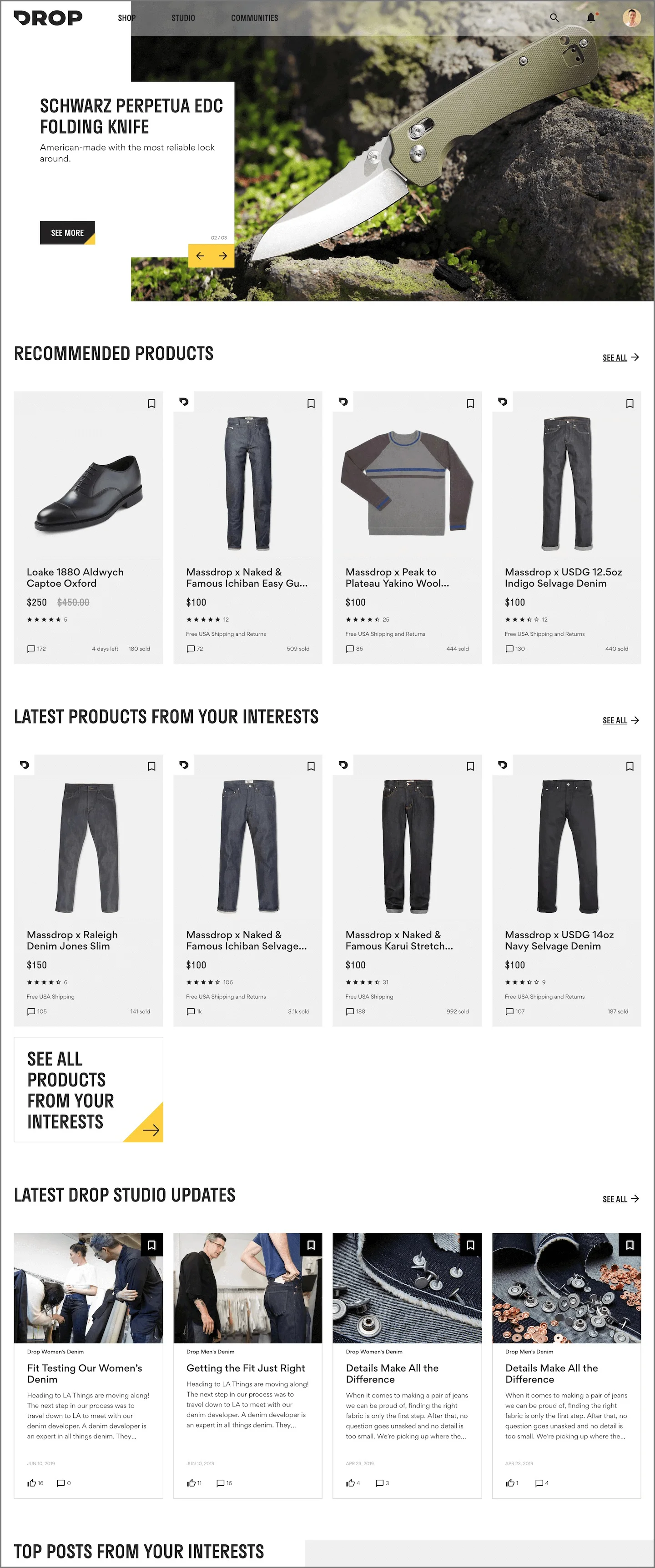
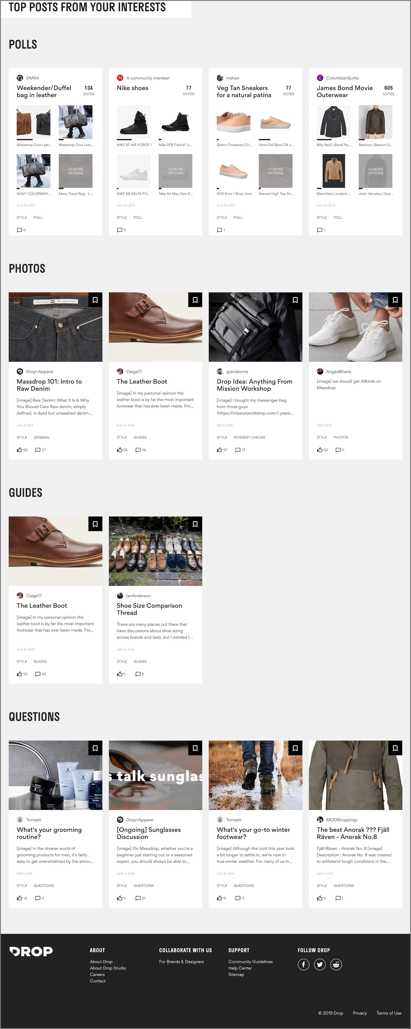
The current home page seems to be doing a bit too much. Right now, it's a slightly more curated version of a community page, whereas it should play a larger role in promoting exploration and creating excitement for users. By keeping the home page sections more high-level, we empower the user to learn and explore different sections of the website.
ANALYSIS
Not enough curation of products and relevant updates
There are only 9-10 communities
Consider sections for expert advice and top products
The height of the hero image seems too large
If items are uninteresting, the large carousel becomes distracting
Lack of variation in the element designs
Cards feel overused
No display of communities
Currently, there is no section on the home page that allows the user to jump to a community
Missing sections like:
"Trending"
"New Products"
"Ending Soon"
DESIGN EXAMPLE
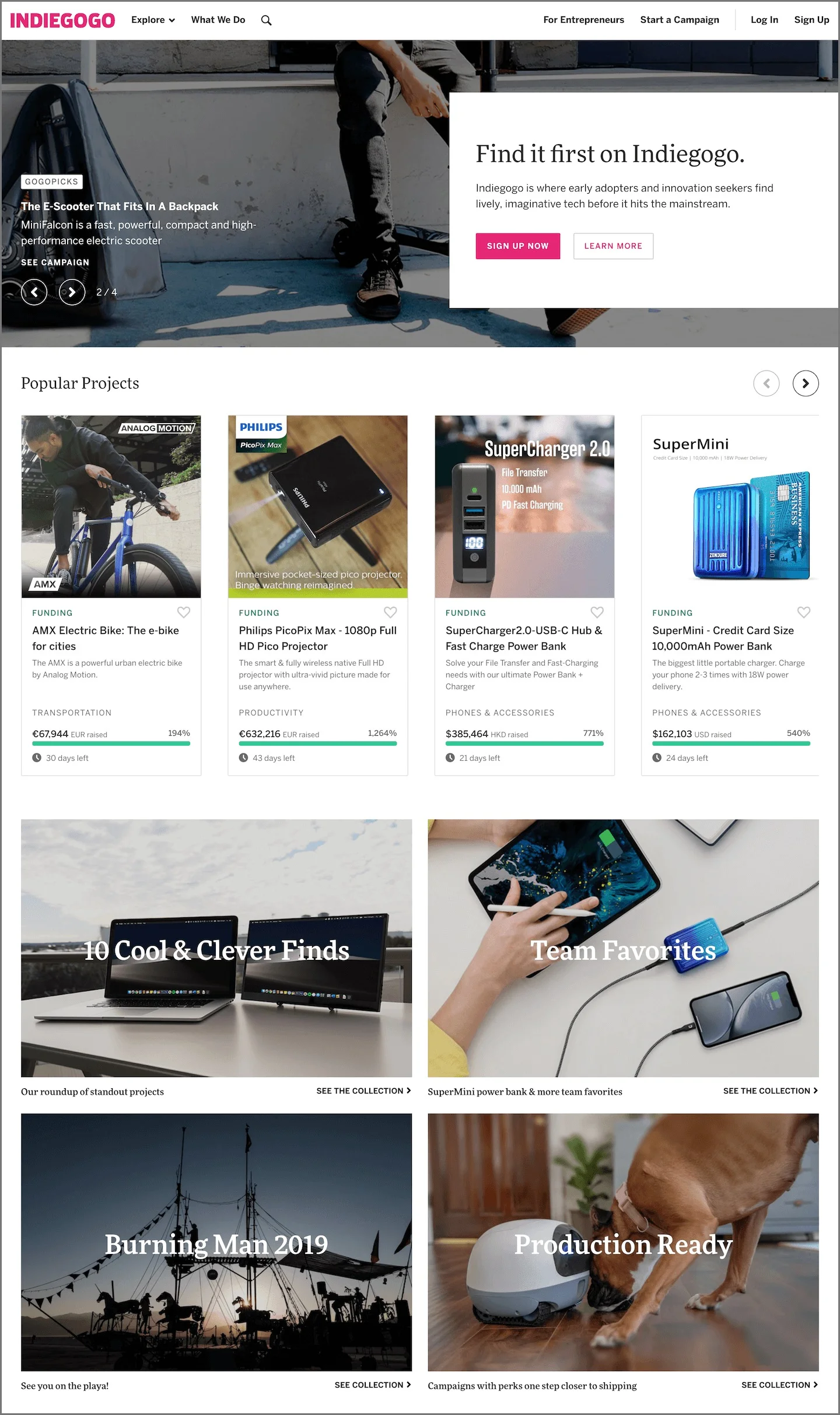
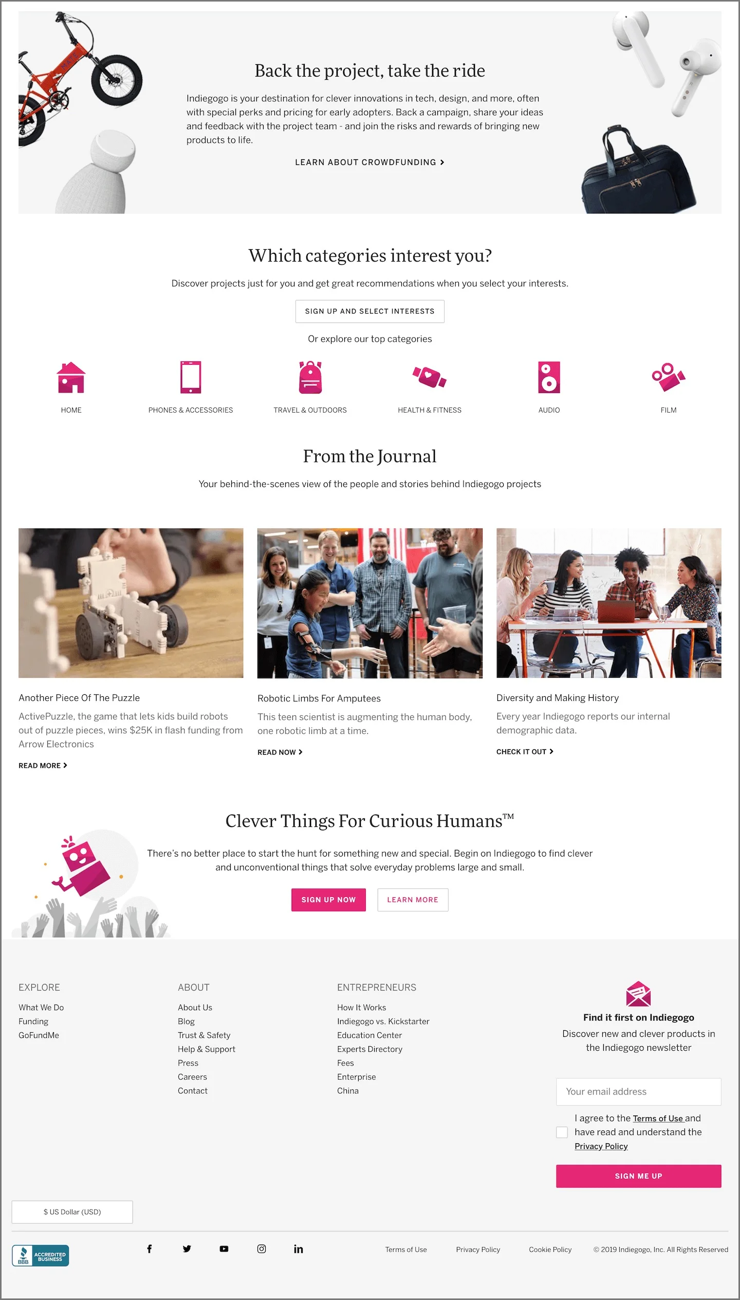
Indiegogo nicely features useful content such as:
Popular Projects
Team Favorites
Seasonal Campaigns
Categories
Blogs
Category Page Assessment
The category page can create a bit of confusion. At this stage, users are already browsing and trying to compare different products. Displaying hectic filters doesn't help with the decision-making process. While it doesn’t feel far off from a standard category page, there are notable inconsistencies in this section.
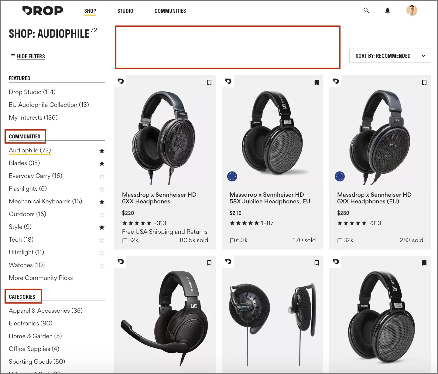
ANALYSIS
Nomenclature of categories as “Communities” is unclear
Communities section or Shop section?
Then, there are actual “Categories” below
Takes the user's focus off the current category
Opportunity to include a featured item on this page
Either towards the top or dispersed through the products to break up sections
Wasting the opportunity to use an impactful hover animation, such as an alternate views
Scrolling through“Sold Through” products can feel never-ending
Perhaps include a drawer that allows users to view sold through products
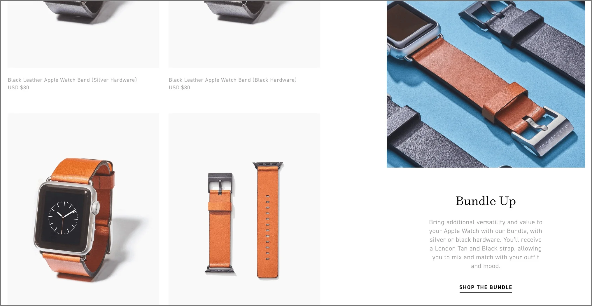
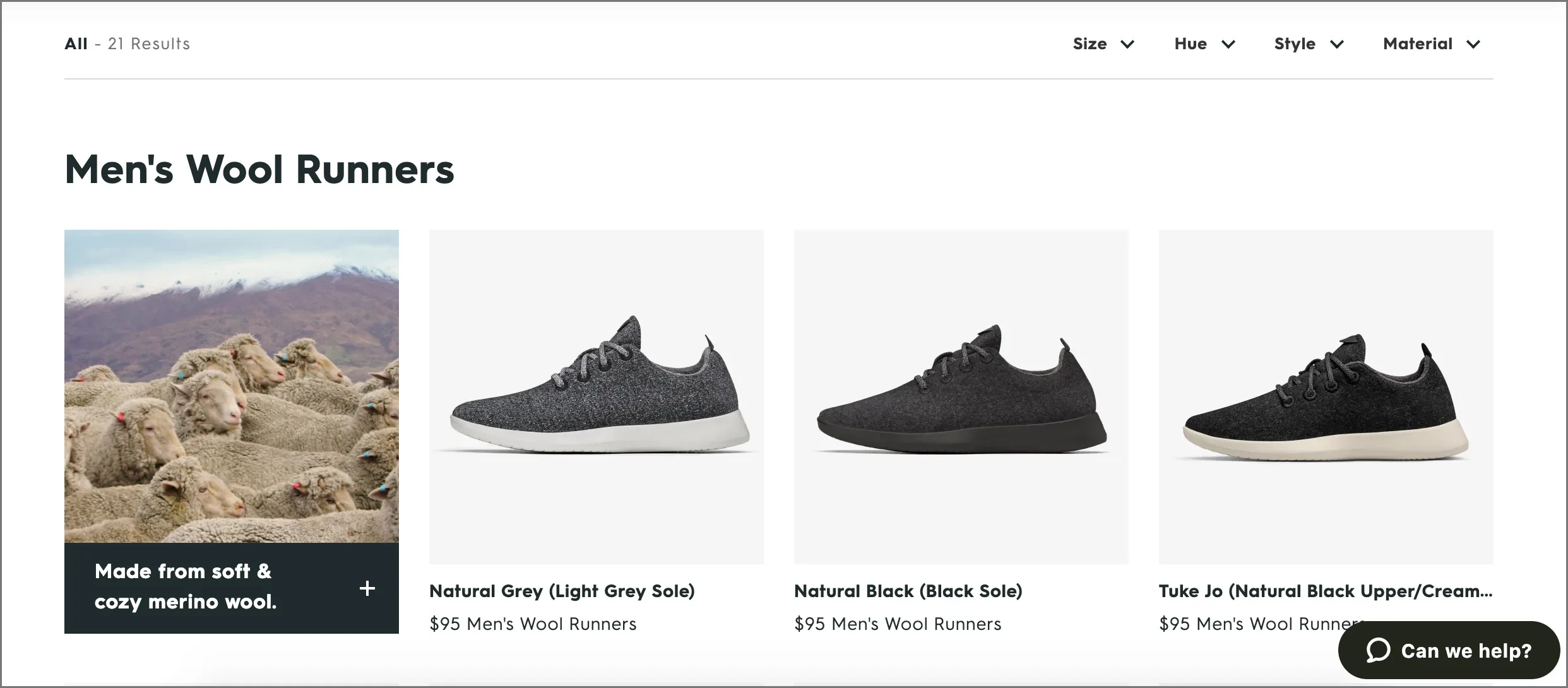
DESIGN EXAMPLES
Grovemade includes category call-outs dispersed throughout the product category pages. They also effectively use hover effect to show products in context.
Allbirds uses a fixed filter design towards the top of the page, and also features a call-out showcasing the development process
Product Detail Page Assessment
I like the design of this product detail page. The page showcases a lot of photos, is very educational, and offers a lot of options to learn about the product. The challenge is making information easily accessible when handling a great deal of content.
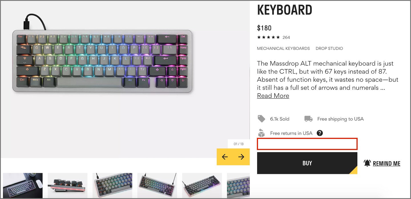
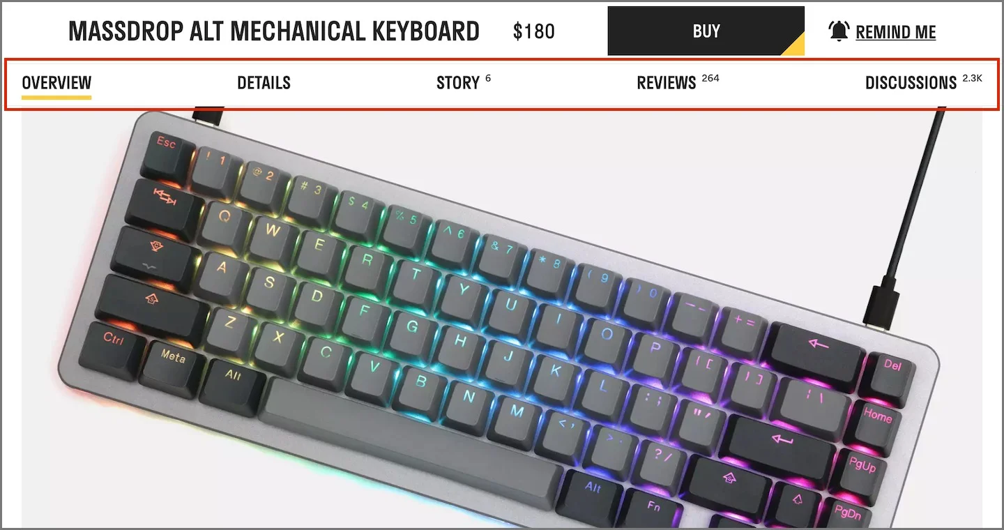
ANALYSIS
Unclear as to why the product variation dropdown is not found on this page
On the checkout page, the user does not see a product photo and will have to rely on memory
Sub-navigation can get lost on this page
If the user did not click on this sub-navigation, they miss out on important details
The "Discussions" section helps users learn and feel confident about purchasing the product

DESIGN EXAMPLE
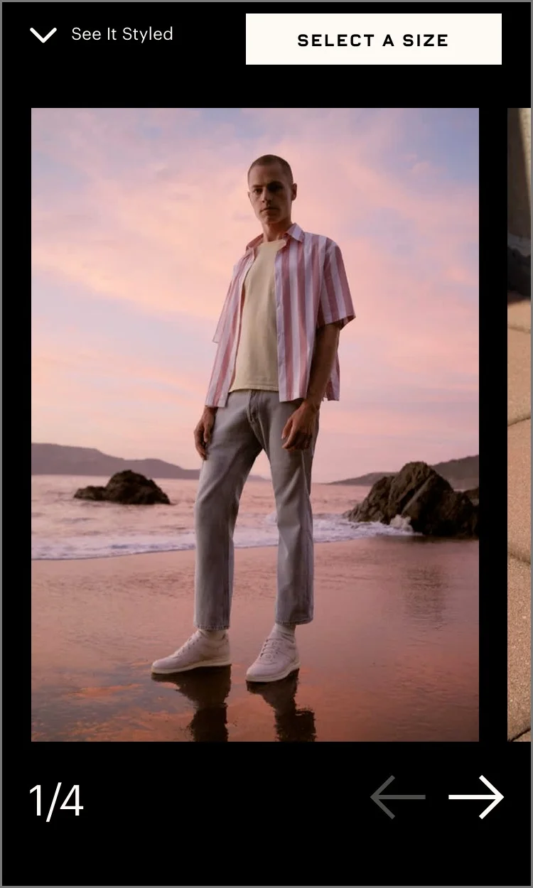
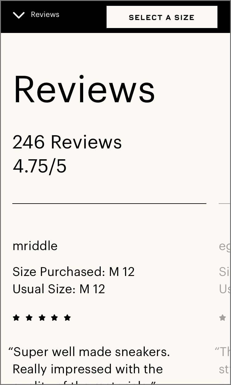
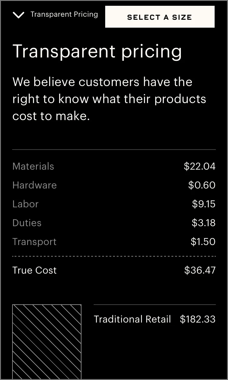
Everlane’s design uses a sidebar sub-navigation that works as anchor. I like this layout for many reasons:
Sub-navigation is very noticeable
Takes advantage of the horizontal scroll
Mobile: The sidebar becomes fixed to the top of the mobile screen and functions as a navigation for the product detail page
Sub-navigation menu becomes locked as the primary navigation for the product detail page
Horizontal scrolling feels very intuitive
Community Page Analysis
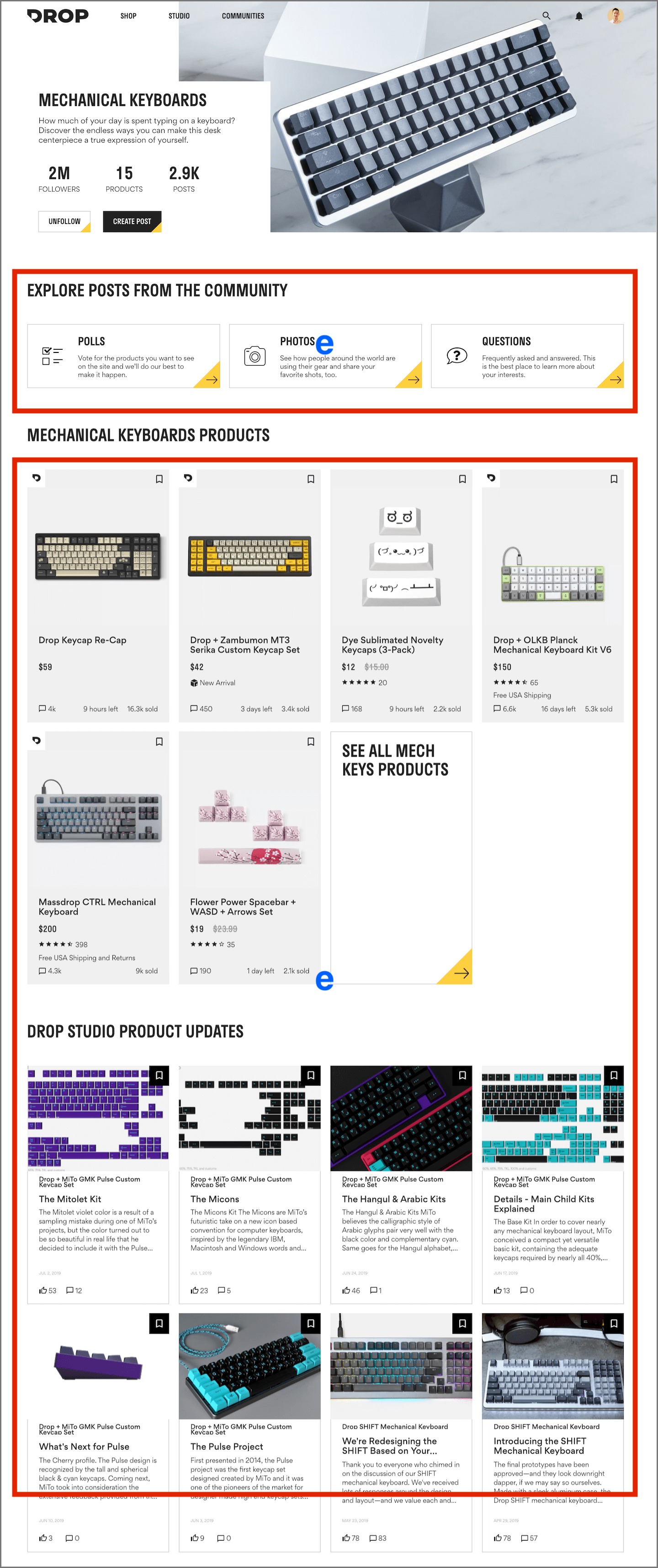
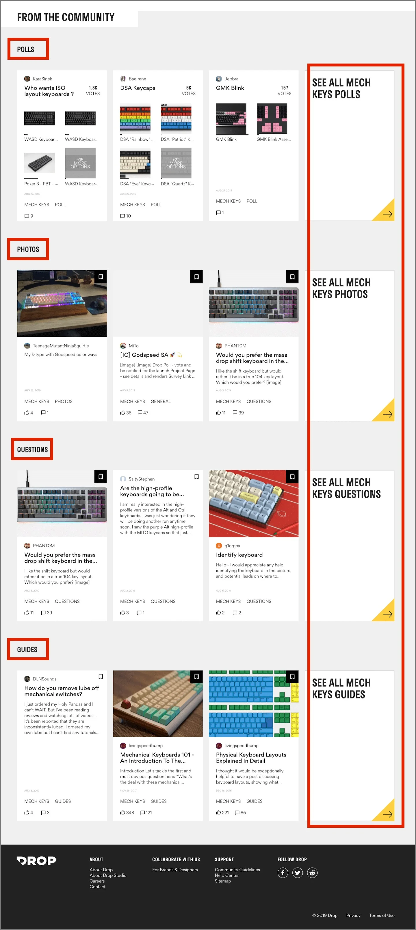
The community page has a lot of potential to be the most compelling page on the website. To achieve this, it's important for the company to truly understand what users want from this section. The Community page is where: community discussions are held, lifestyle photos are shared, and product ideas are conceived. It's currently not apparent, so it's important we prioritize the most useful sections on this page.
ANALYSIS
This section looks too similar to the home page
This section also looks similar to the shop page
Difficult to understand the page's goal
The repetitive nature of the card design creates no sense of hierarchy of importance
DESIGN EXAMPLES
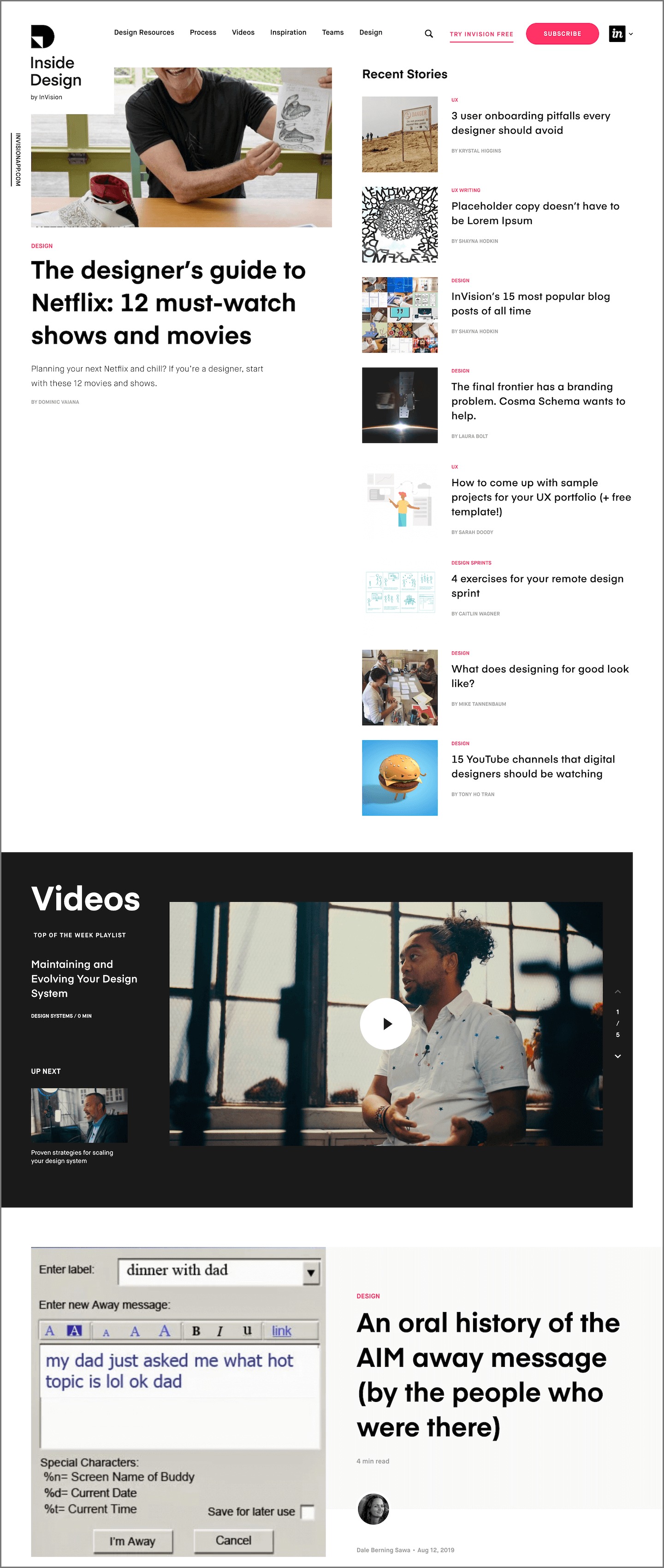
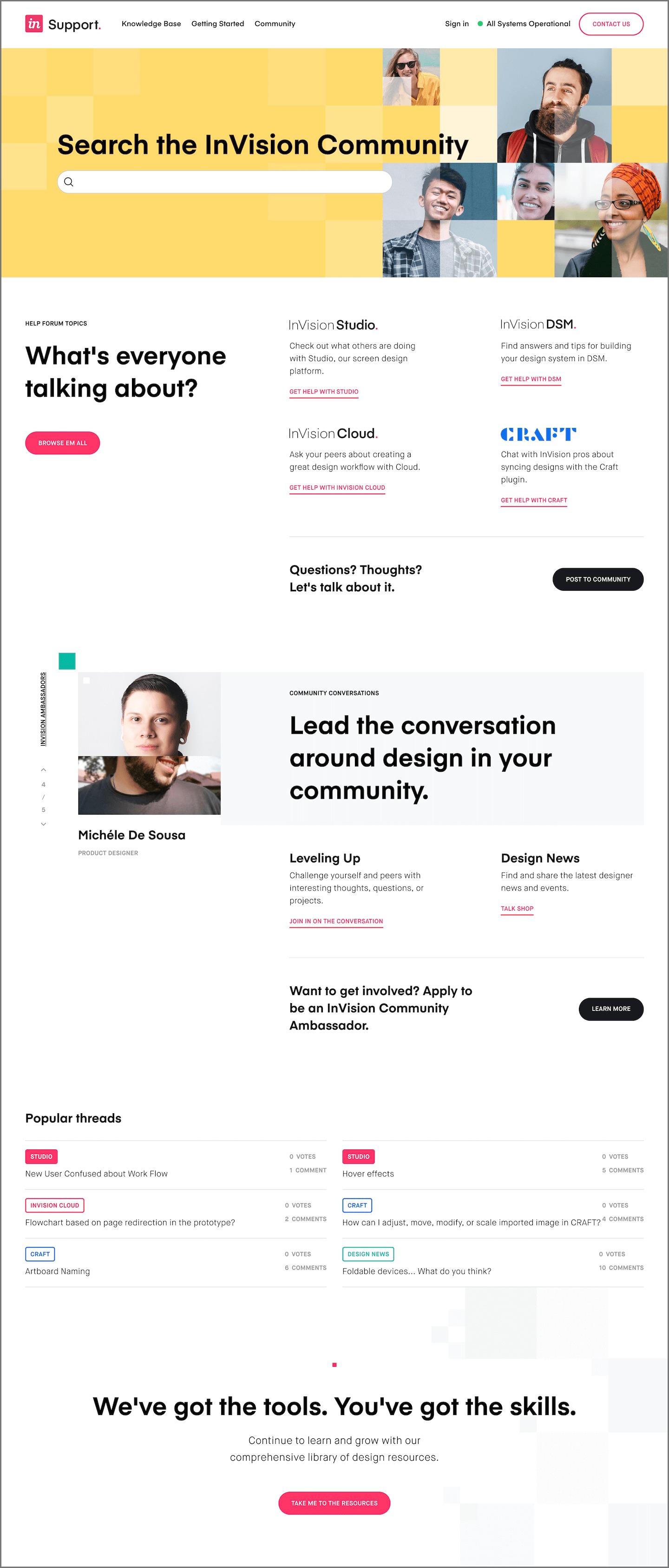
Invision has multiple communities on their website that artfully showcases multiple forms of media, blogs, and comment threads.
Invision's community designs are exemplified by:
Alternates layouts to reduce repetitiveness
Strategically limit the amount of content displayed
Draw attention to featured content
Uses a variety of font colors and font sizes
Navigation Menu Analysis
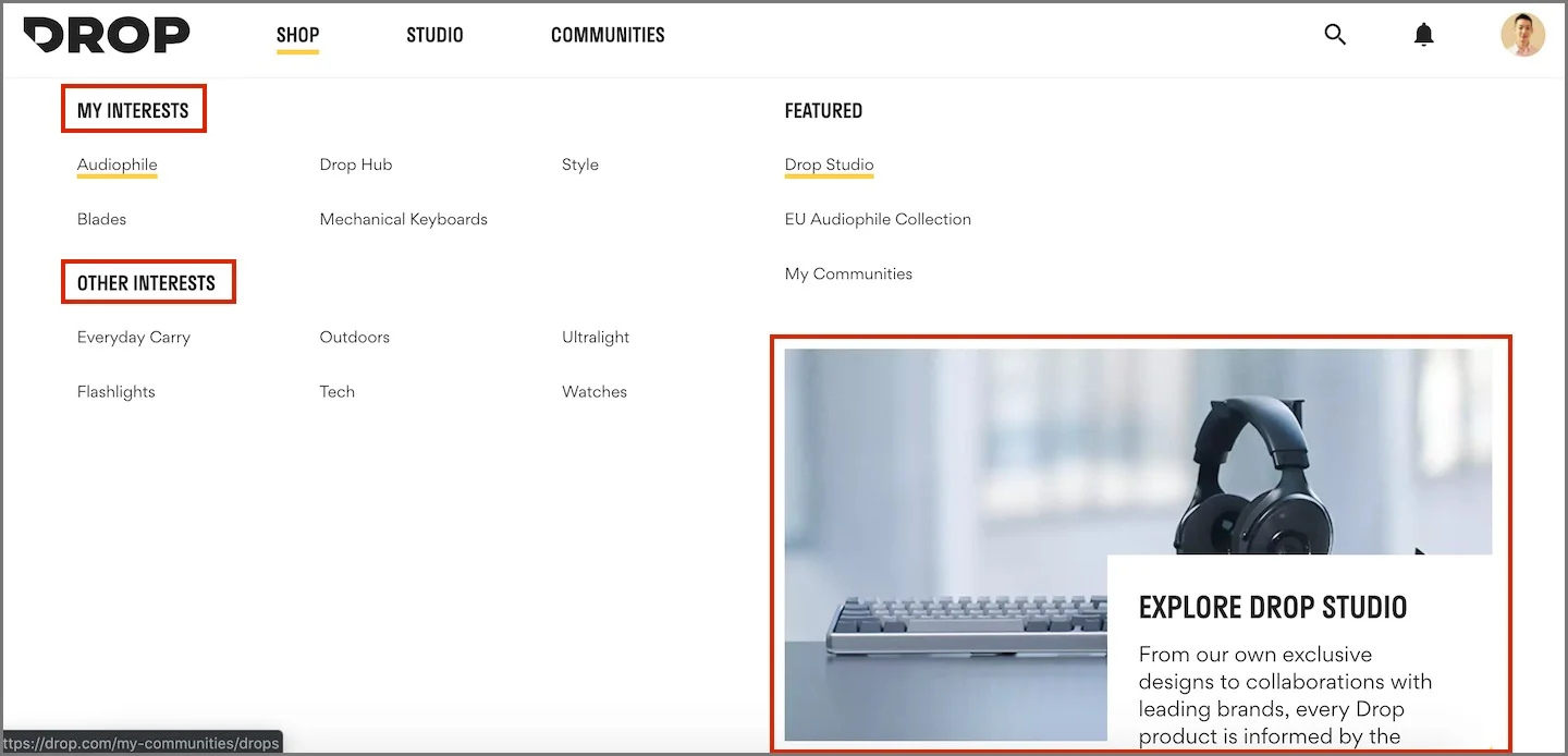
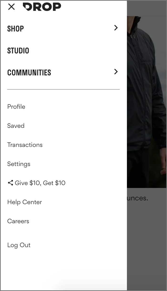
The navigation menu needs to be strategically implemented to ensure users understand what each option entails. From my current perspective, it's difficult to make a proper assessment without fully understanding Drop's business strategy. My assessment will primarily evaluate responsive design and consistency.
ANALYSIS
Areas of improvement:
Navigation menu is missing an About / What We Do page
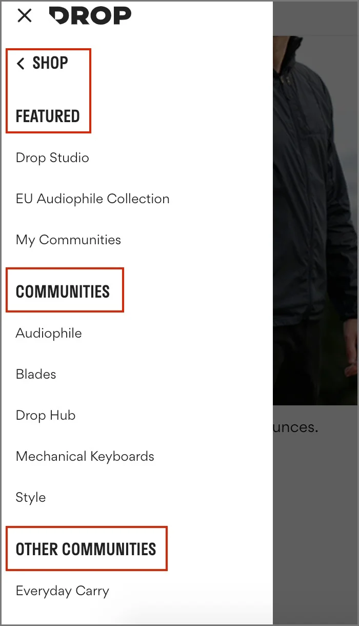
Interests vs Other Interests
Interests vs Communities inconsistency across devices
Not being able to easily unhover off the navigation menu
Featured section cut off on 13-inch Macbook Pro
Mobile: Difficult to differentiate between category and subcategory, due to font size
Mobile: Shows "Featured" above Communities / Other Communities
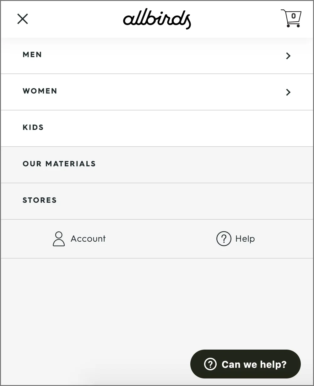
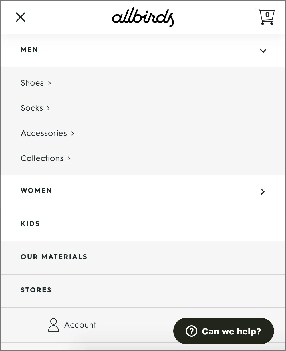
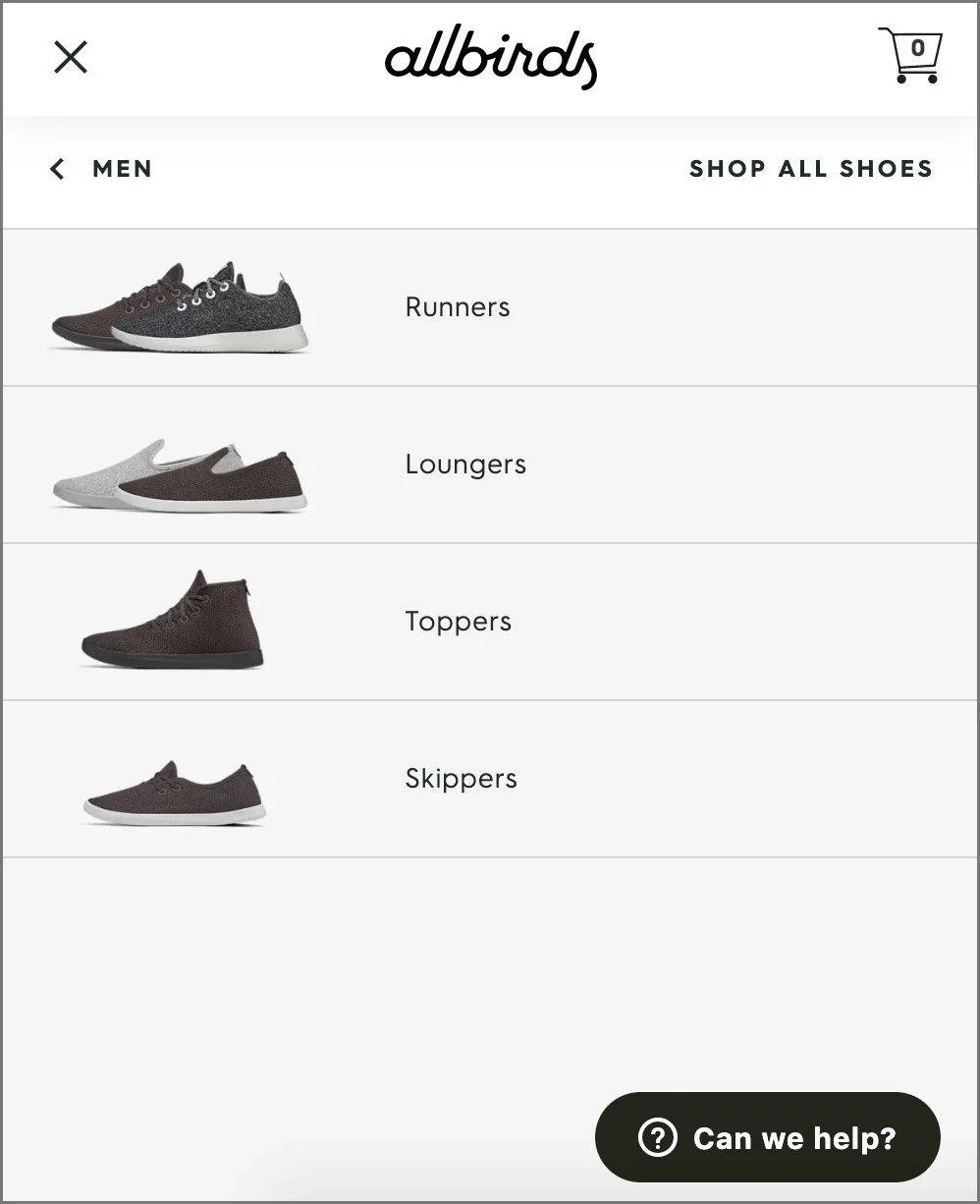
DESIGN EXAMPLE 1
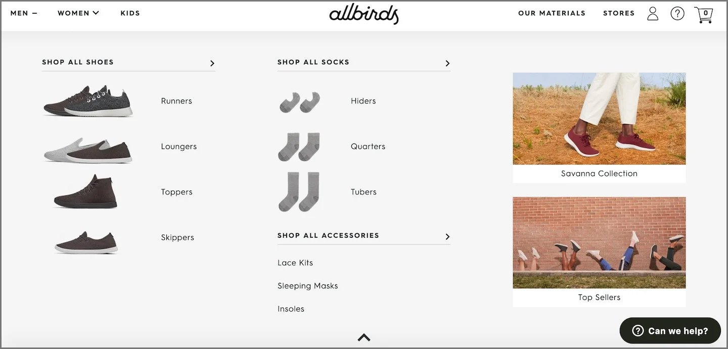
Allbirds' mega menu design creates a sense of product hierarchy
With Drop sunsetting many of its past categories, we can put more focus on the products and communities that convert at a higher rate
Consider including photos or icons within the navigation dropdown
Ensure the dropdown allows the user to exit out of the hover state (refer to up-chevron)
Mobile: The dropdowns slide down in the first screen, then to the right on the second screen
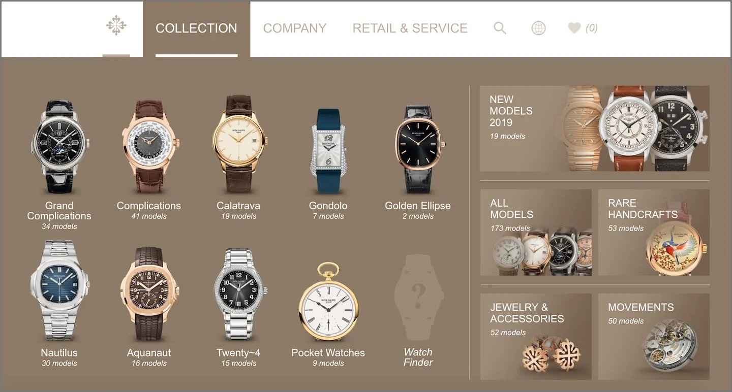
DESIGN EXAMPLE 2
Other examples that can provide design inspiration are high-end watch companies, due to the intricate details on their products
Patek Philippe uses their menu design to display their top watch categories, leaving room on the right side to feature additional information
Checkout Process Analysis
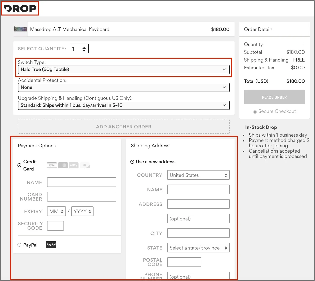
The checkout process takes a different approach than most e-commerce websites, likely due to the ordering model established by Massdrop. With the business model shifting, it'll be interesting to see how the website adjusts to the new strategy.
ANALYSIS
At the moment, the checkout process seems deceptive and lacks confidence in the company's products
No shopping cart feature
Logo isn't a hyperlink
All form fields crammed onto one page
Additional confusion:
Inconvenient product configuration options
Shipping speed separate from the shipping address section
Visually, there is a too strong of a strong contrast with the form fields
Mobile: Form fields and sections will feel long and overwhelming without breaks
DESIGN EXAMPLE
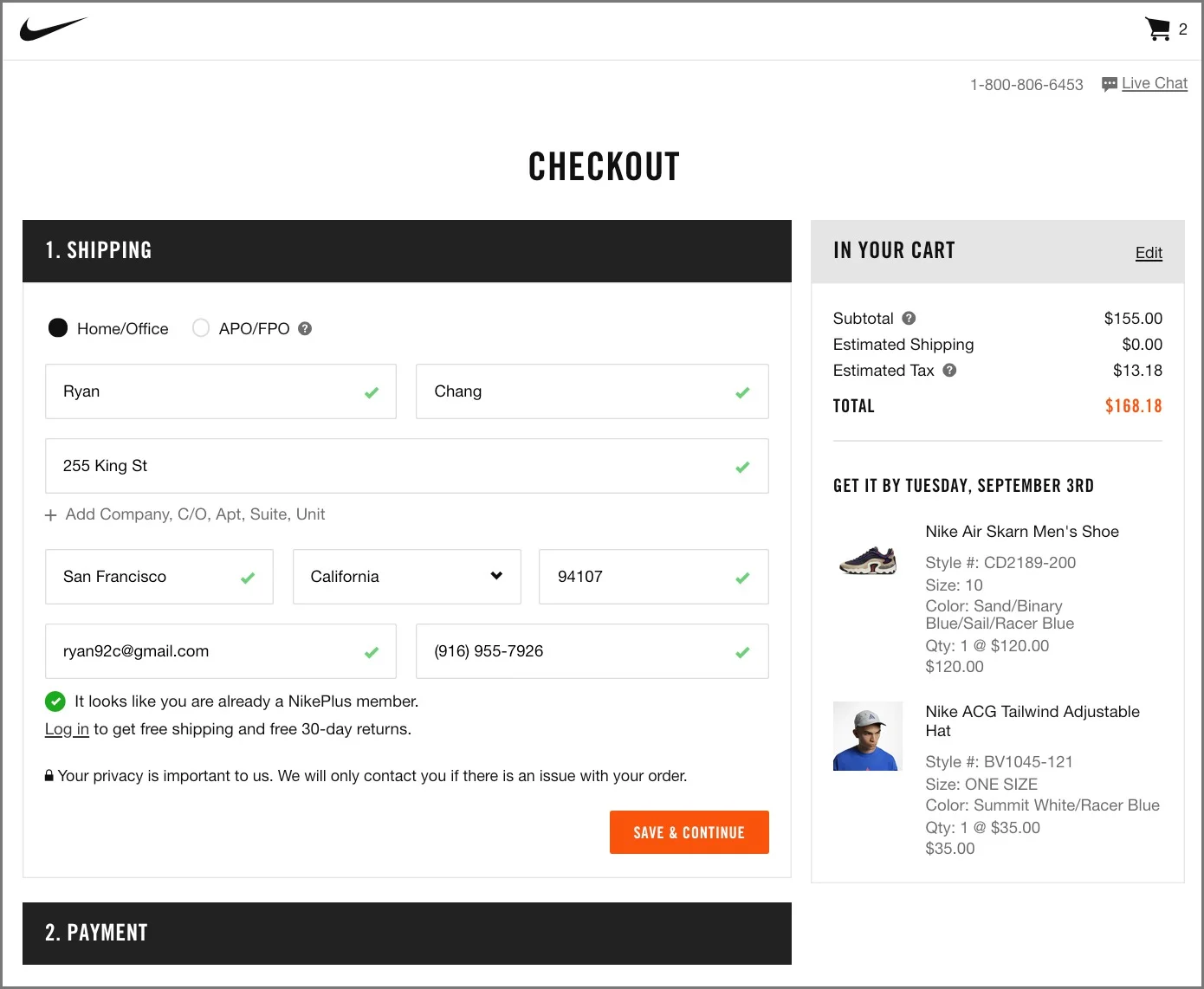
While assessing Nike's checkout process, it appears everything can still fit on one page and remain trustworthy.
Cart shows product thumbnails
Logo works as a home button
Steps divided by "drawer" design
Configurations decided on product detail page
Informational hover icons
Low contrast on form field borders
Green checks to show completion
Summary
In this quick assessment, I wanted to demonstrate my process on how I approach design challenges and solve UX problems. I also wanted to provide a fresh (and honest!) perspective, from a long-term Drop user, on how new users may potentially view the brand. I have a lot more ideas to share, but, for the sake of time, I wanted to give the team a brief look into my thinking.
Drop is going through a huge transition with its business strategy and this change will come with a lot of challenges. I look forward to learning more about how I can contribute during this exciting growth period.