
W E B D E S I G N
Pink Shell Resorts
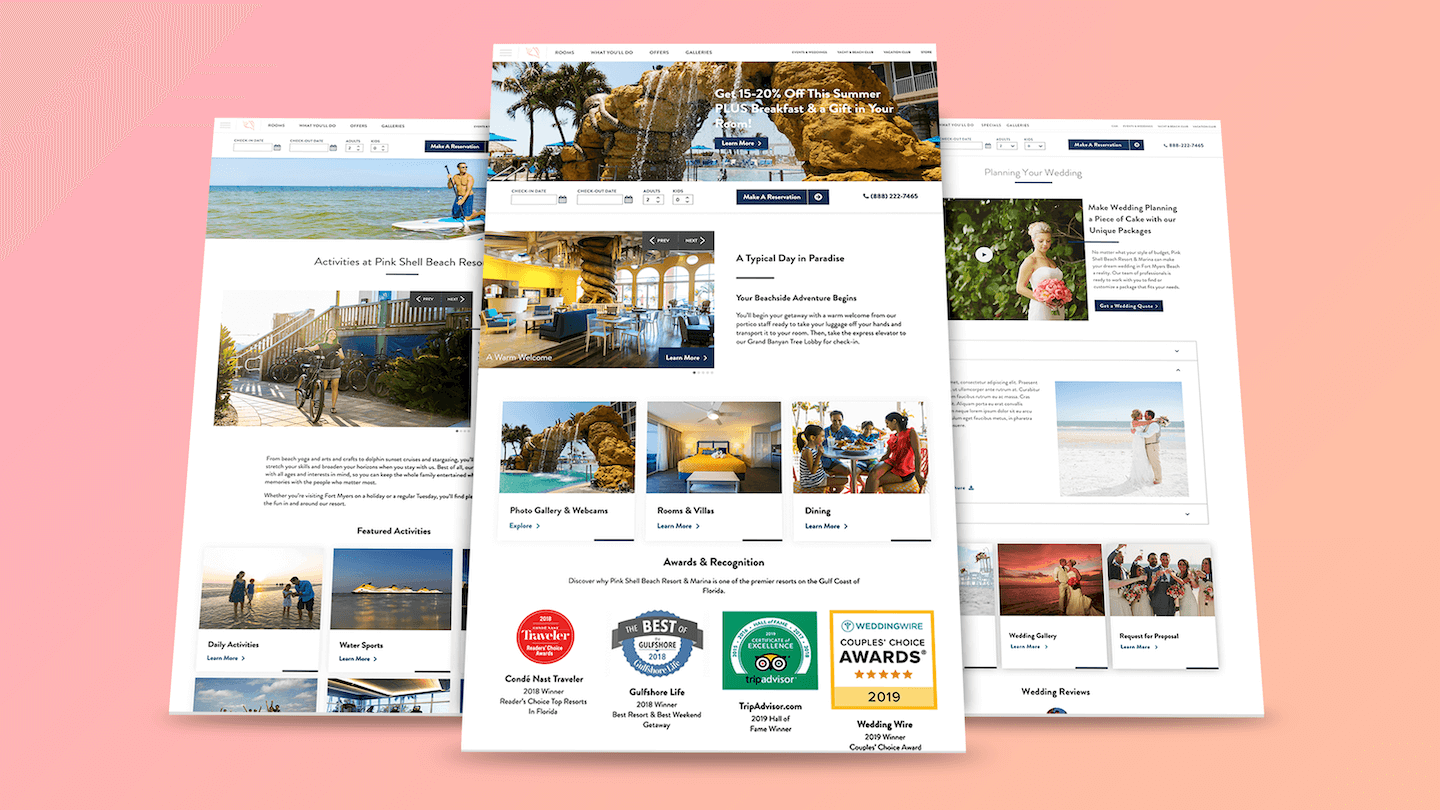
An award-winning resort, located on the beachfront of Estero Island in Florida, approached us with the need to redesign and restructure their current website to increase booking conversions.
U X / U I D E S I G N E R
Overview
To address low online booking rates, we revamped the look and feel of the website, incorporating both a brand refresh and an improved organizational structure to cater to different use cases. Our new design simplifies the user experience, making exploration easier, while seamlessly highlighting resort amenities through well-defined user flows.
Setting the Stage
At this stage of the project, it’s crucial to understand who our users are and what they aim to accomplish. By focusing on specific user needs, we can design a well-curated, intuitive website that encourages exploration and ultimately drives more conversions.
Who are our users?
Older Couples (60+)
Families with Children
Young Couples
Corporate Event Planners
What are they trying to accomplish?
Explore the different resort amenities
View the resort experience through high-quality photos
Browse and select the ideal room
Easily make a reservation online
Understanding the Pain Points
What is the current problem they’re solving?
Users are struggling to find key sections, specifically resort amenities, on the website due to poor organization.
What is that as-is scenario?
The website’s navigation is cluttered and confusing, making it difficult for users to quickly locate and browse amenities or other important sections.
Where are they experiencing the pain and frustration?
Users are encountering pain points mainly in the navigation and when trying to find specific resort amenities, leading to frustration as they waste time searching for information.
What effects do their pain have?
This causes delays in the user journey, which can lead to higher bounce rates and potential loss of bookings, as users may give up or feel frustrated with the experience.
Pain Point 1: Resort Amenities
Users are spending too much time trying to find key sections on the website. According to survey data, we know that users primarily want to browse the resort amenities, but the current organization makes it challenging.
BEFORE:
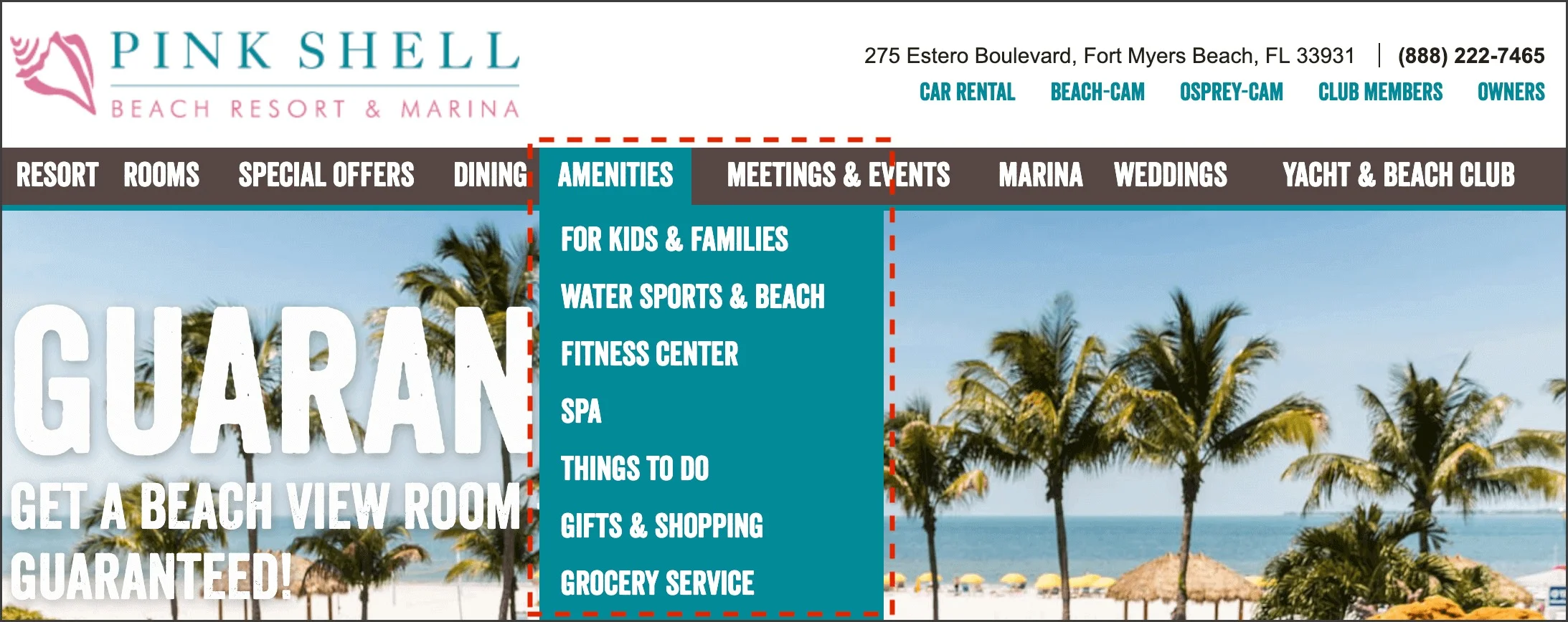
Currently, with 9 items in the navigation, there's too much overlap. Before recategorizing this section, we needed to answer a few key questions:
What qualifies as an amenity?
Can we consolidate these to make the experience more streamlined?
Users expect to find all amenities under the 'Amenities' menu item. Without taking a step back to reconsider the resort experience as a whole, there would be a disconnect between the business and the users' experience. We needed to collaborate with the Pink Shell team to consolidate their offerings and determine the best way to organize this information.
AFTER:
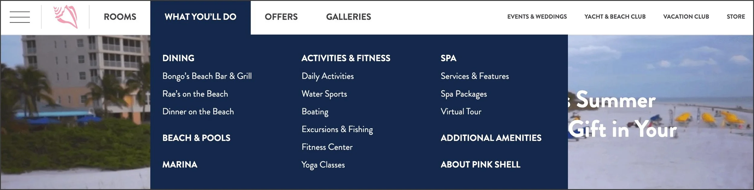
We consolidated the navigation to include just four main sections: Rooms, What You'll Do, Offers, and Galleries. We used the 'What You'll Do' menu item as the primary section for browsing amenities, simplifying the previous design's navigation into one centralized mega menu dropdown. This streamlined approach reduced decision-making when users first land on the website.
Pain Point 2: Resort Photography
Users are spending too much time trying to locate key sections on the website. According to survey data, we know that users are primarily interested in browsing the resort amenities, but the current organization makes this difficult.
BEFORE:
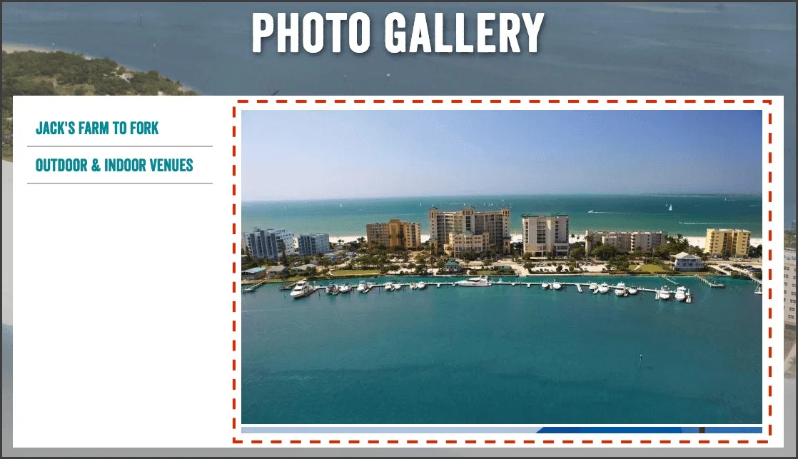
While there were some photos scattered throughout the old website, they were limited and not well-organized. Our users want to come to the site and easily envision themselves within the resort experience.
Users were spending too much time searching for photos of specific amenities. Considering the older demographic, we aimed to provide an equally engaging experience that didn’t require excessive reading.
AFTER:
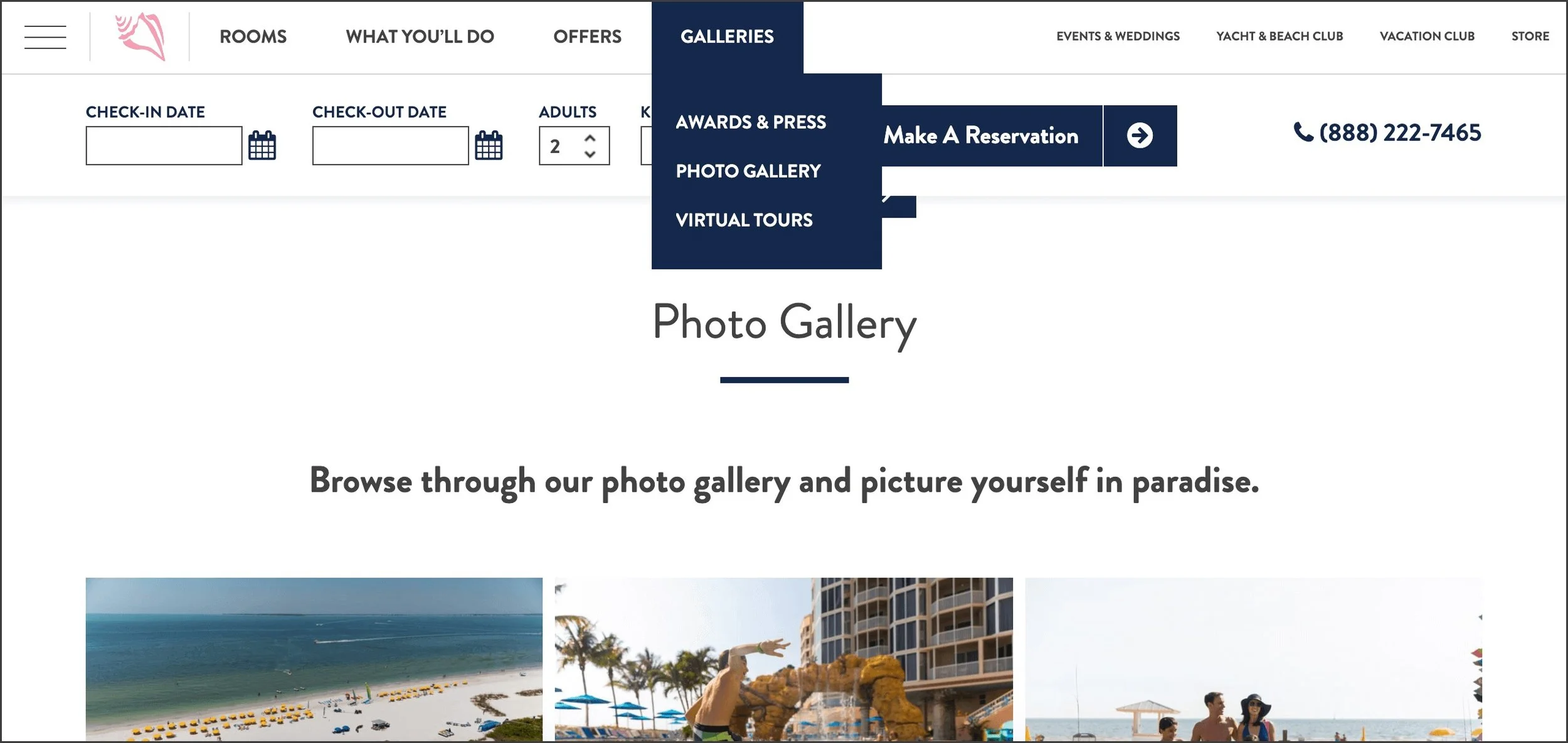
We created a Galleries dropdown, offering users three options: Awards & Press, Photo Gallery, and Virtual Tours. With the clear design of this menu and its dropdowns, users would feel confident knowing they are in the right section.
Pain Point 3: Browsing and Selecting Rooms
The rooms hub and individual room pages are designed to highlight the perks of each room while simplifying the decision-making process for users. Our goal is for this section of the website to encourage users to browse and select the room that best fits their needs.
Currently, the room webpages are functional but the visual design feels outdated. With a dated background image and low-quality photos, Pink Shell gave the impression of an unmaintained resort.
BEFORE:
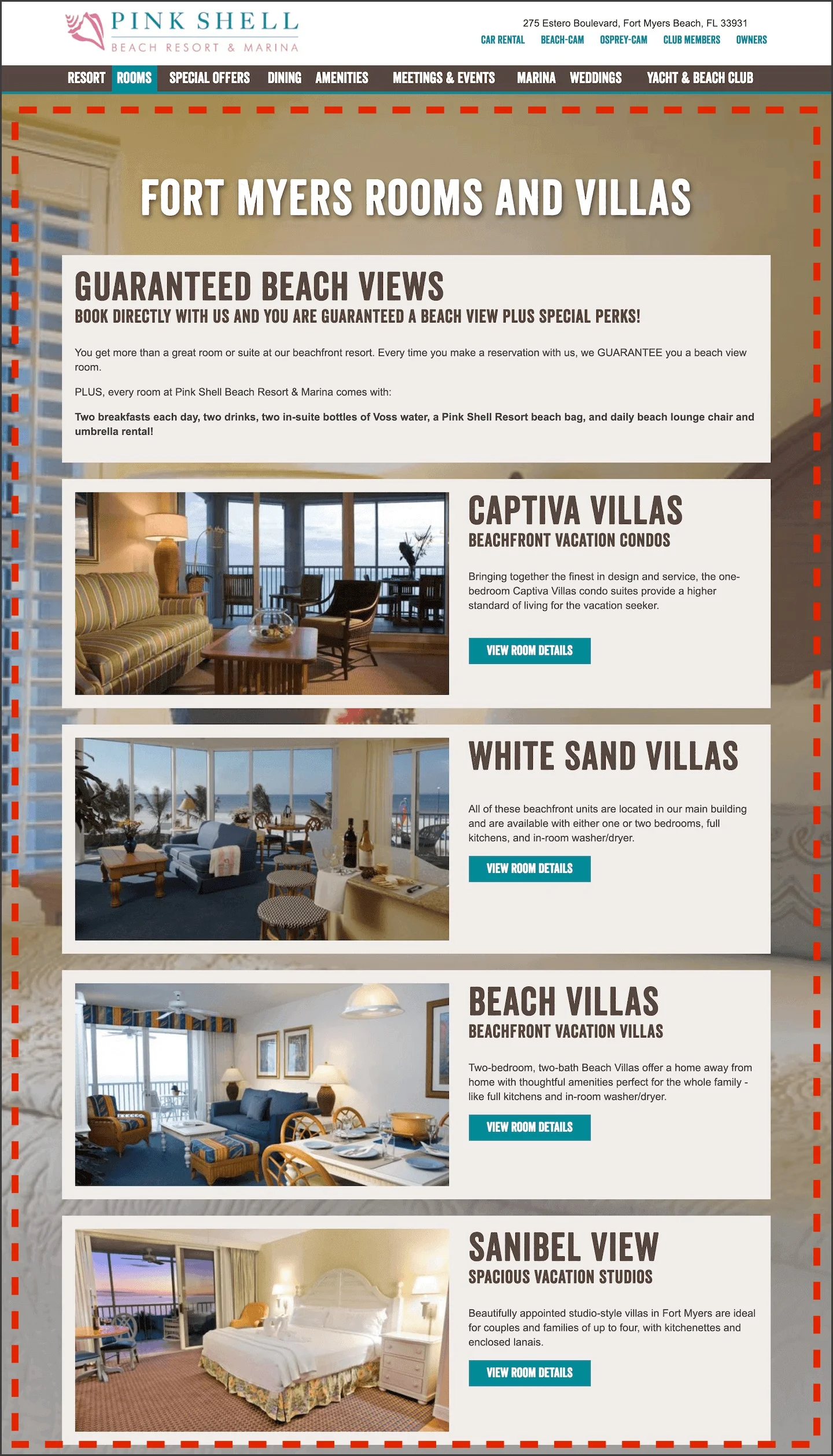
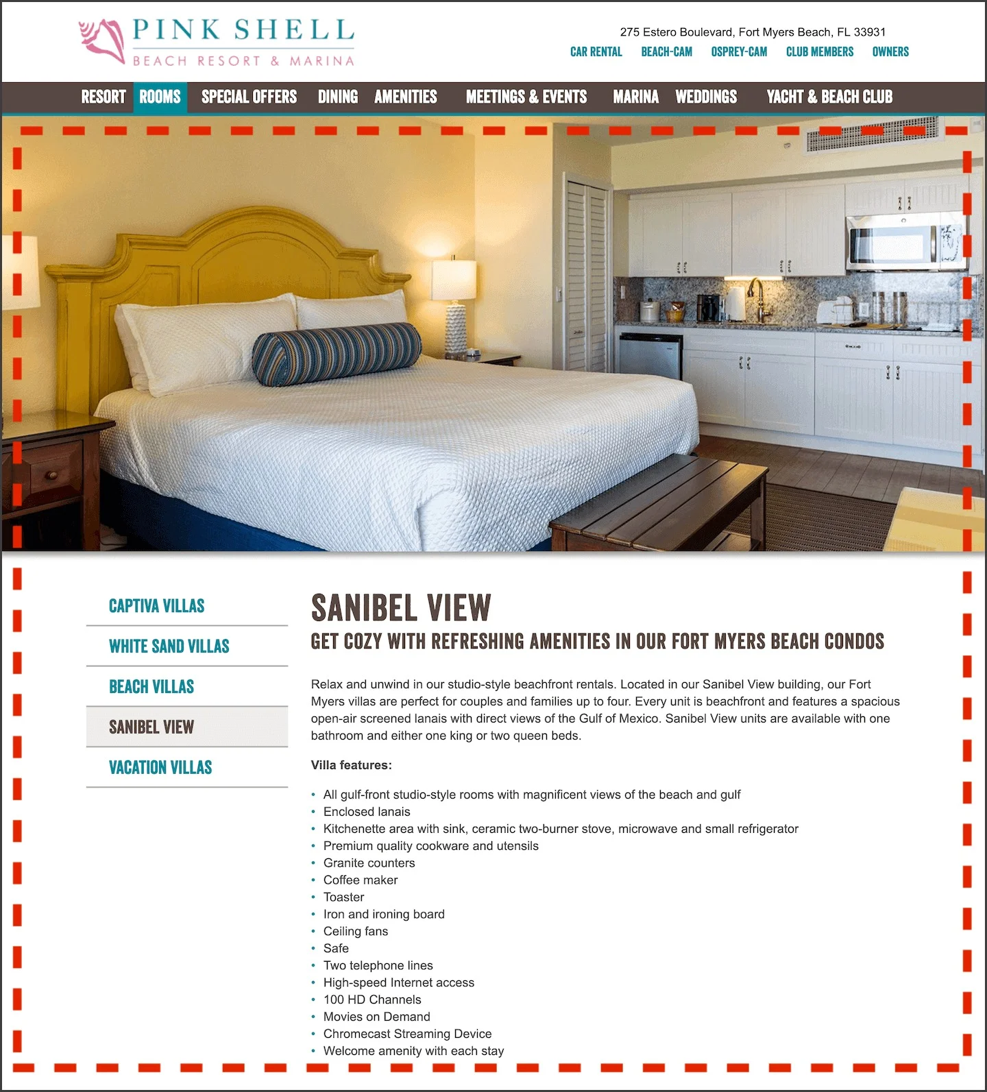
Users visiting this part of the website may be deterred by the visual design and the lack of trust-building content. The design didn’t optimize the image selection, making it difficult for users to compare the different room types and fully engage with the room experience.
AFTER:
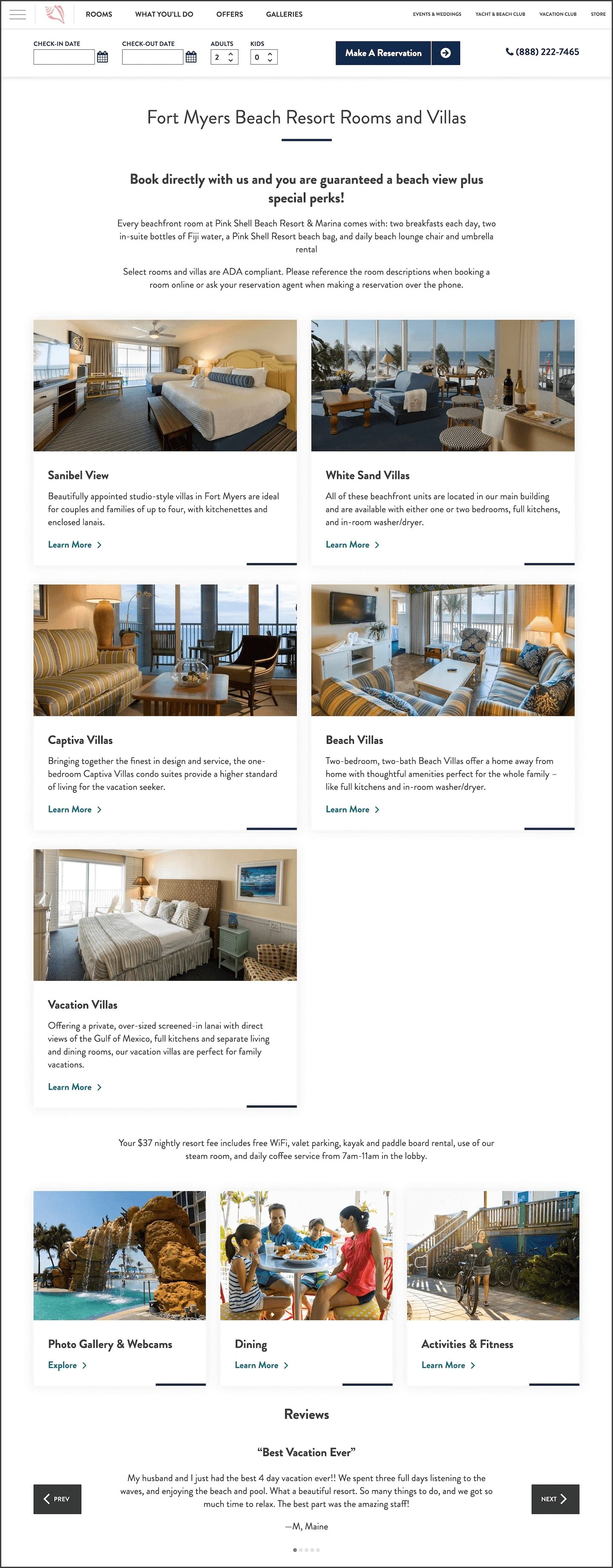
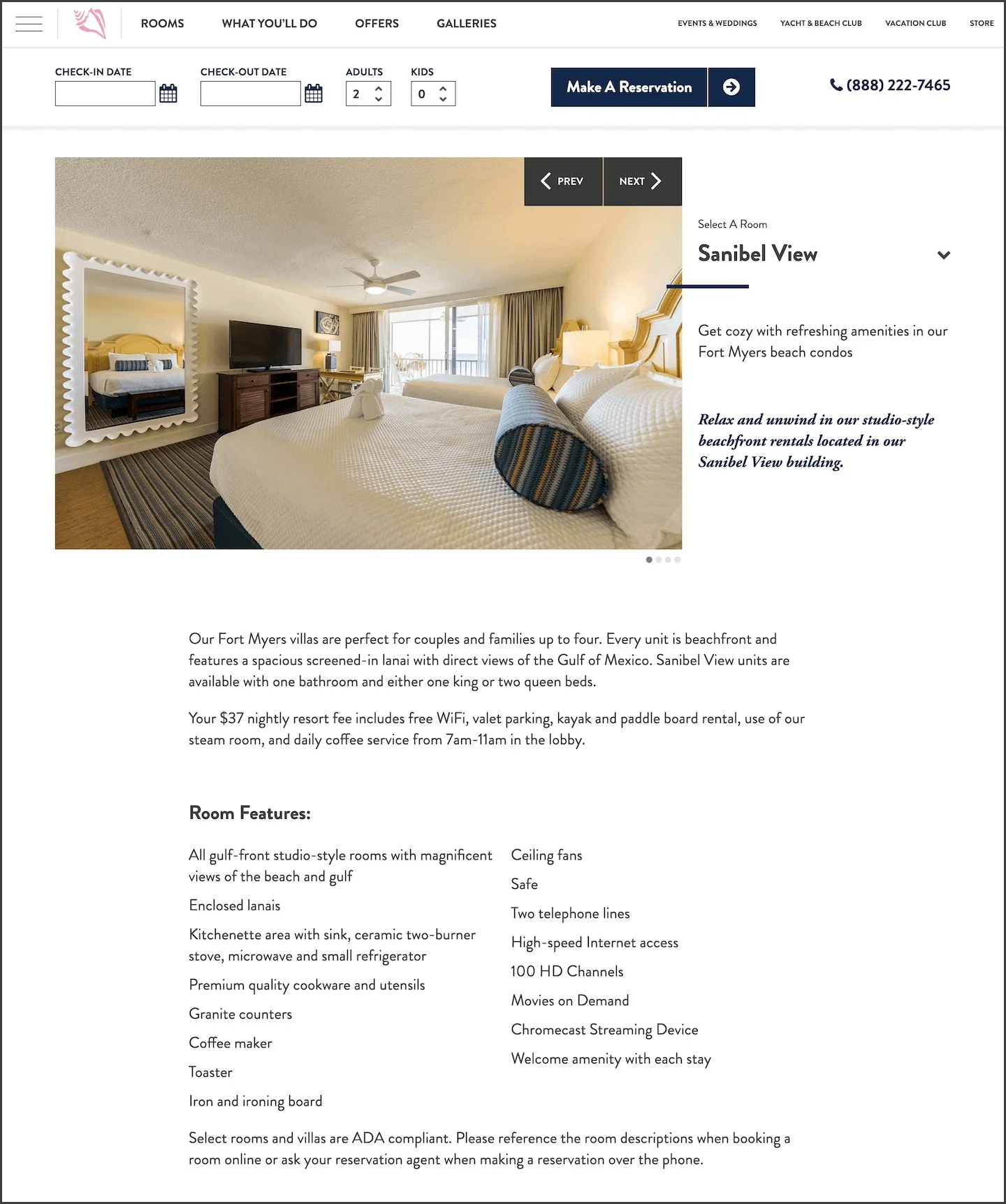
On the rooms hub, we aimed to make it easy for users to compare rooms. We also wanted to showcase resort testimonials and provide options to view the resort gallery and explore amenities.
For the individual room pages, it was essential to feature optimized images that clearly represent the room. Additionally, a dropdown was included to allow users to quickly navigate to other room options.
Pain Point 4: Making a Reservation
Making a reservation should be straightforward. Users should easily input their desired stay dates and be shown available options for those dates. If users prefer an alternative booking method, other options should be provided as well.
Currently, there's a sticky booking widget at the bottom of the screen that stays visible as the user scrolls. The widget includes form fields and dropdowns for check-in and check-out dates, number of adults and kids, a promo code, and a prominent 'Make a Reservation' button.
BEFORE:

While the booking widget is fairly standard, users have described some subtle pain points. One major issue was that the promo code option in the widget caused errors early in the process, leading to uncertainty about how to apply a promo code. Additionally, the lack of a clearly visible alternative booking option resulted in user frustration.
At this stage, the user has already decided to proceed with the booking. Since this is the final step before conversion, it's crucial that the booking bar functions seamlessly.
AFTER:

In the redesign, we focused on including only the essentials in the booking widget to streamline the checkout process. We moved the promo code field to a later stage in the checkout flow and added a phone number for users who preferred to book over the phone.
Designing the Solution
SITE MAP
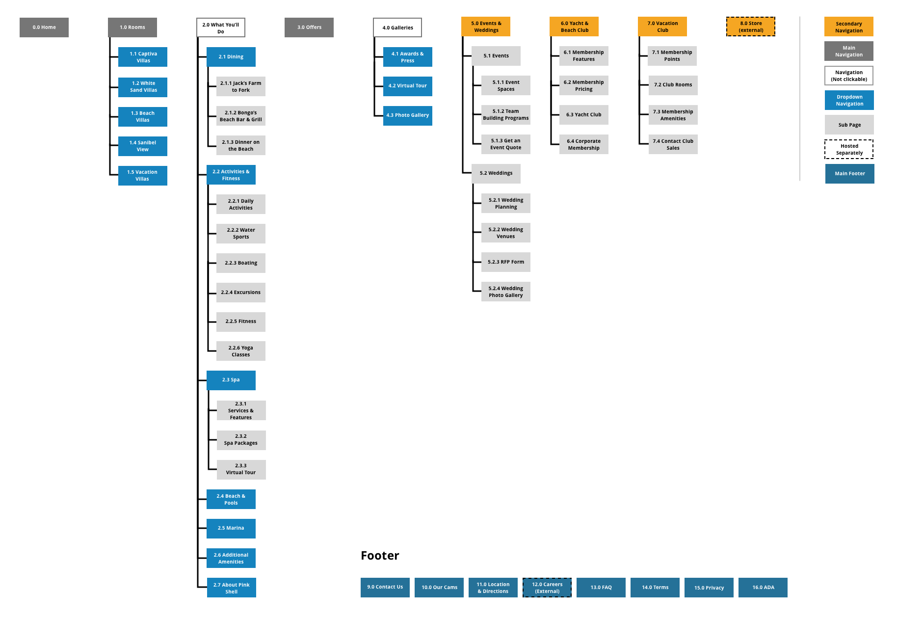
To optimize the website structure, we took a step back to understand what our primary users would want to see. By focusing on our main personas, we discovered that users wanted to easily access amenities, browse room options, and view resort photos. With this insight, we returned to the website and recategorized and reorganized everything to align with these user goals.
After balancing the needs of users with the goals of the stakeholders, we simplified the main navigation to include only four menu items and implemented a mega menu to address larger categories.
Creating the Visual Concepts
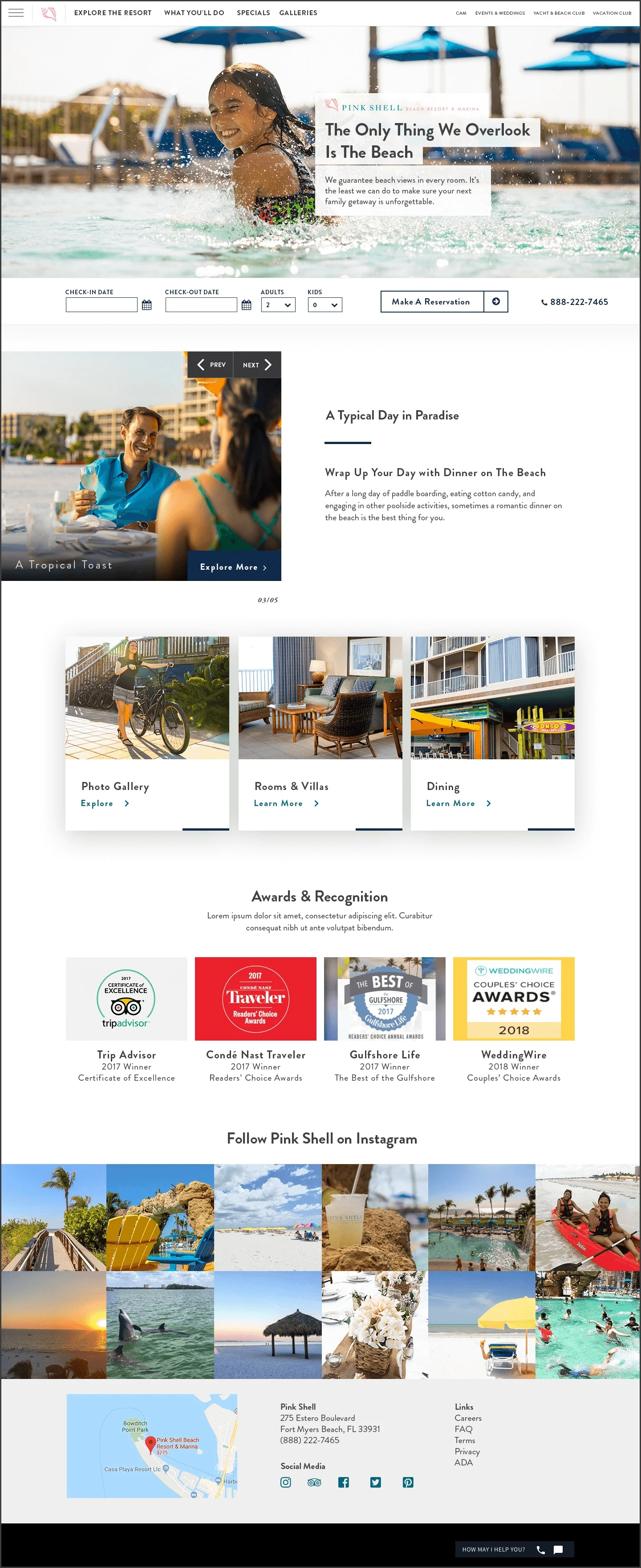
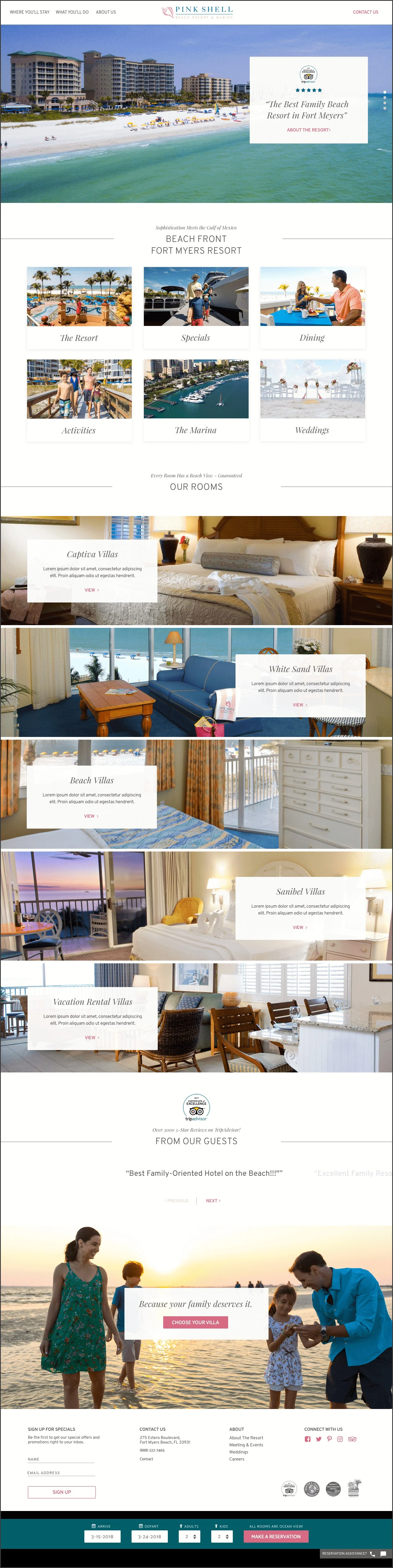
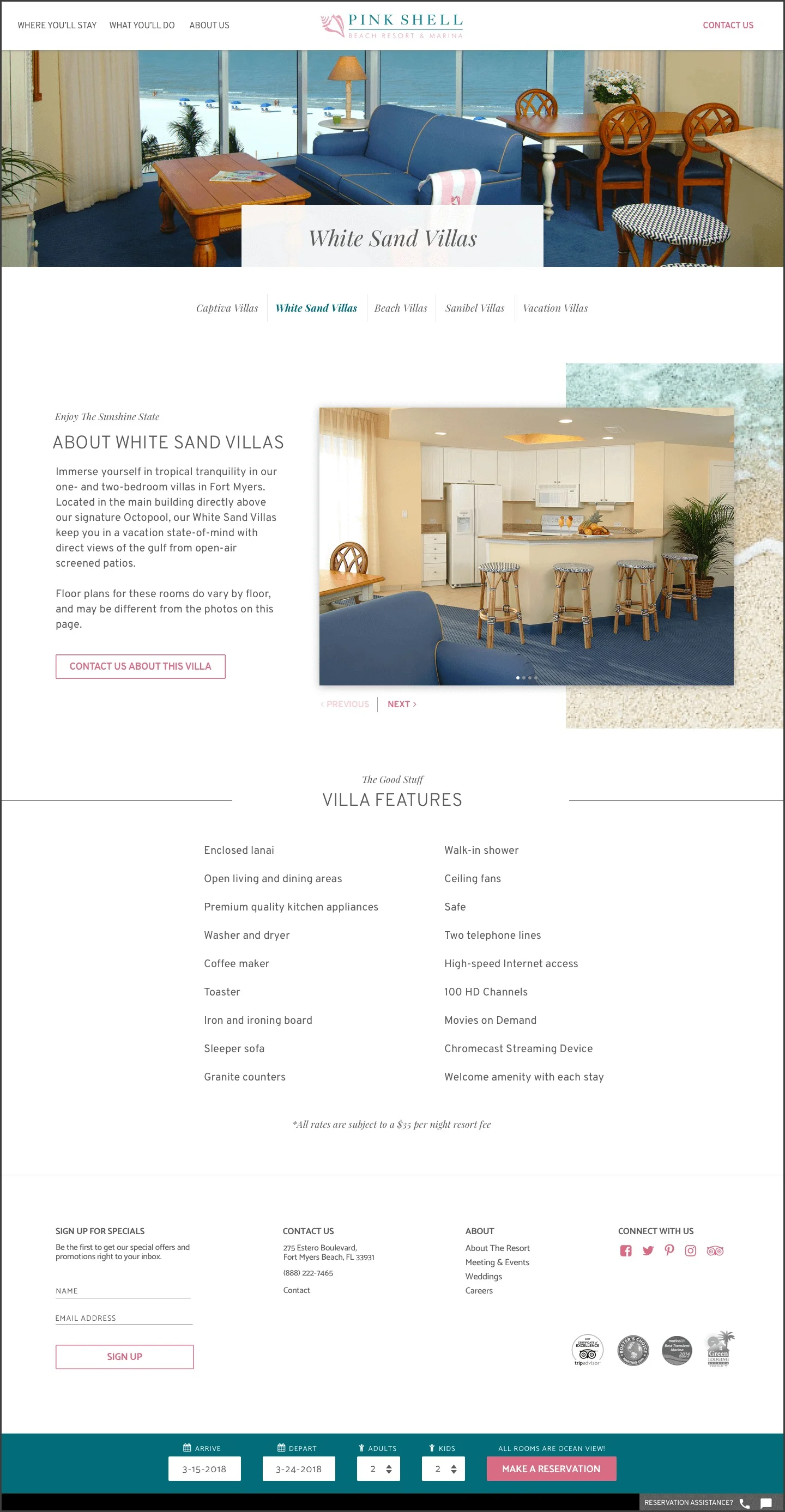
Before working on our wireframes, we created two high-fidelity concepts for both the home page and an interior page (including mobile designs) to present to the client.
CONCEPT A:

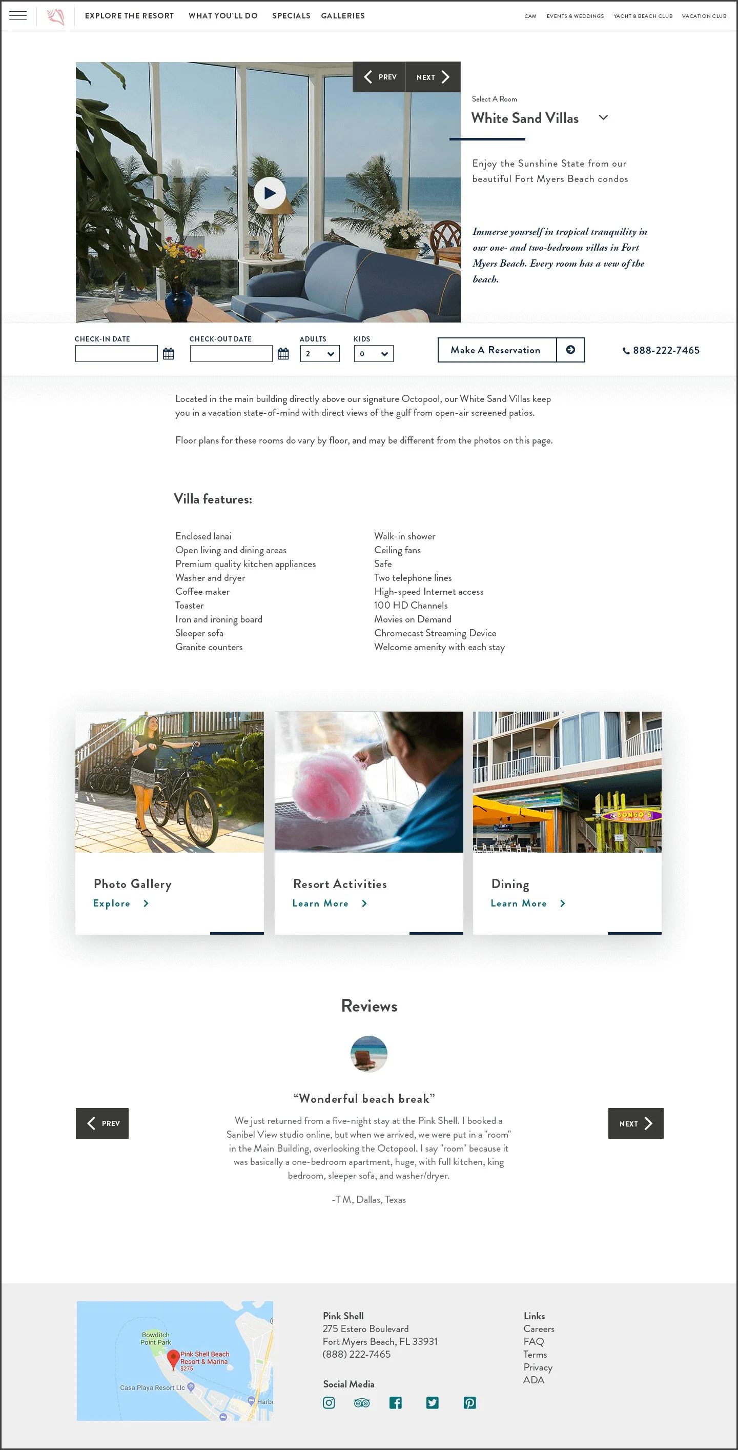

CONCEPT B:


Wireframes
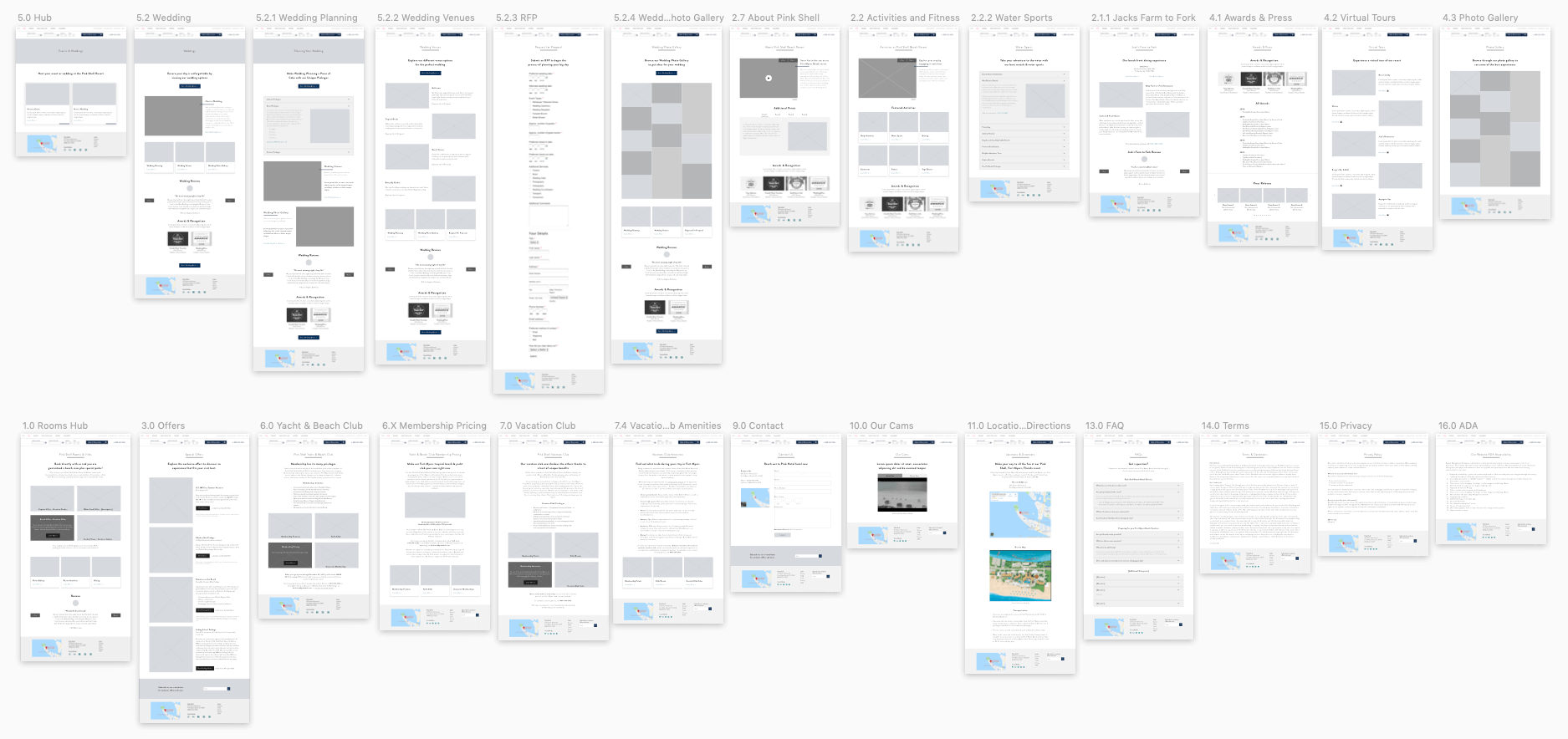
Once we received approval to move forward with one of the concepts, we began designing wireframes, reusing elements from the approved concept. To streamline the process, we grouped similar pages together and made minor adjustments to each based on the specific content.
Visual Design
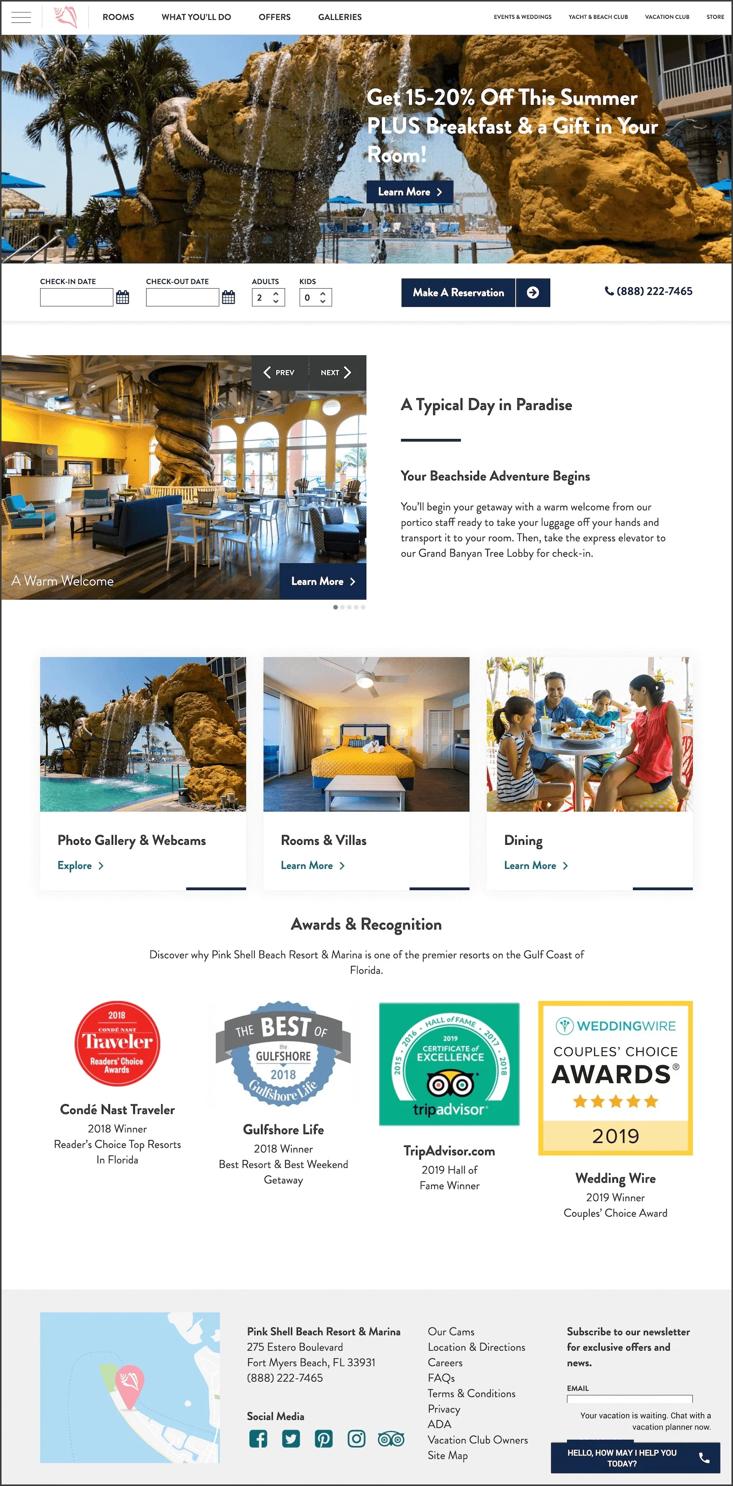
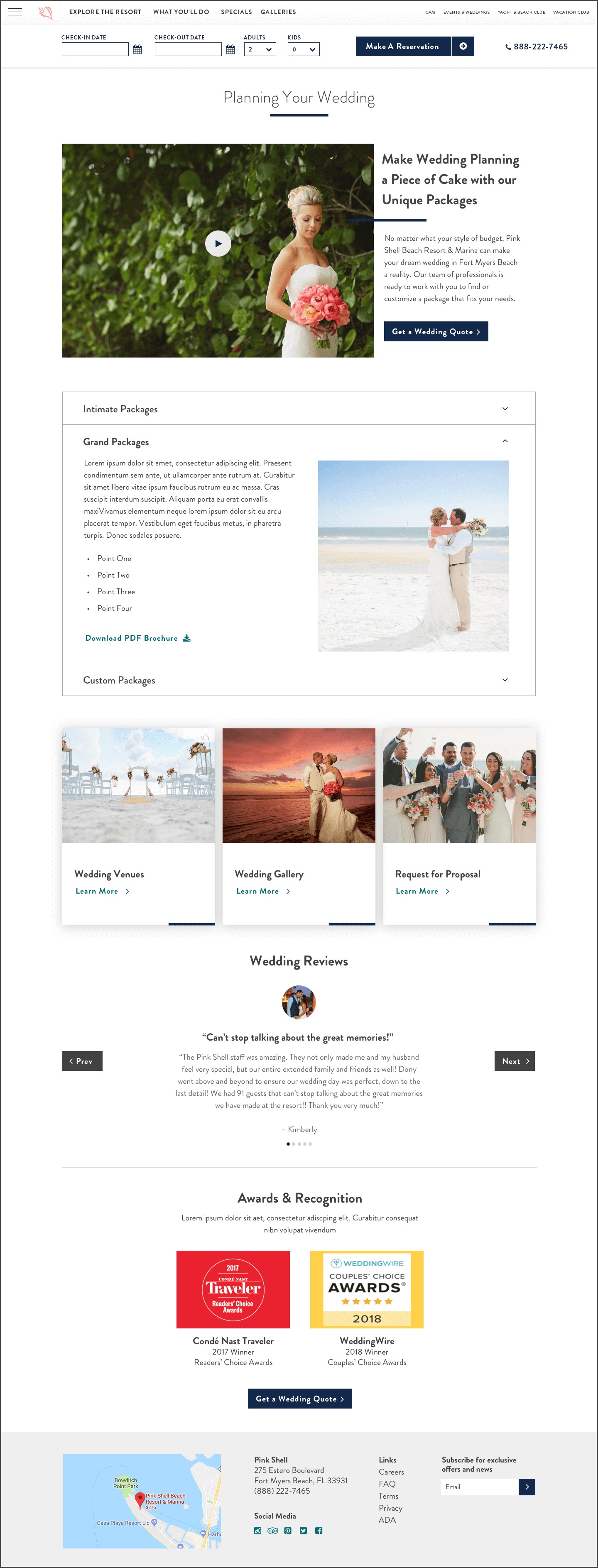
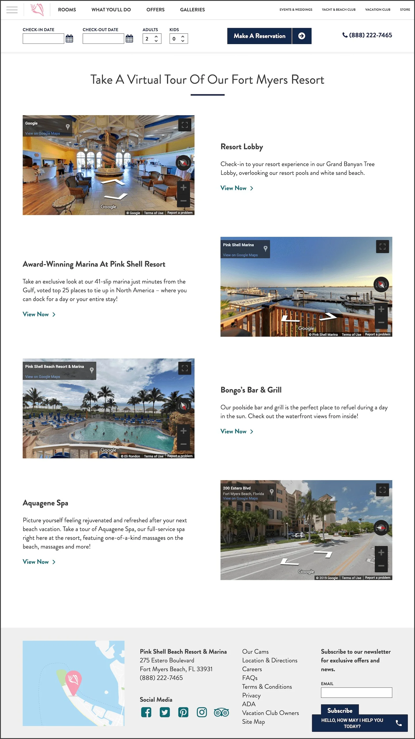
With our final designs, we wanted to create a web experience that properly matched the resort experience. We also ensured that the website met ADA considerations, and tailored our designs and assets to speak to our target demographic. Ultimately, we wanted to create a cleaner experience, ensuring all webpages had a strong purpose as well as a thought-out SEO strategy.
Conclusion
Once all the pages were mocked up and added to InVision, we presented the prototype to the client, who had very positive feedback about the website. The designs were then handed off to our development team and launched once the coding process was complete.
On a fun note, the visual aesthetic we created for Pink Shell was repurposed for their sister resort, Sandpiper Gulf Resort, another project we designed and managed.